一道设计 | 为我心爱的三个“她”打造一所处处都好看的家
户型三室
面积140m²
花费30~50万
位置苏州市
风格 美式
前言
在这光怪陆离的城市中,我们应该放慢脚步去享受生活,在这个慵懒的午后,麻烦,给我的爱人来一杯莫吉托。
In this strange city, we should slow down and enjoy our life In this lazy afternoon,A Mojito for my sweetheart, please.
项目坐标 | 江苏 苏州
项目信息 | 水漾花城140㎡
项目类型 | 私宅
设计机构 | 一道设计
设计主创 | 叶婷
设计执行 | 管寅
客户需求:
a. 氛围 —在简约时尚的基调中融入美式和轻奢的设计元素;
b. 功能—在满足家庭日常成员日常需求的情况下,希望有更多收纳的空间;
c. 喜好 —红酒、喝咖啡、读书、电影等;
d. 材质 —素雅的白色、米色调,现代干净的灰调;
户型结构:三室两厅两卫
家庭成员:夫妻俩+两个可爱的女儿
· 户型图
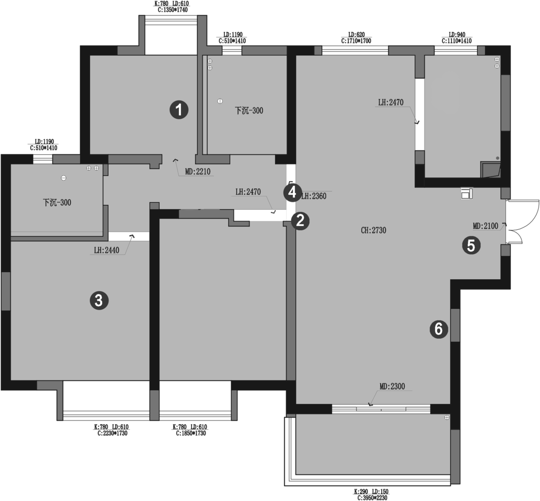
原始户型结构空间分析
1.北次卧空间较小,考虑如何满足儿童房的生活,学习需要?
2.考虑是否能够更改电视背景墙的阳角正对入户门的风水问题?
3.主卧面积较小,考虑如何布置衣柜?
4.走道位置结构关系不理想,考虑能否更改使客餐厅更加完整?
5.门厅空间较为宽敞,能否更好的利用空间?
6.客厅沙发墙尺寸较短,空间比例感较差,能否使客厅更加方正?
1.北次卧空间较小,考虑如何满足儿童房的生活,学习需要?
2.考虑是否能够更改电视背景墙的阳角正对入户门的风水问题?
3.主卧面积较小,考虑如何布置衣柜?
4.走道位置结构关系不理想,考虑能否更改使客餐厅更加完整?
5.门厅空间较为宽敞,能否更好的利用空间?
6.客厅沙发墙尺寸较短,空间比例感较差,能否使客厅更加方正?
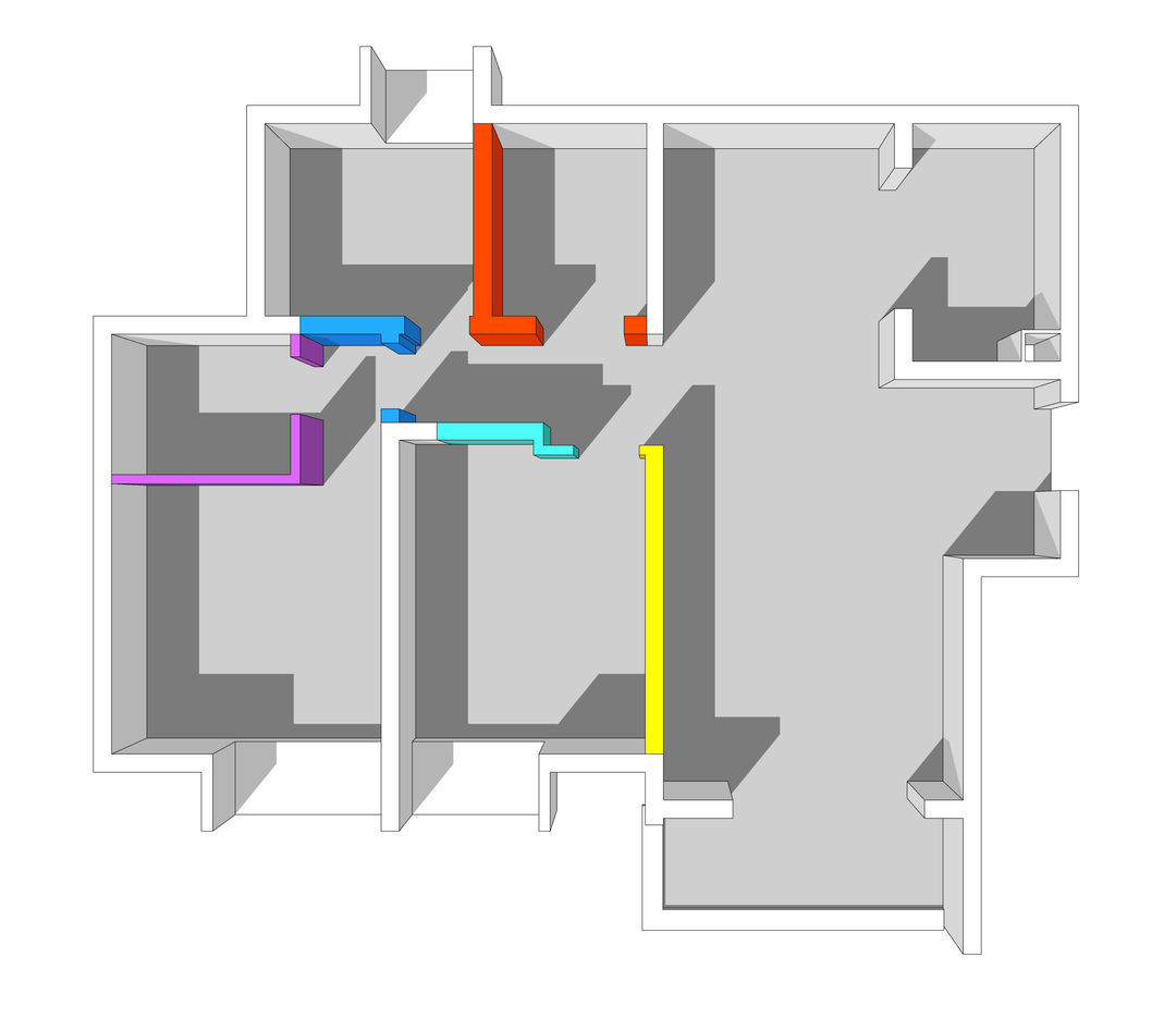
空间布局改造思路:
1.拆除黄色区,根据入户门的轴线关系,从新梳理走道的空间结构关系及次卧室的功能布置;
2.拆除橘红区,借外卫生间的尺寸,扩大北次卧的面积;
3.拆除蓝色区,设计储物柜,给主卧增加储物空间;
4.拆除青色区,设计背靠背储物柜,增大储物面积;
5.拆除紫色区,调整主卫门的位置及功能布置,避免卫生间门和房门正对问题;
1.拆除黄色区,根据入户门的轴线关系,从新梳理走道的空间结构关系及次卧室的功能布置;
2.拆除橘红区,借外卫生间的尺寸,扩大北次卧的面积;
3.拆除蓝色区,设计储物柜,给主卧增加储物空间;
4.拆除青色区,设计背靠背储物柜,增大储物面积;
5.拆除紫色区,调整主卫门的位置及功能布置,避免卫生间门和房门正对问题;

平面布置图
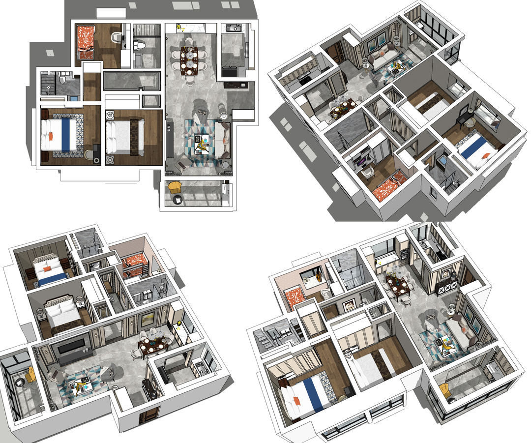
本方案充满了
浪漫主义色彩
因为有生命中三个最重要的女人的存在
莫吉托不再需要咖啡糖
世界已经甜得过头了
......
浪漫主义色彩
因为有生命中三个最重要的女人的存在
莫吉托不再需要咖啡糖
世界已经甜得过头了
......
· 玄关
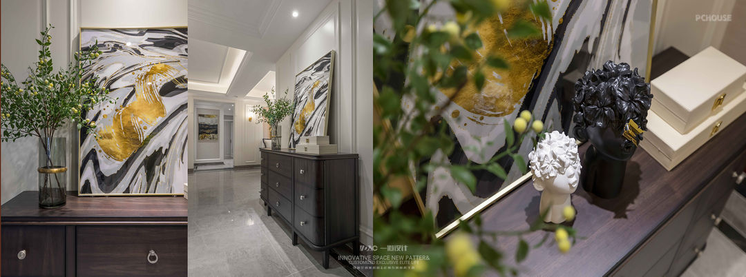
进门的左手边做了一个大的深度60CM深的衣帽柜,可以满足一家人进出的衣物的需求。
On the left side of the door, a 60CM deep garment and hat cabinet is made, which can meet the needs of the whole family.
On the left side of the door, a 60CM deep garment and hat cabinet is made, which can meet the needs of the whole family.
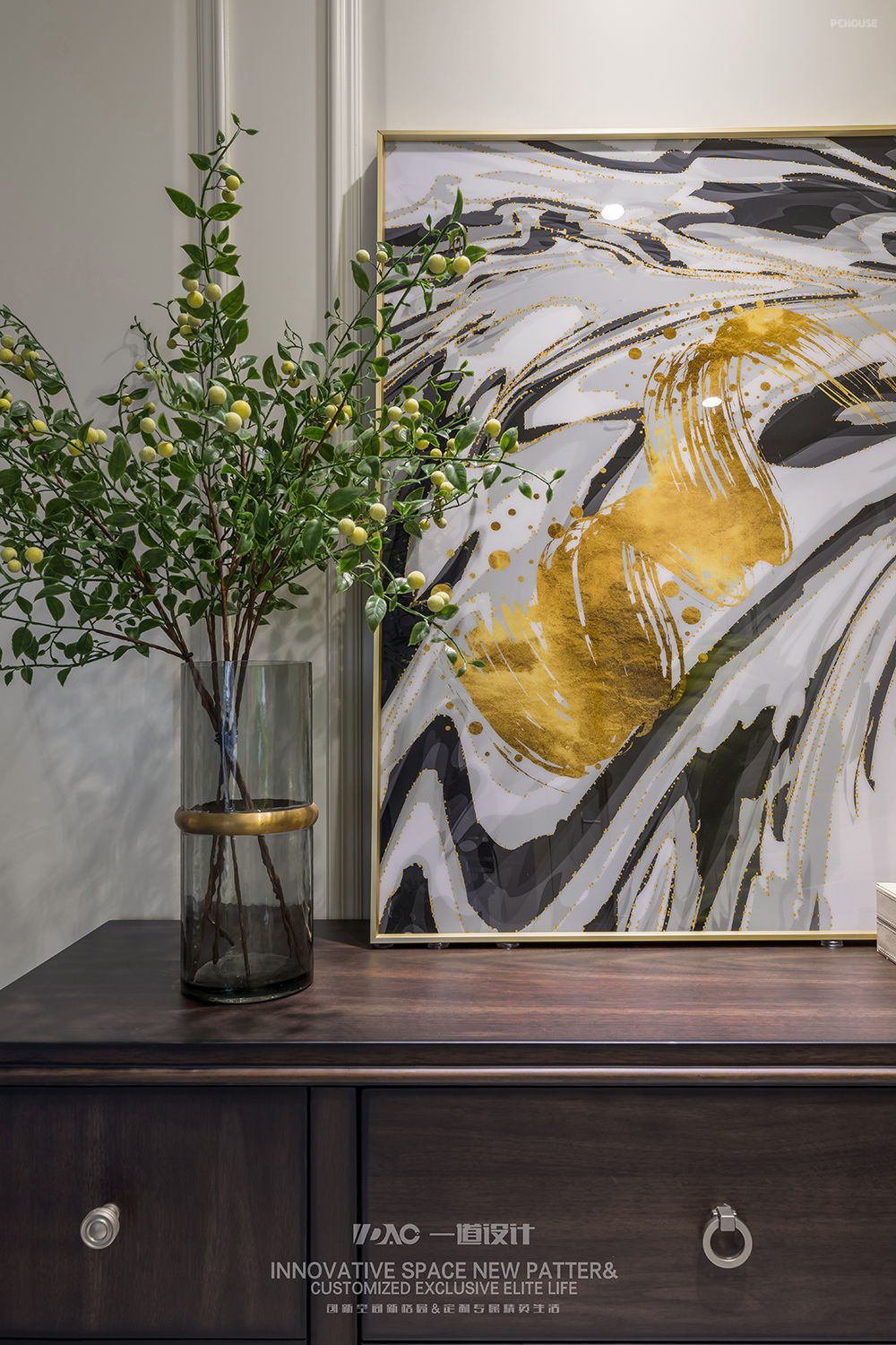
右手边设计了小的装饰背景,墙面通过护墙板的修饰来提升整体空间的品质感,搭配成品现代美式的矮柜、矮柜上一组画和软装小品及绿植的搭配,营造入户的第一氛围感受!入户正对的走廊尽头形成入户端景,白色护墙板中间素色墙布,挑选了品质感非常高的晶瓷画来营造端景。
The right side designed a small decorative background, the wall through the decoration of the wall panels to enhance the overall quality of the space, with the finished product modern American low cabinet, a group of paintings and soft installation sketch and green plant collocation, to create the first atmosphere into the home experience!
The right side designed a small decorative background, the wall through the decoration of the wall panels to enhance the overall quality of the space, with the finished product modern American low cabinet, a group of paintings and soft installation sketch and green plant collocation, to create the first atmosphere into the home experience!
· 客厅
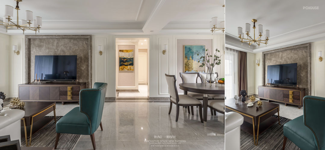
整个客餐厅的设计,立面主要通过造型木饰面搭配素色墙布,电视背景用了品质感比较高的天然波斯灰大理石。顶面通过叠级吊顶和造型石膏线来做处理。地面是深色的地砖做了围边尺寸是15CM,中间选了800*800的地砖整体通铺.
The design of the entire guest dining room, the facade mainly through the modeling wood veneer with plain wall cloth, the TV background with a high quality of natural Persian gray marble. The top surface is processed through the cascade condole top and the molding gypsum line. The floor is made of dark floor tiles with an edge size of 15CM and a floor tile of 800*800 in the middle.
The design of the entire guest dining room, the facade mainly through the modeling wood veneer with plain wall cloth, the TV background with a high quality of natural Persian gray marble. The top surface is processed through the cascade condole top and the molding gypsum line. The floor is made of dark floor tiles with an edge size of 15CM and a floor tile of 800*800 in the middle.
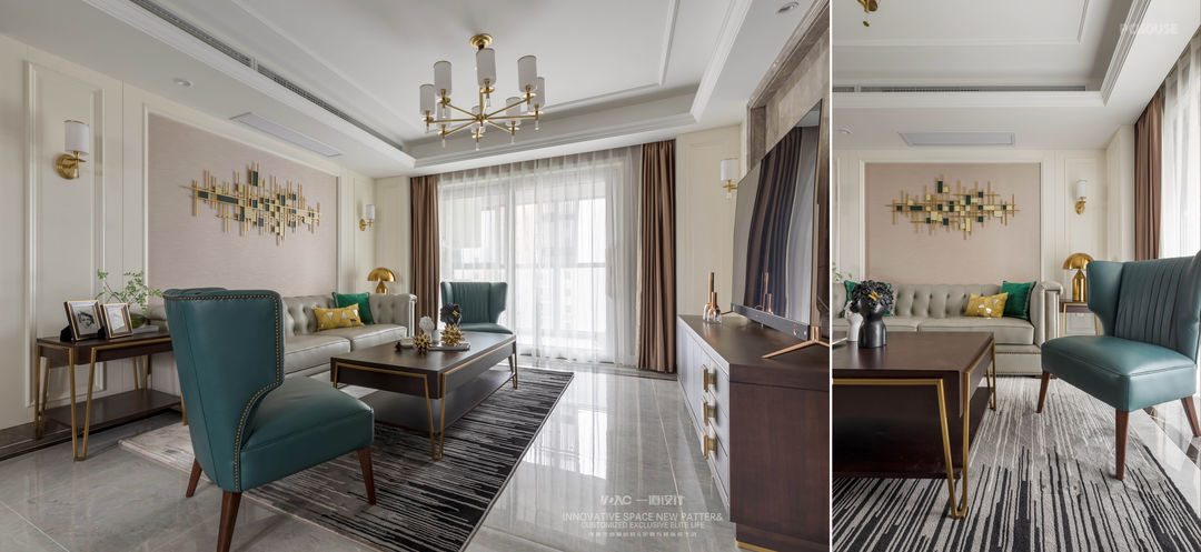
窗帘处设计窗帘暗箱,两侧用方管做了单隔墙,可以把窗帘完全藏到两侧的木饰面后面。沙发背景和电视背景转角处的木饰面形成一个L型的转折关系,增加了围合感。
Curtain place designs curtain dark box, two sides made single partition with square pipe, can hide the curtain completely to the wood of two sides to act the role of the face behind. The wood facing of corner office of sofa setting and TV setting forms the turning point relation of an L type, increased surround close feeling.
Curtain place designs curtain dark box, two sides made single partition with square pipe, can hide the curtain completely to the wood of two sides to act the role of the face behind. The wood facing of corner office of sofa setting and TV setting forms the turning point relation of an L type, increased surround close feeling.
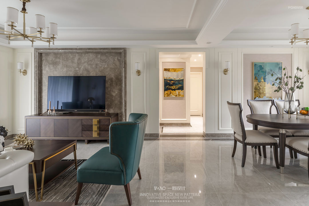
墙面木饰面都没有落地,下面是大理石踢脚线,为了防止踢脚线的上口积灰,大理石踢脚线安装完的尺寸要保持和上面木饰面在一个平面,在大交界处特地设计铣槽做了一个高尺寸为5MM*5MM的槽。
he wall wood veneer is not falling to the ground, the following is the marble footer line, in order to prevent the top of the footer line accumulation of ash, the size of the marble footer line installation should be kept in the same plane with the above wood veneer, at the big border specially designed milling groove made a groove with a high size of 5MM*5MM.
he wall wood veneer is not falling to the ground, the following is the marble footer line, in order to prevent the top of the footer line accumulation of ash, the size of the marble footer line installation should be kept in the same plane with the above wood veneer, at the big border specially designed milling groove made a groove with a high size of 5MM*5MM.

客餐厅在软装灯饰和壁饰上,都选用了黄铜质感的材质,来装饰和提升空间的轻奢属性。
The soft decoration lighting and wall decoration in the guest dining room are made of brass, to decorate and enhance the light luxury property of the space.
The soft decoration lighting and wall decoration in the guest dining room are made of brass, to decorate and enhance the light luxury property of the space.
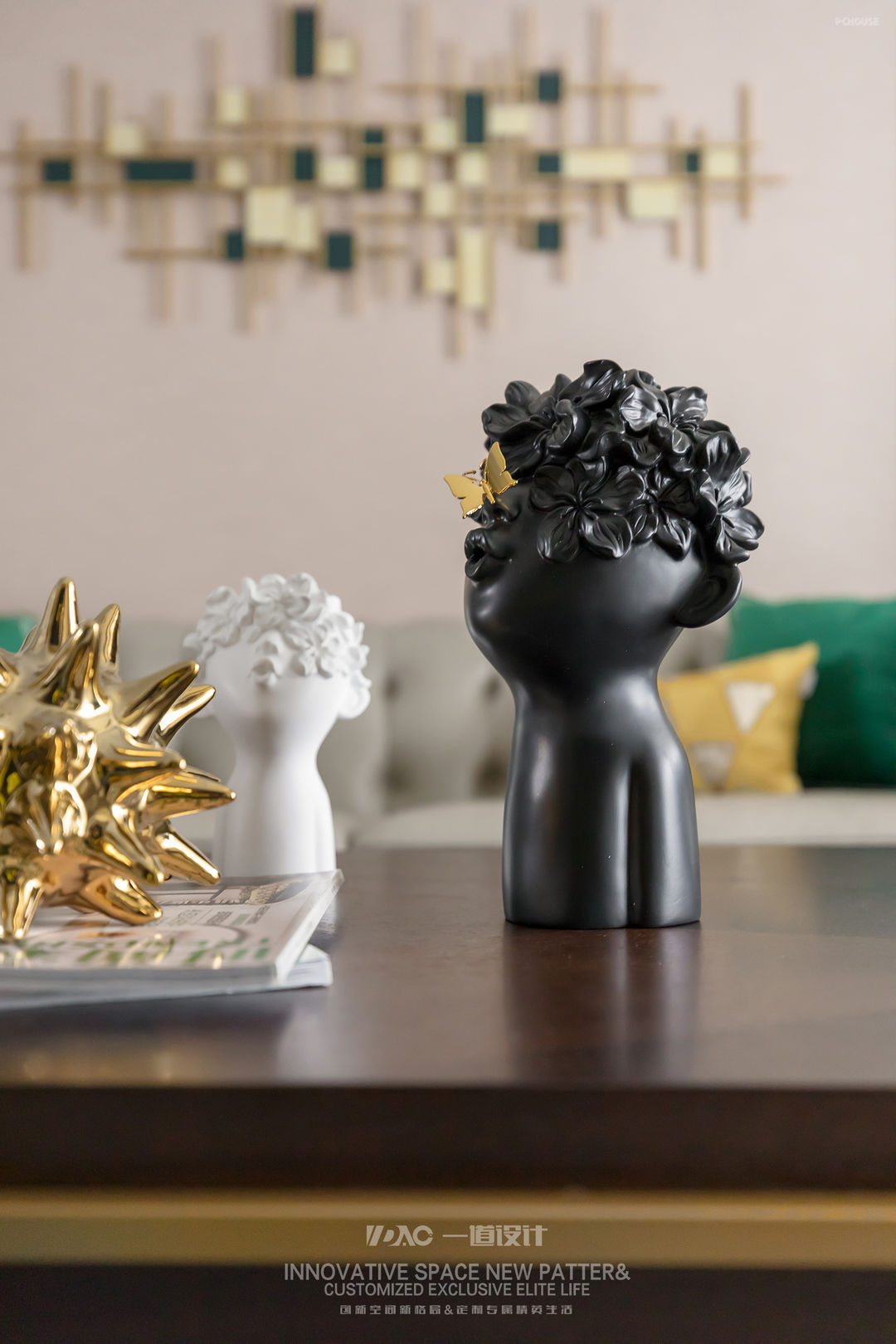

中央空调的风口做了加长处理,中间是真的出风口,两个侧面是假的,吊顶的时候里面需要做石膏挡板,这样更有品质感!
The tuyere of central air conditioning did lengthen processing, it is real air outlet in the middle, two sides are false, when condole supports inside need to do gesso baffle, have quality feeling more so!
The tuyere of central air conditioning did lengthen processing, it is real air outlet in the middle, two sides are false, when condole supports inside need to do gesso baffle, have quality feeling more so!
· 餐厅

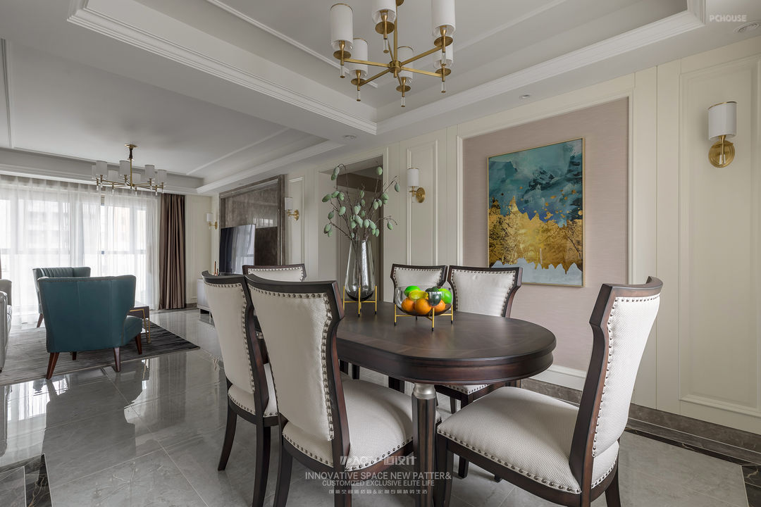
餐厅北侧面靠窗的位置,两侧做了高柜放置烤箱,中间窗户部分做了操作台面,来满足西厨的需求及餐厅的收纳和餐边柜的需求。
Dining-room north flank relies on the position of the window, two sides did tall ark to place oven, middle window part did operating mesa, will satisfy the demand of the west hutch and dining-room receive the demand that ark of eat edge.
Dining-room north flank relies on the position of the window, two sides did tall ark to place oven, middle window part did operating mesa, will satisfy the demand of the west hutch and dining-room receive the demand that ark of eat edge.
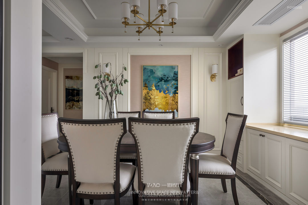
餐厅的背景两侧面护墙板的尺寸和电视背景两侧保持一致,中间换了一个材质,墙布让餐厅的温度质更高。这样通过中间的走道门洞,两侧也是完全对称的关系。
The size of the wall panels on the two sides of the restaurant's background is the same as that on the two sides of the TV background. A different material is used in the middle. The wall cloth makes the temperature of the restaurant higher. So through the middle aisle of the door, the two sides are also completely symmetrical.
The size of the wall panels on the two sides of the restaurant's background is the same as that on the two sides of the TV background. A different material is used in the middle. The wall cloth makes the temperature of the restaurant higher. So through the middle aisle of the door, the two sides are also completely symmetrical.
· 厨房
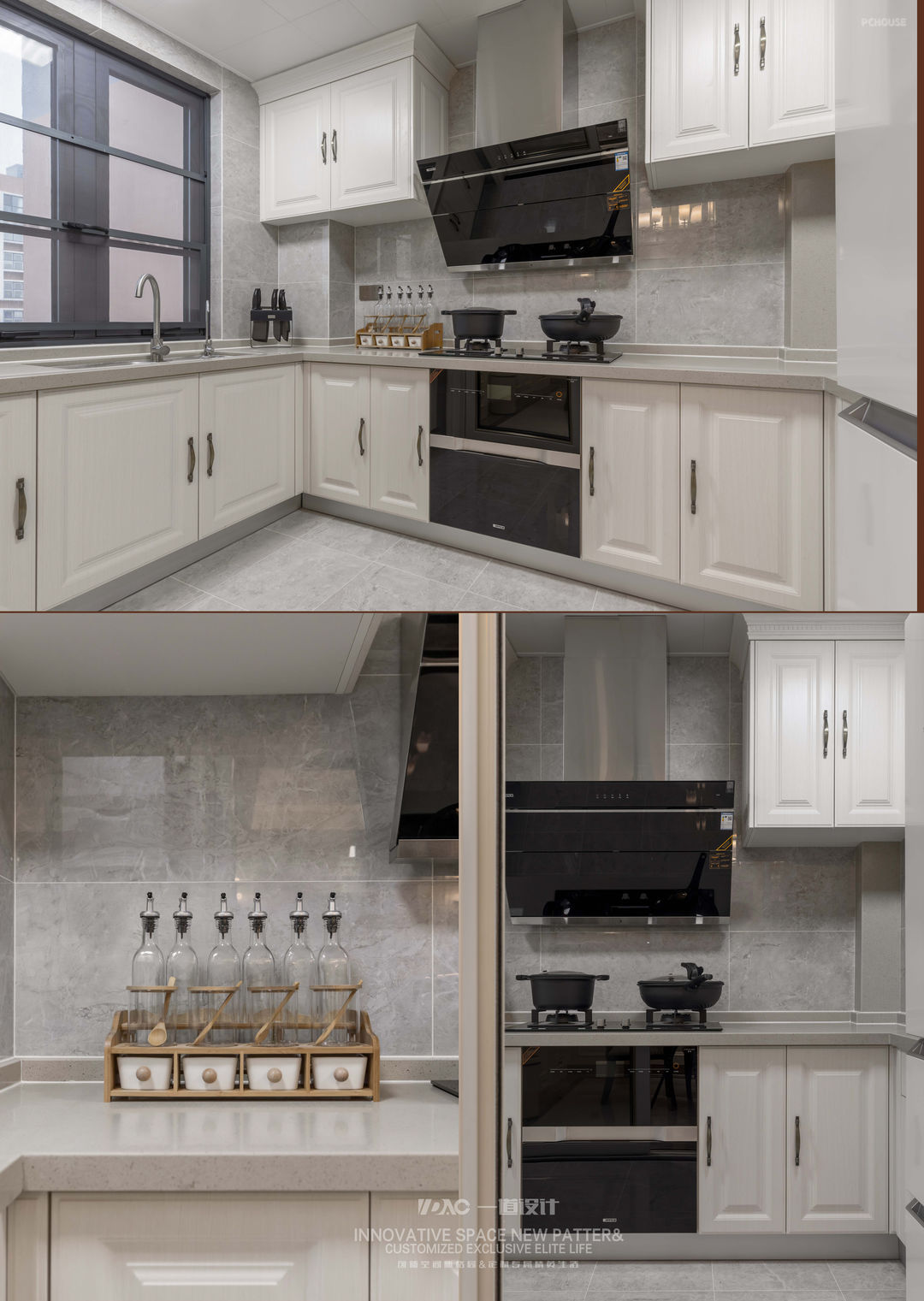
厨房墙地面砖一体,用的800*800的大砖加工上墙,橱柜门板继续延续护墙板的造型。
Kitchen wall ground brick is an organic whole, the big brick that USES 800*800 processes on the wall, ambry door plank continues the modelling of clapboard.
Kitchen wall ground brick is an organic whole, the big brick that USES 800*800 processes on the wall, ambry door plank continues the modelling of clapboard.
· 卧室
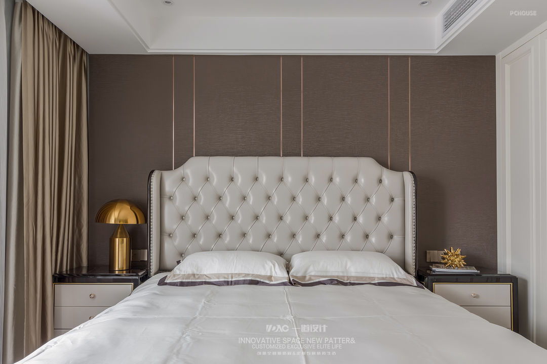
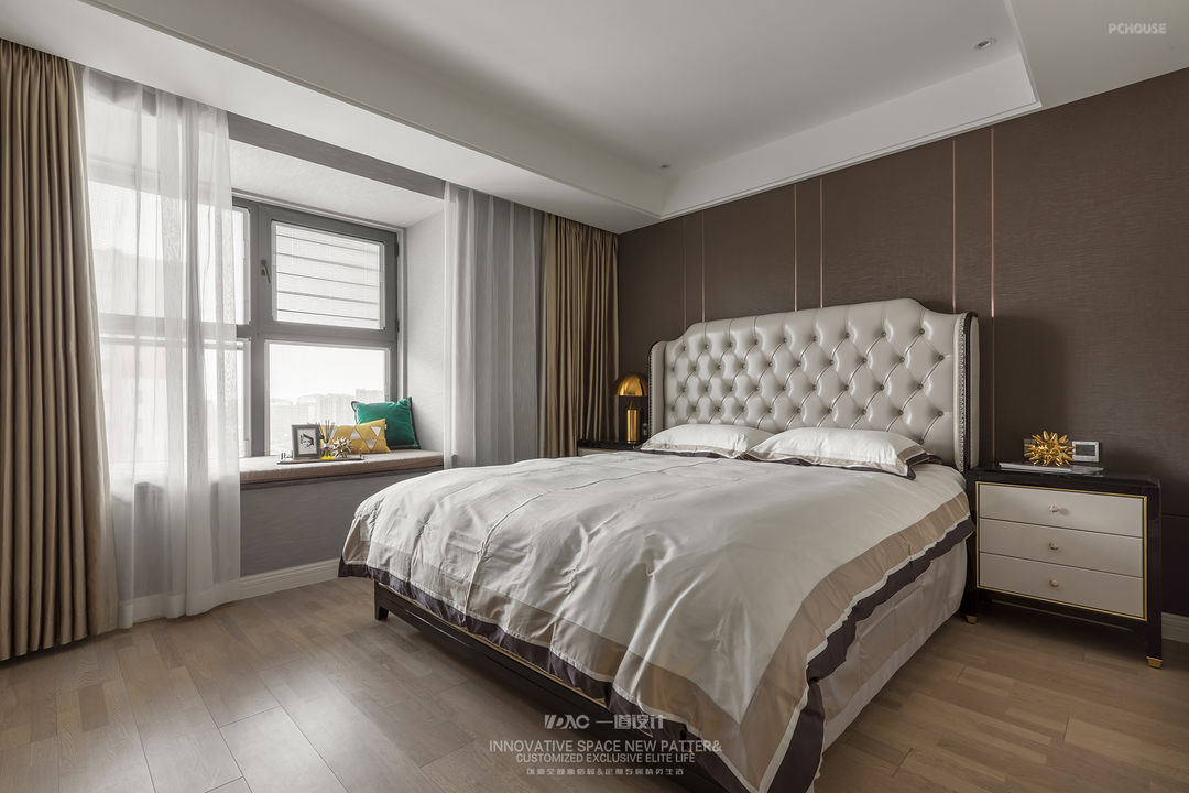
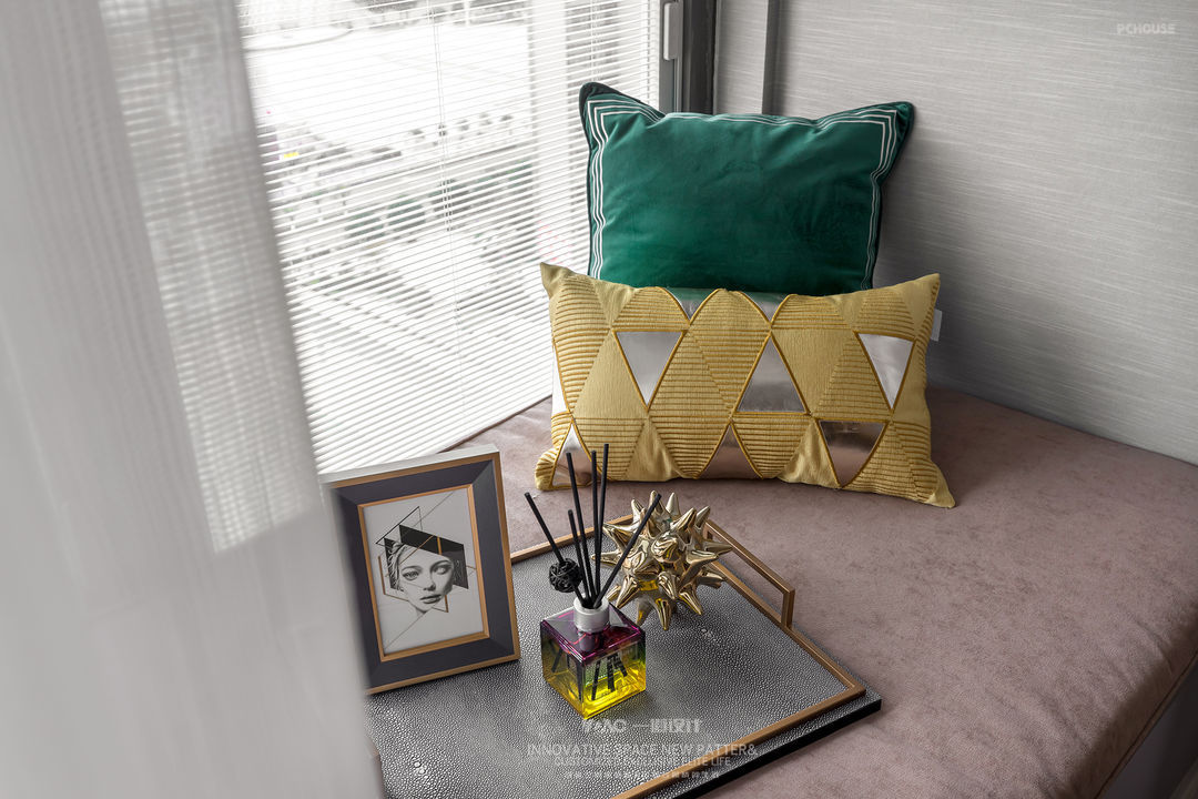
主卧室顶面做了无主灯设计,通过小的射灯点光源来营造卧室的舒适感。床头通过布艺硬包和金属线条的搭配,来打造卧室的品质感。
Master bedroom top surface does not have the main lamp design, through the small spot light source to build the bedroom comfort. The head of a bed passes the collocation of cloth art hard package and metallic line, will make the quality feeling of the bedroom.
Master bedroom top surface does not have the main lamp design, through the small spot light source to build the bedroom comfort. The head of a bed passes the collocation of cloth art hard package and metallic line, will make the quality feeling of the bedroom.
· 大女儿房
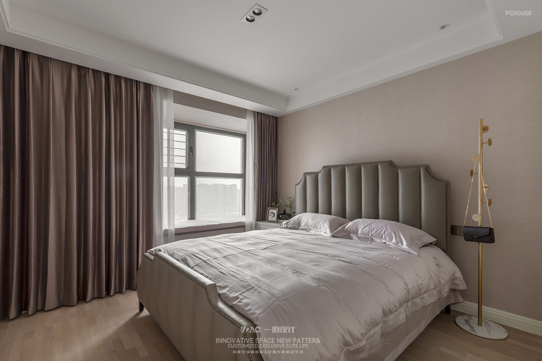
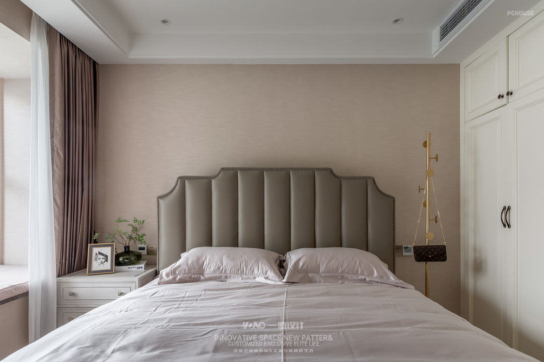
次卧室是大姑娘的房间,整体没有做的很小孩子气,整体空间的感受上比较温馨。做了无主灯设计,通过小的射灯点光源来营造卧室的舒适感。
Second bedroom is the room of big girl, whole did not do very small child, the feeling on integral space is more sweet. Do not have advocate the design of the lamp, the intimacy that will build a bedroom through small spot light source.
Second bedroom is the room of big girl, whole did not do very small child, the feeling on integral space is more sweet. Do not have advocate the design of the lamp, the intimacy that will build a bedroom through small spot light source.
· 小女儿房


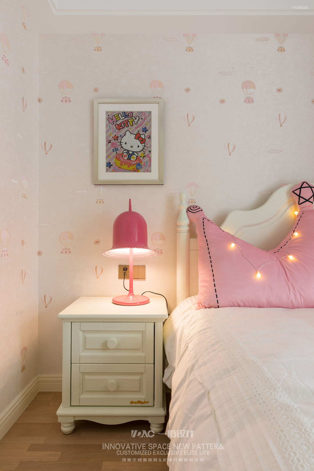
北卧室是小姑娘的房间,整体设计会比较童趣一些!色彩上更粉一些,希望给小朋友打造一个梦幻一点的公主房的感受。
North bedroom is the room of little girl, integral design can compare tong Qu a few! More pink on colour, the feeling that the princess room that hopes to make a bit of a dream to the child.
North bedroom is the room of little girl, integral design can compare tong Qu a few! More pink on colour, the feeling that the princess room that hopes to make a bit of a dream to the child.
更多推荐
发表您的看法…
目录
户型图
玄关
客厅
餐厅
厨房
卧室
大女儿房
小女儿房


评论 0