叁点壹线设计. 实景 | TOMATO HOUSE番茄堂全新升级
空间类型餐饮
面积368m²
花费30~50万
位置常州市
风格 自然风
前言
TOMATO HOUSE
番茄堂餐饮空间设计
-
改变这件事,
仅仅有愿望可是不够的,还必须要有力量。
但只要你想,
当下便是发生变化最好的时候。
于是,更好的她,来了!
番茄堂餐饮空间设计
-
改变这件事,
仅仅有愿望可是不够的,还必须要有力量。
但只要你想,
当下便是发生变化最好的时候。
于是,更好的她,来了!
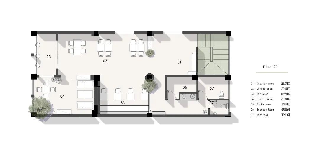
· 户型图

· 门头
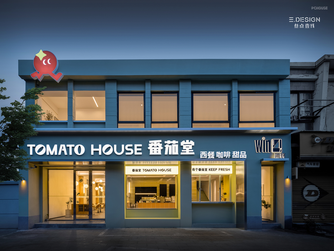
一直备受大家喜爱的TOMATO HOUSE番茄堂近期全面升级、重装开业,无论是品牌形象、店面设计,还是餐食饮品,都希望能带给老朋友们新惊喜、新体验。
Tomato House, which has always been loved by everyone, has recently been fully upgraded and reopened, whether it is brand image, store design, or food and drinks, hoping to bring new surprises and new experiences to old friends.
Tomato House, which has always been loved by everyone, has recently been fully upgraded and reopened, whether it is brand image, store design, or food and drinks, hoping to bring new surprises and new experiences to old friends.
· 其他
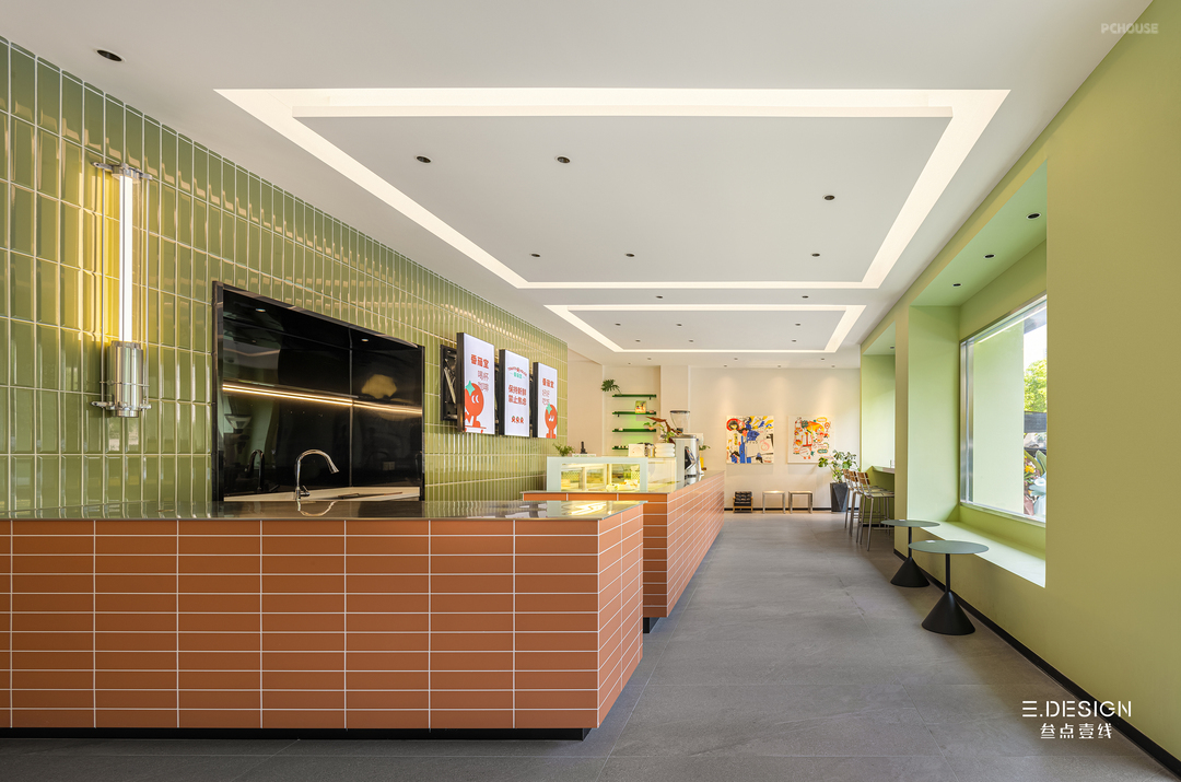
推门而入,就像是掉进了牛油果绿的天堂。空间迎合当下流行的空气感色彩趋势,大面积采用清新的牛油果绿,这种介于黄、绿之间的中性偏冷色系,兼容了莫兰迪色系的温柔与黄绿调的明快。自带黄调的牛油果绿,与棕色系十分适配,像是“果肉”和“果核”的组合,令人联想起绵密的质感,叫人食欲大开。
Pushing the door in is like falling into an avocado-green paradise. The space caters to the current trend of air-sensitive colors, with a large area of fresh avocado green, a neutral cool color between yellow and green, which is compatible with the gentleness of Morandi and the brightness of yellow-green tones. The yellow tone of avocado green is very suitable for brown, like a combination of "pulp" and "core", which is reminiscent of a dense texture and can't help but be appetizing.
全新的品牌形象俏皮而直接,简约宽敞的吧台繁忙地运作,精致的蛋糕甜品以心意输出,一派美好。
The new brand image is playful and direct, the simple and spacious bar is busy working, and the exquisite cake desserts are output with heart, which is beautiful.


被打开后的室内空间最大程度地与室外交融,结合自然的采光和阴翳,将享用美食的惬意心情尽情舒展。开敞的窗景模糊了内外的边界,也塑造着室内时间的维度。打开折叠窗,坐上高脚椅,那一刻,让夏夜的晚风疏散工作的疲惫,让橘色的黄昏拥抱落日的浪漫。
The opened interior space blends in with the outdoors to the greatest extent possible, combining natural lighting and shade to stretch out the comfortable mood of enjoying a meal. The open window view blurs the boundaries between the inside and outside, and also shapes the dimension of time in the interior. Open the folding window and sit in a high chair, at that moment, let the evening wind of the summer night evacuate the tiredness of the work, let the orange dusk embrace the romance of the sunset.
The opened interior space blends in with the outdoors to the greatest extent possible, combining natural lighting and shade to stretch out the comfortable mood of enjoying a meal. The open window view blurs the boundaries between the inside and outside, and also shapes the dimension of time in the interior. Open the folding window and sit in a high chair, at that moment, let the evening wind of the summer night evacuate the tiredness of the work, let the orange dusk embrace the romance of the sunset.
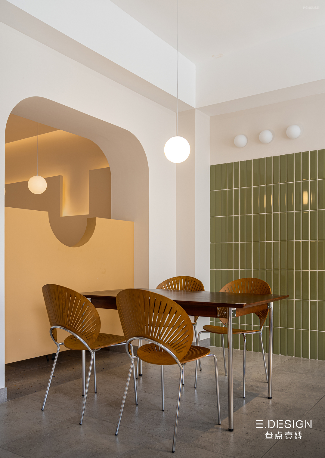
樱桃木色的扇贝椅、原木色的餐边柜、胡桃木色的高脚椅……设计师在绿色空间中注入深深浅浅的木色,使得空间更具层次感和生命的张力。灯具、桌椅脚等不锈钢材质穿插其中,让整体调性在暖与冷、柔与刚中达到恰到好处的平衡。还有那随处可见的绿植,肆意生长的绿使整体空间更丰富、自然。
Cherry-wood scallop chairs, log-colored sideboards, walnut-colored high chairs... The designer injects a deep and light wood color into the green space, making the space more layered and life-like tension. Stainless steel materials such as lamps, tables and chairs are interspersed with them, so that the overall tonality can achieve the right balance between warm and cold, soft and rigid. There are also green plants that can be seen everywhere, and the green that grows freely makes the overall space rich and natural.
Cherry-wood scallop chairs, log-colored sideboards, walnut-colored high chairs... The designer injects a deep and light wood color into the green space, making the space more layered and life-like tension. Stainless steel materials such as lamps, tables and chairs are interspersed with them, so that the overall tonality can achieve the right balance between warm and cold, soft and rigid. There are also green plants that can be seen everywhere, and the green that grows freely makes the overall space rich and natural.
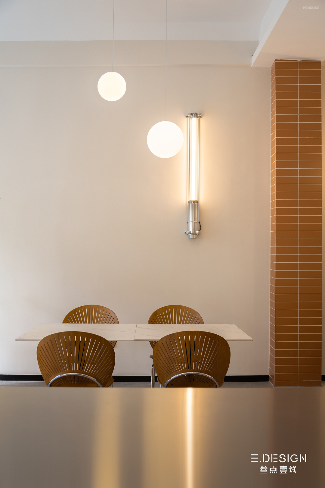
局部的跳色和别具特色的软装,不动声色地调和着空间情绪,催化出轻松、愉悦的用餐氛围。
Local color jumping and unique soft decoration quietly reconcile the mood of the space, catalyzing a relaxed and pleasant dining atmosphere.
Local color jumping and unique soft decoration quietly reconcile the mood of the space, catalyzing a relaxed and pleasant dining atmosphere.


绿色,成为贯穿上下空间的纽带,脚踏牛油果色拾阶而上,我们将到达二楼的用餐区。
Green, which becomes the link that runs through the upper and lower spaces, pedals up the avocado color and we will reach the dining area on the 2nd floor.
Green, which becomes the link that runs through the upper and lower spaces, pedals up the avocado color and we will reach the dining area on the 2nd floor.
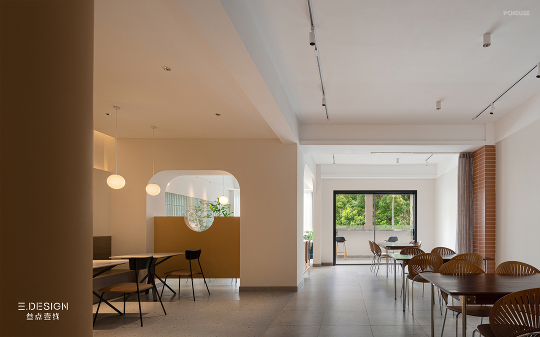

作为空间氛围光的来源之一,一盏盏球形吊灯,既强化了圆形元素的秩序感,又营造出宛如月光般的安定与柔和。卡座采用木饰面进行装饰,自然的材质与原始的色泽,与黄棕色的墙面相得益彰。
As one of the sources of ambient light in the space, a spherical chandelier not only strengthens the sense of order of the circular elements, but also creates a stable and soft like moonlight. The booth is decorated with a wooden finish, and the natural material and original color complement the yellow-brown wall.
As one of the sources of ambient light in the space, a spherical chandelier not only strengthens the sense of order of the circular elements, but also creates a stable and soft like moonlight. The booth is decorated with a wooden finish, and the natural material and original color complement the yellow-brown wall.
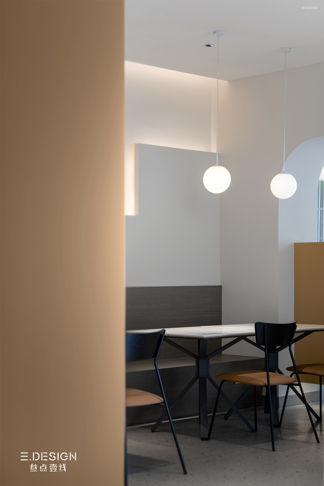
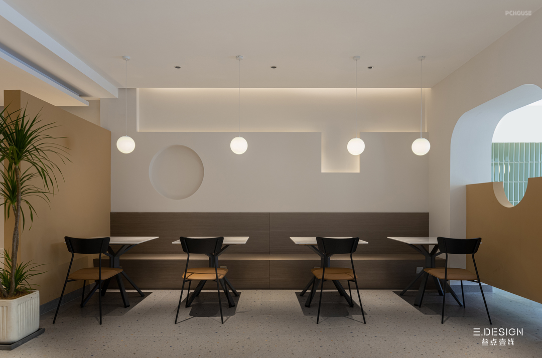
设计师将饱满又柔和的圆弧运用至空间各处。向上拱起的弧形,呈现一种向上的视觉,半墙的造型让空间隔而不断。圆形的窗洞,有效地消减了空间的围合感,让观感更敞亮、舒适。你可以看到,不同的圆在空间内部连续呼应着,与墙面的几何造型相互对撞,让空间更具艺术感和趣味感。
The designer uses full and soft arcs throughout the space. The curved shape of the upward arch presents an upward vision, and the shape of the half wall makes the space continuously spaced. The circular window opening effectively reduces the sense of encirclement of the space, making the look more open and comfortable. You can see that different circles echo continuously inside the space, colliding with the geometric shape of the wall, making the space more artistic and interesting.
The designer uses full and soft arcs throughout the space. The curved shape of the upward arch presents an upward vision, and the shape of the half wall makes the space continuously spaced. The circular window opening effectively reduces the sense of encirclement of the space, making the look more open and comfortable. You can see that different circles echo continuously inside the space, colliding with the geometric shape of the wall, making the space more artistic and interesting.

设计方 / 叁点壹线设计
Designer Company / 三.DESIGN
设计主创 / 房凤丹
Designer / Fang Fengdan
辅助设计 / 王志泓、钱浩杰
Assisted designer /
Wang Zhihong、Qian Haojie
项目类型 / 商业餐饮空间
Category / Dining space
建筑面积 / 368m²
Building area / 368m²
Designer Company / 三.DESIGN
设计主创 / 房凤丹
Designer / Fang Fengdan
辅助设计 / 王志泓、钱浩杰
Assisted designer /
Wang Zhihong、Qian Haojie
项目类型 / 商业餐饮空间
Category / Dining space
建筑面积 / 368m²
Building area / 368m²
更多推荐
发表您的看法…
目录
户型图
门头
其他





评论 0