集间设计 | 向阳
户型四室
面积145m²
花费50万以上
位置成都市
风格 日式、自然风、原木
前言
本案屋主现在的家庭成员是95后夫妇+猫咪陈颠颠。男主人在国外留学生活多年后回国从事IT职业,女主人是一名语文老师有咖啡、甜品、手工、茶道、花艺的喜好,陈颠颠是个活泼的小猫咪需要单独的空间同时也需要在其他空间放养。两人平时喜欢看书、听音乐、希望自己的家里满足功能需求的同时简洁、温润、经典。这是他们第一次装修,对他们的婚房充满期待,房屋原始为精装房,他们明确提出不喜欢原始的硬装设计,希望设计师根据他们的生活习惯拆了重塑,开拓视野、增加空间多样性和趣味感,预留小孩房和次卧室,增加智能家居。
The current family members of the homeowner in this case are the couple born in 1995 and the cat Chen Dianding. The male protagonist has been studying abroad for many years before returning to China to pursue an IT career. The female protagonist is a Chinese language teacher with hobbies such as coffee, desserts, handicrafts, tea ceremony, and floral art. Chen Dianding is a lively kitten who needs a separate space and also needs to be raised in other spaces. The two usually enjoy reading and listening to music, hoping that their home can meet functional needs while being simple, warm, and classic. This is their first decoration and they are full of expectations for their wedding room. The house was originally a hardcover design, and they clearly expressed their dislike for the original hardcover design. They hope that the designer can demolish and reshape it according to their lifestyle habits, broaden their horizons, increase spatial diversity and fun, reserve a children's room and a second bedroom, and add smart homes.
The current family members of the homeowner in this case are the couple born in 1995 and the cat Chen Dianding. The male protagonist has been studying abroad for many years before returning to China to pursue an IT career. The female protagonist is a Chinese language teacher with hobbies such as coffee, desserts, handicrafts, tea ceremony, and floral art. Chen Dianding is a lively kitten who needs a separate space and also needs to be raised in other spaces. The two usually enjoy reading and listening to music, hoping that their home can meet functional needs while being simple, warm, and classic. This is their first decoration and they are full of expectations for their wedding room. The house was originally a hardcover design, and they clearly expressed their dislike for the original hardcover design. They hope that the designer can demolish and reshape it according to their lifestyle habits, broaden their horizons, increase spatial diversity and fun, reserve a children's room and a second bedroom, and add smart homes.
· 户型图
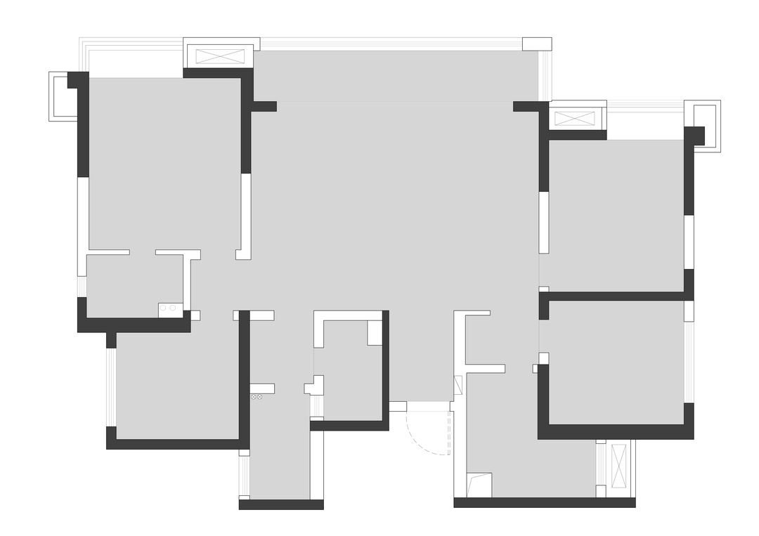

设计重点:
1.拆除入户与冰箱隔墙,改变入户动线,增加玄关功能分区,形成迂回动线。
2.冰箱移至厨房内,台面合理分配,增加使用的便利性。
3.改变客餐厅横厅结构,取消客厅主沙发在中间的布局,让出更大的活动空间,拓宽公区视野。
4.餐厅设置到原客厅阳台位置,向阳而居,把最好的阳光留给餐厅视野更佳。
5.书房在餐厅右边,拆除与餐厅中间隔墙形成开放式书房。
6.拆除次卫和家政阳台墙体,利用柜子与移门做空间分区。
7.拆除主卫与主卧中间隔墙,重新调整布局,将衣柜放置床对面。
1.拆除入户与冰箱隔墙,改变入户动线,增加玄关功能分区,形成迂回动线。
2.冰箱移至厨房内,台面合理分配,增加使用的便利性。
3.改变客餐厅横厅结构,取消客厅主沙发在中间的布局,让出更大的活动空间,拓宽公区视野。
4.餐厅设置到原客厅阳台位置,向阳而居,把最好的阳光留给餐厅视野更佳。
5.书房在餐厅右边,拆除与餐厅中间隔墙形成开放式书房。
6.拆除次卫和家政阳台墙体,利用柜子与移门做空间分区。
7.拆除主卫与主卧中间隔墙,重新调整布局,将衣柜放置床对面。
· 玄关
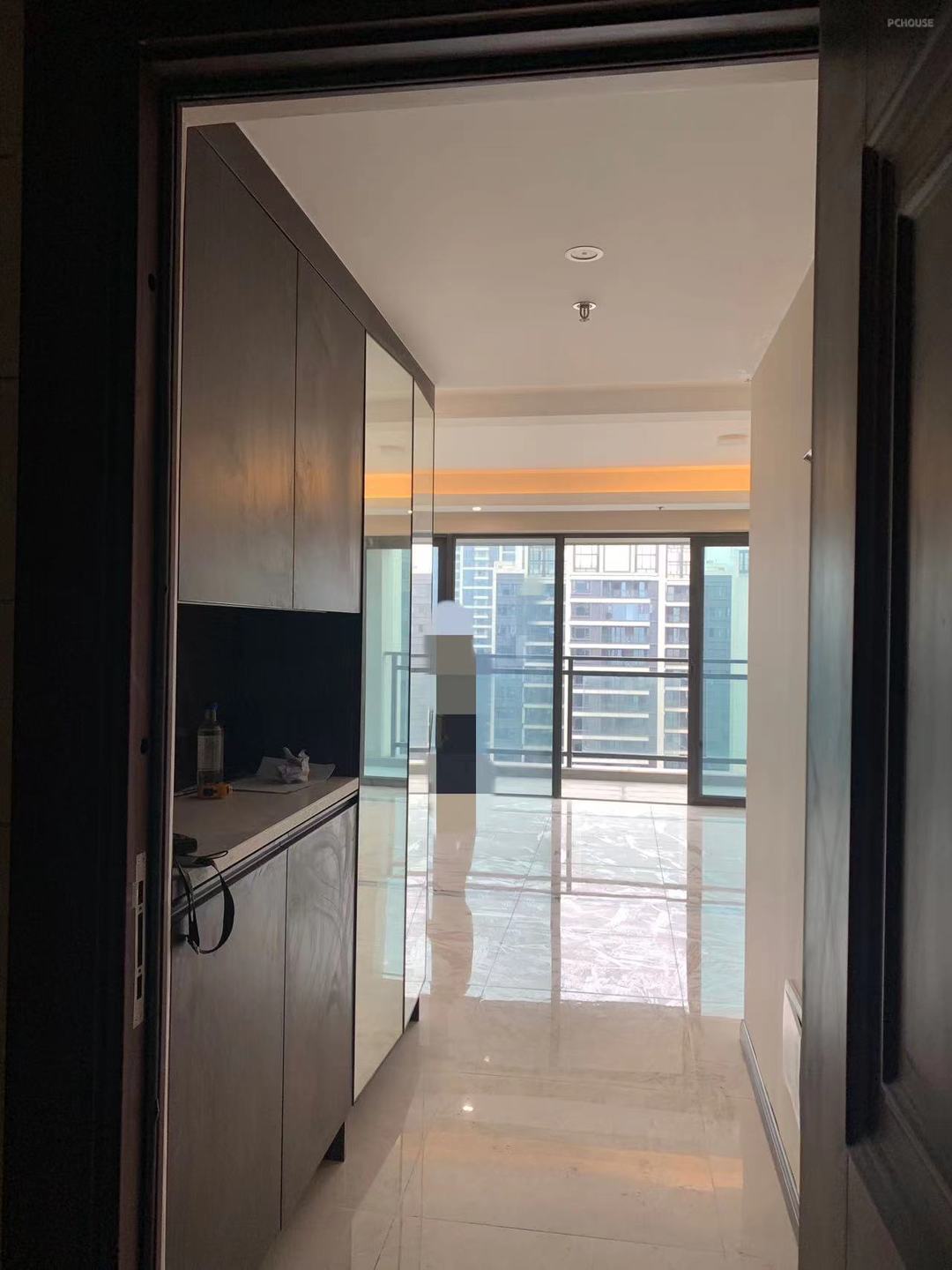
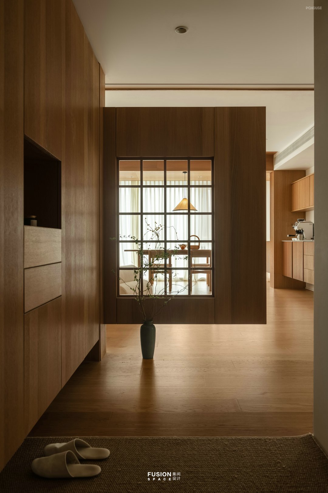
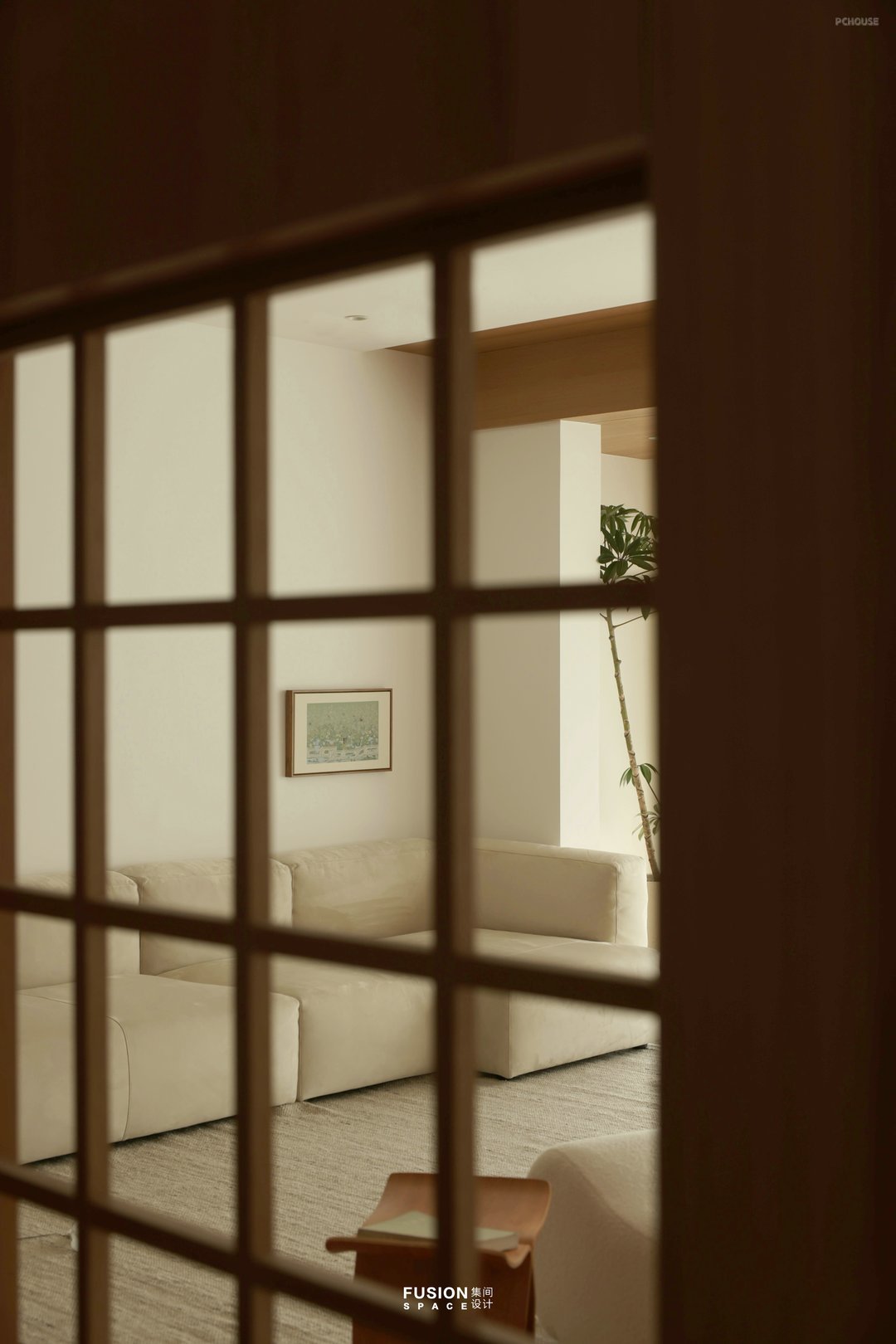
一进门的入户空玄关增加回家的仪式感,隔断是悬空样式中间镂空,在明暗对比下家里的场景对刚回家的主人充满吸引。
The empty entrance entrance adds a sense of ceremony to the homecoming experience, and the partition is a suspended style with a hollow in the middle. In contrast to the light and dark, the scene at home is full of attraction to the newly returning owner.
The empty entrance entrance adds a sense of ceremony to the homecoming experience, and the partition is a suspended style with a hollow in the middle. In contrast to the light and dark, the scene at home is full of attraction to the newly returning owner.
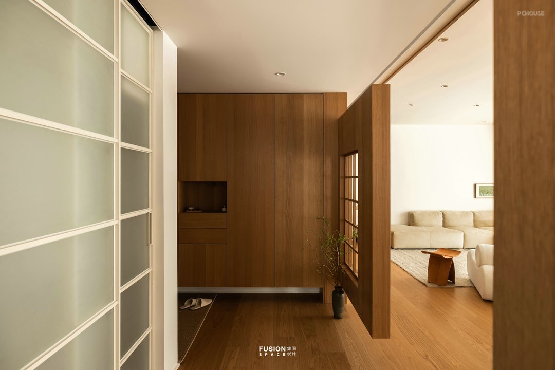
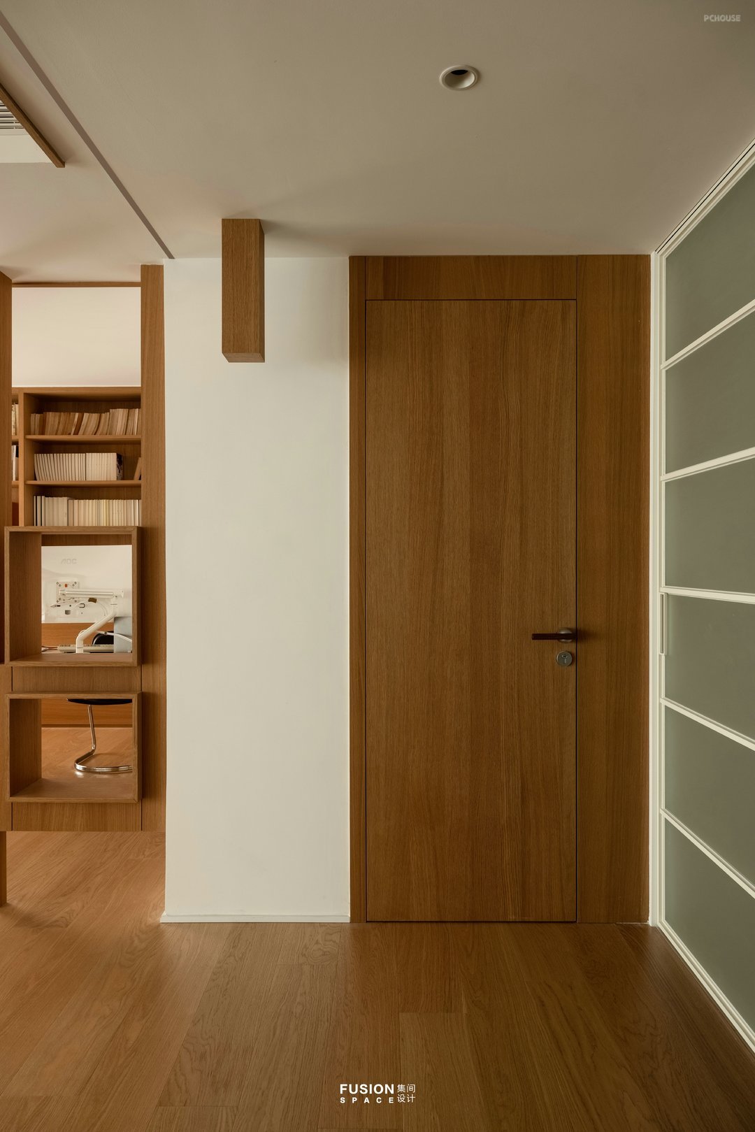
进门的左手边利用原有的墙体厚度设计鞋柜,鞋柜外观在与空间调性统一的情况下设计镂空跟抽屉满足日常生活的便利性。正对次卧隐形门设计满足了功能与颜值的要求。
The left side of the entrance uses the original wall thickness to design a shoe cabinet, and the appearance of the shoe cabinet is designed with hollowed out heels and drawers to meet the convenience of daily life, while maintaining consistency with the space. The design of the hidden door facing the second bedroom meets the requirements of functionality and appearance.
The left side of the entrance uses the original wall thickness to design a shoe cabinet, and the appearance of the shoe cabinet is designed with hollowed out heels and drawers to meet the convenience of daily life, while maintaining consistency with the space. The design of the hidden door facing the second bedroom meets the requirements of functionality and appearance.
· 客厅
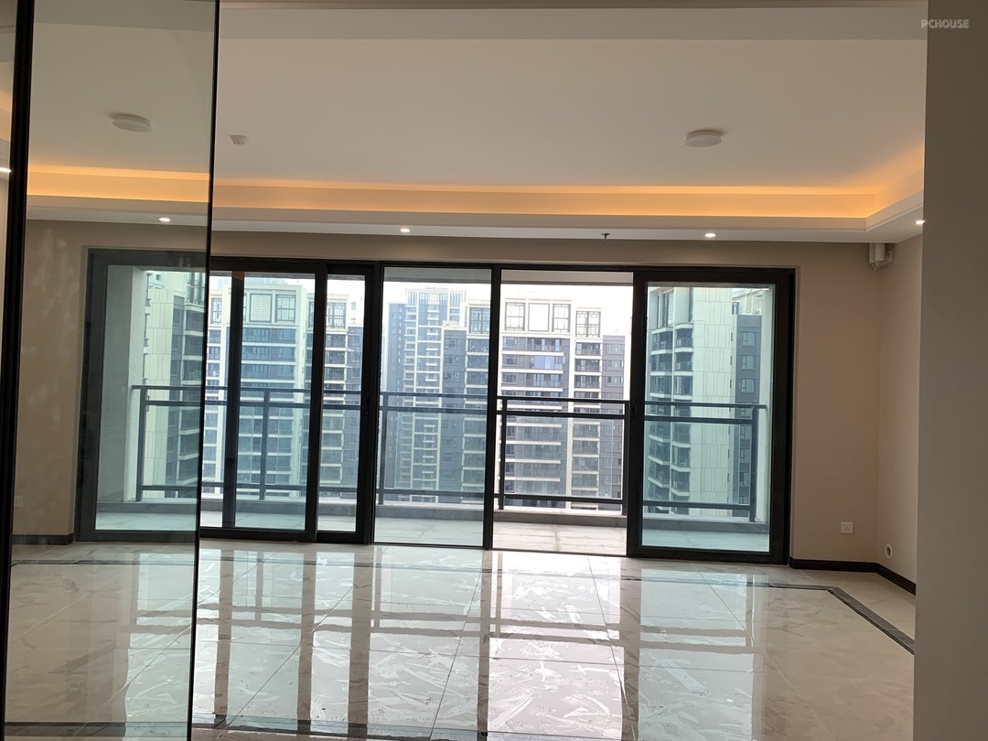
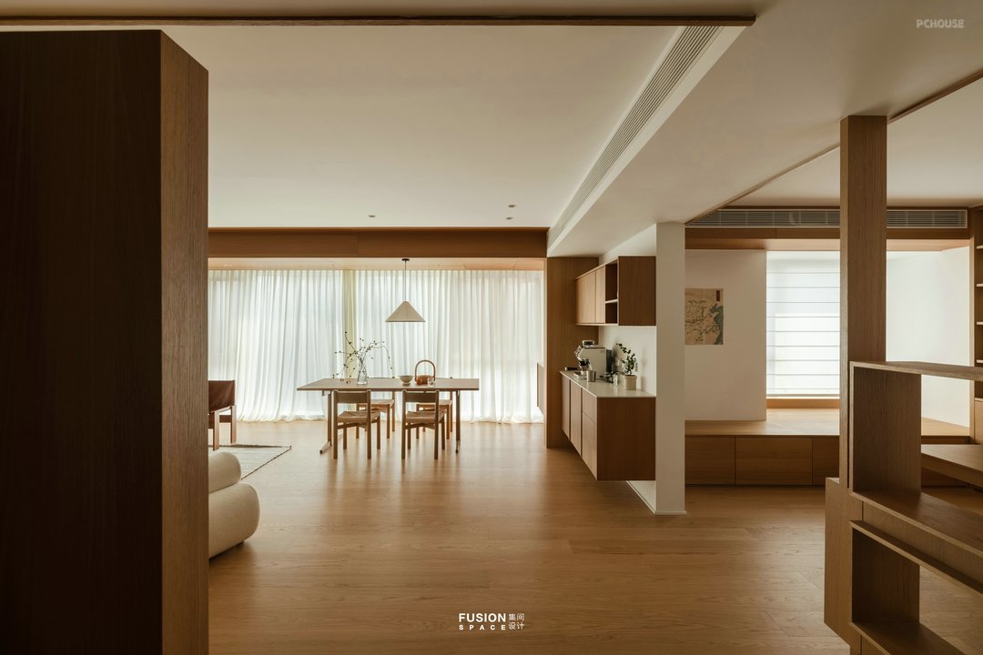
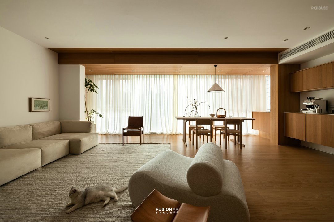
回想我们在餐厅就餐的时候是否想选个靠窗的位置,设计师把餐厅与西厨安排在采光与视线最好的位置,在风和日丽的天气里与家人分享美食的同时沐浴阳光。客厅采用无主灯设计,阳台顶面增加木饰面材质增加空间层次。原来餐厅的位置空出来可以供陈颠颠和以后的小朋友玩耍也让动线更流畅。
Looking back on whether we wanted to choose a window seat when dining in the restaurant, the designer arranged the restaurant and Western kitchen in the best lighting and visibility position, sharing delicious food with family and bathing in the sunshine on a sunny day. The living room adopts a design without main lights, and the top surface of the balcony is made of wood veneer material to increase the spatial hierarchy. The original location of the restaurant was vacated for Chen Dianding and future children to play, making the movement smoother.
Looking back on whether we wanted to choose a window seat when dining in the restaurant, the designer arranged the restaurant and Western kitchen in the best lighting and visibility position, sharing delicious food with family and bathing in the sunshine on a sunny day. The living room adopts a design without main lights, and the top surface of the balcony is made of wood veneer material to increase the spatial hierarchy. The original location of the restaurant was vacated for Chen Dianding and future children to play, making the movement smoother.


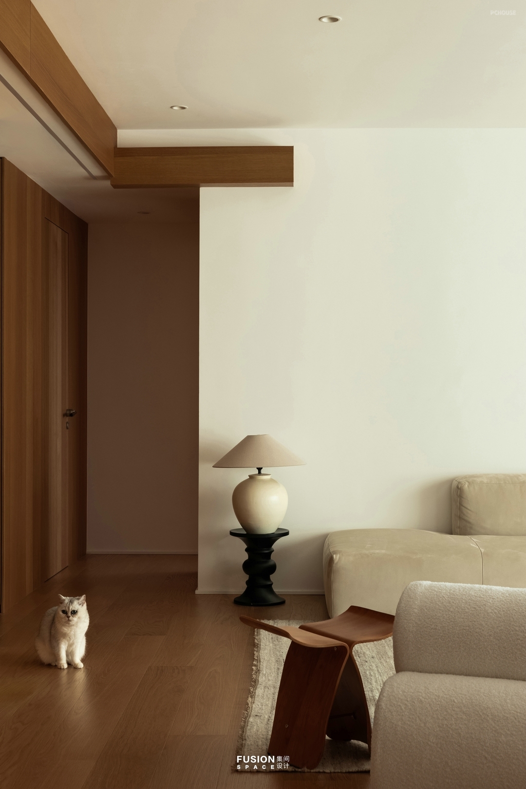
秉承少即多的原则,客厅区域我们满足功能的情况下没有用材质装饰,白墙加一副绿色色调的画做点缀,沙发我们选用了科技布,亲肤且防陈颠颠“搞破坏”。女主人经常说陈颠颠是个喜欢镜头的猫咪,每次都能精确捕捉到镜头。客厅家具我们采用低饱和度配色,用边几替代传统茶几。阳台的绿植和白木空间相处的非常融洽。
Adhering to the principle of "less is more", the living room area is not decorated with materials while meeting its functional requirements. The white wall is adorned with a green tone painting, and the sofa is made of technological fabric, which is skin friendly and prevents damage caused by aging and bumping. The hostess often says that Chen Dianding is a cat who loves the camera and can accurately capture the camera every time. We use low saturation color schemes for the living room furniture and replace traditional coffee tables with edge tables. The green plants on the balcony and the white wood space coexist very harmoniously.
Adhering to the principle of "less is more", the living room area is not decorated with materials while meeting its functional requirements. The white wall is adorned with a green tone painting, and the sofa is made of technological fabric, which is skin friendly and prevents damage caused by aging and bumping. The hostess often says that Chen Dianding is a cat who loves the camera and can accurately capture the camera every time. We use low saturation color schemes for the living room furniture and replace traditional coffee tables with edge tables. The green plants on the balcony and the white wood space coexist very harmoniously.


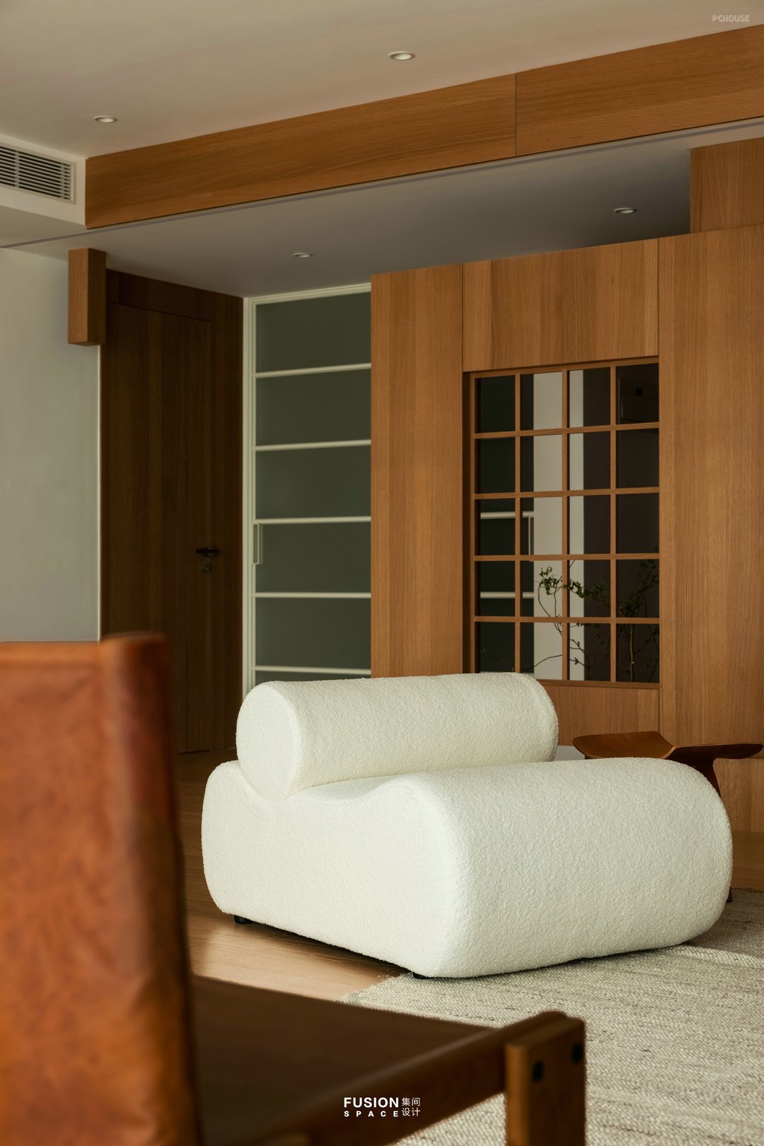
客厅电视墙设计师设计了嵌入式,藏匿好背后的各种电源线。悬空玄关作为电视墙的延伸,让原本直白的门厅变得含蓄,客厅变得整体。拆掉原本厨房冰箱的墙把单开门变成了双推门,客餐厅进出厨房更流畅。
The designer of the living room TV wall has designed an embedded system that hides various power cords behind it. The suspended entrance serves as an extension of the TV wall, making the originally straightforward foyer more reserved and the living room more integrated. Dismantle the wall of the original kitchen refrigerator and turn the single door into a double sliding door, making the entrance and exit of the dining room smoother.
The designer of the living room TV wall has designed an embedded system that hides various power cords behind it. The suspended entrance serves as an extension of the TV wall, making the originally straightforward foyer more reserved and the living room more integrated. Dismantle the wall of the original kitchen refrigerator and turn the single door into a double sliding door, making the entrance and exit of the dining room smoother.
· 餐厅
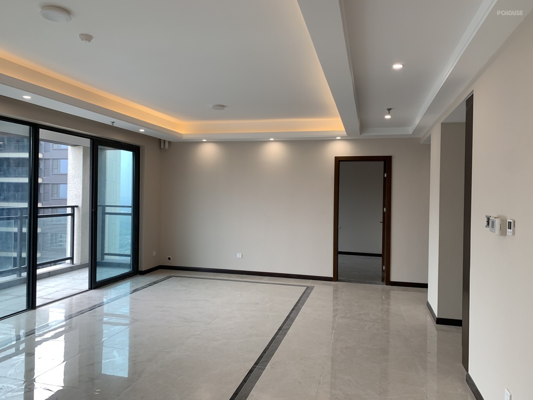

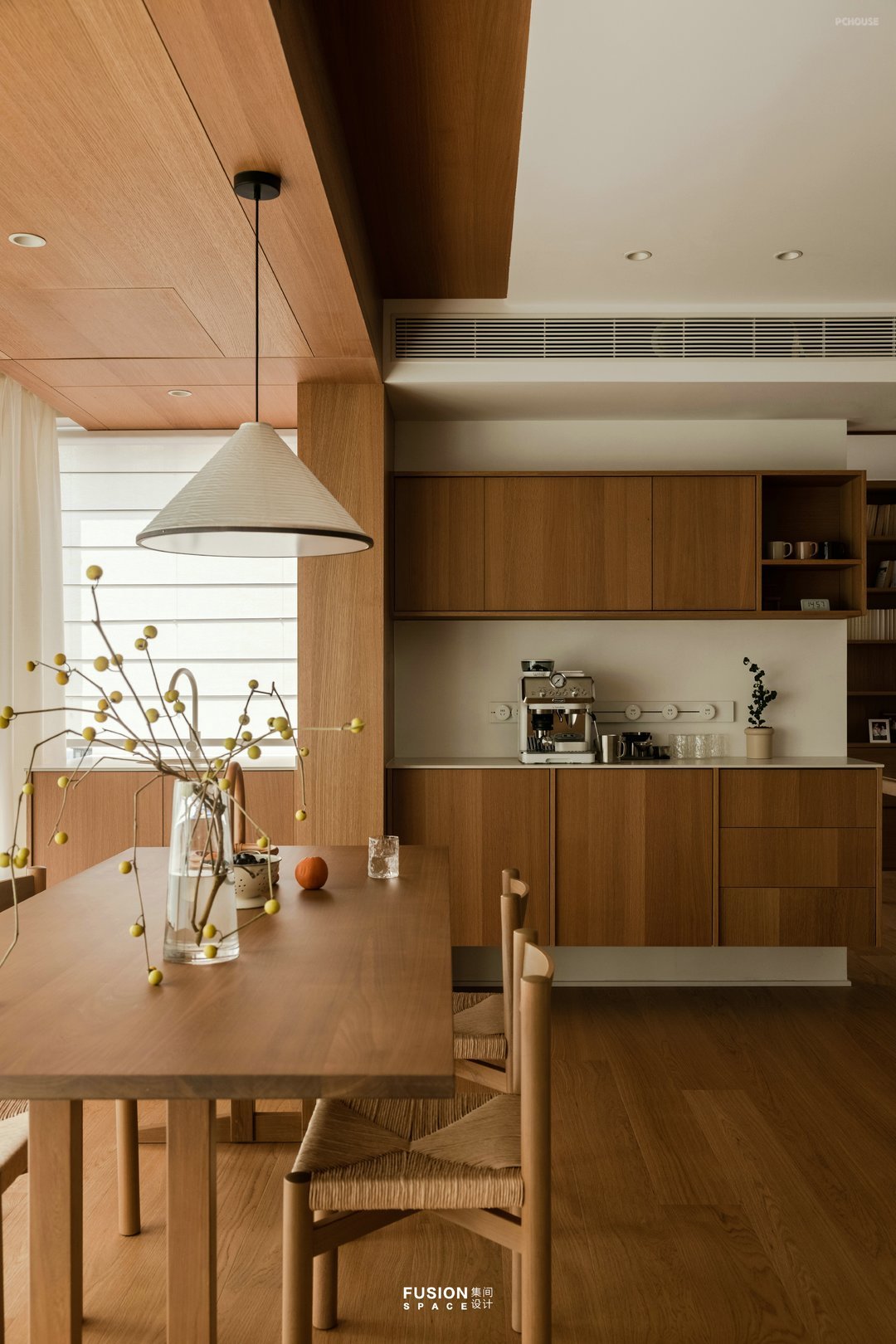

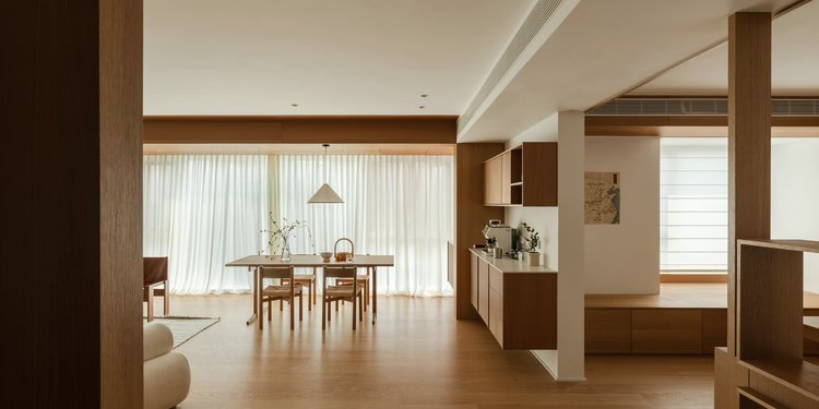
书房与餐厅之间的墙拆掉后书房纳入公共区域,视野无限放大,动线更流畅,同时为以后小朋友的活动空间及亲子区域更多元。设计师利用不可拆除的墙体深度增加西厨收纳柜及水槽,为屋主实现LDK一体化设计,满足日常咖啡、简餐、料理等生活需求。
After the wall between the study and the restaurant is demolished, the study is incorporated into a public area, with an infinitely enlarged view and smoother movement. At the same time, it provides more space for children's activities and parent-child areas in the future. The designer utilizes the depth of the non removable wall to increase the Western kitchen storage cabinet and sink, achieving LDK integrated design for homeowners, meeting daily needs such as coffee, light meals, and cooking.
After the wall between the study and the restaurant is demolished, the study is incorporated into a public area, with an infinitely enlarged view and smoother movement. At the same time, it provides more space for children's activities and parent-child areas in the future. The designer utilizes the depth of the non removable wall to increase the Western kitchen storage cabinet and sink, achieving LDK integrated design for homeowners, meeting daily needs such as coffee, light meals, and cooking.
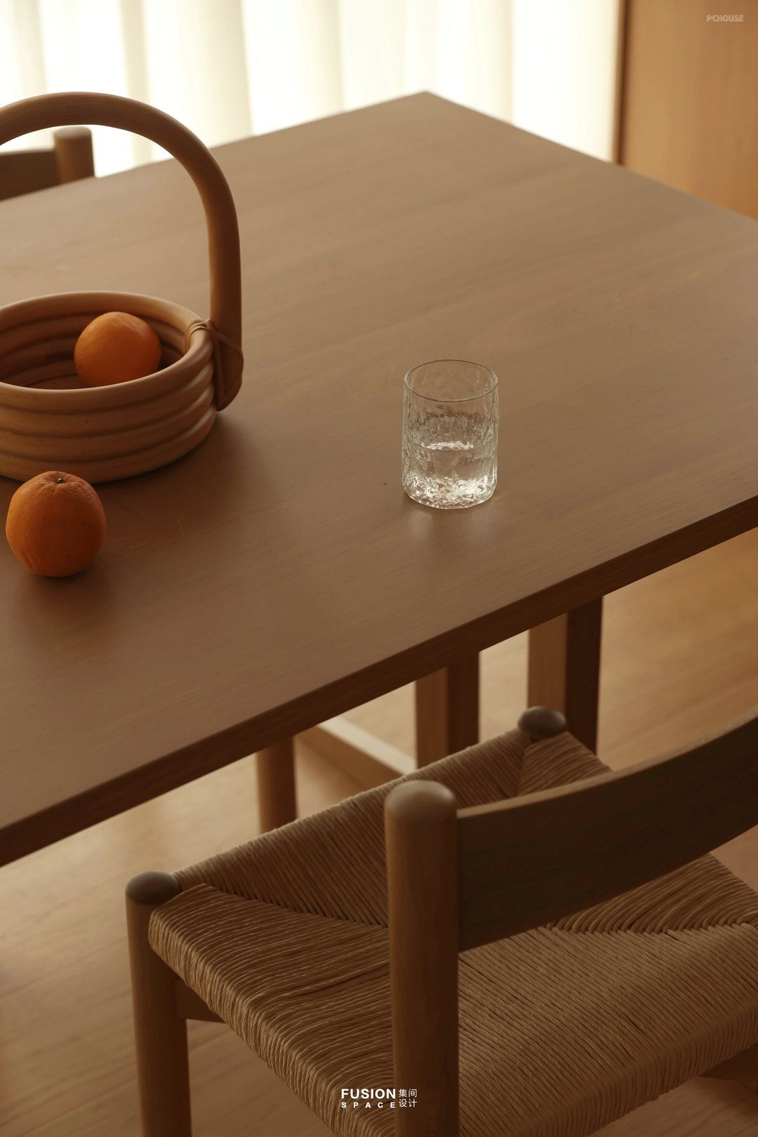
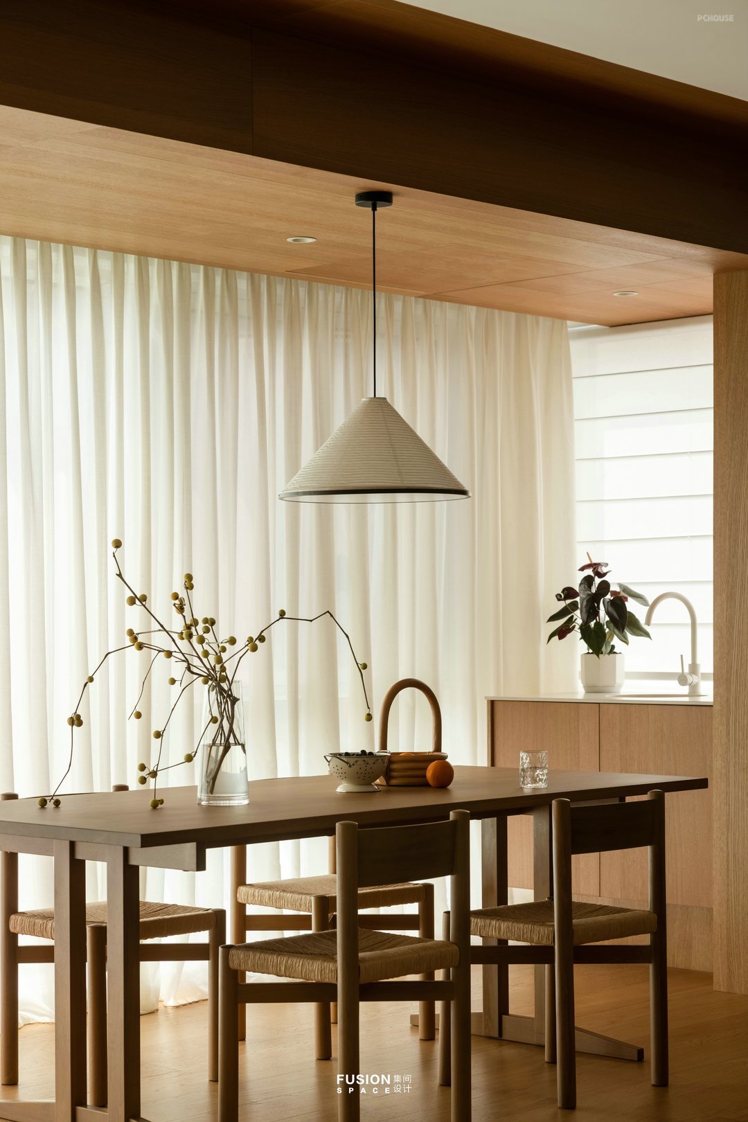
2.1米大餐桌平时也充当女主人工作台,插花、煮茶、手工……闲暇时间餐厅也是放松的好去处 , 咖啡、远眺、发呆。
The 2.1 meter dining table also serves as the hostess's workbench for flower arrangement, tea making, handicrafts... In leisure time, the restaurant is also a good place to relax, enjoy coffee, overlook, and be in a daze.
The 2.1 meter dining table also serves as the hostess's workbench for flower arrangement, tea making, handicrafts... In leisure time, the restaurant is also a good place to relax, enjoy coffee, overlook, and be in a daze.
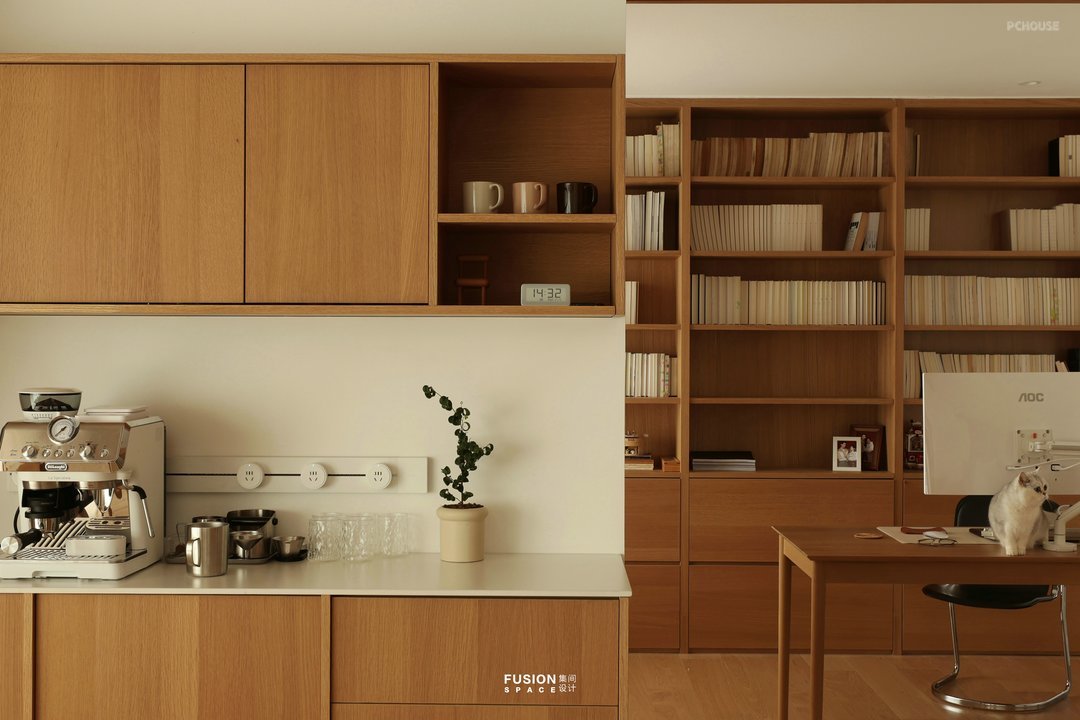
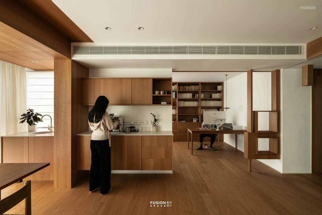
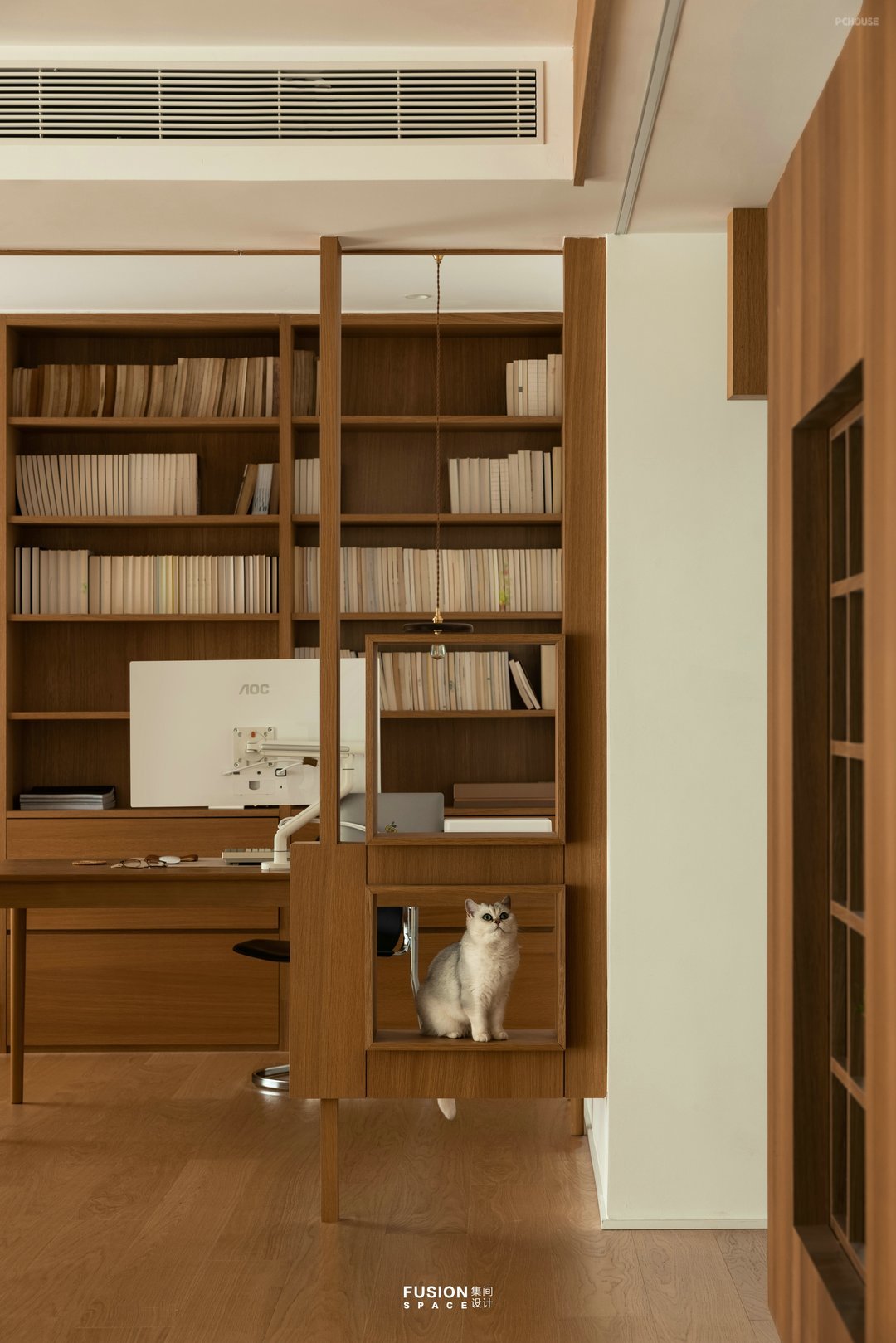
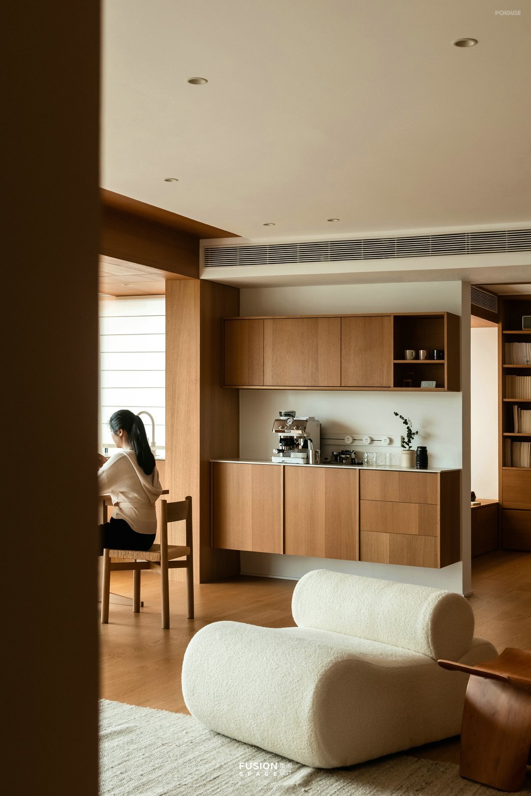
一家人在同一空间男主人办公、看书,女主人咖啡、简餐既独立又能互动。陈颠颠作为家庭的一员也有了自己的娱乐场所。
The family works and reads in the same space as the male host, while the female host has coffee and light meals that are both independent and interactive. Chen Dianding, as a member of her family, also has her own entertainment place.
The family works and reads in the same space as the male host, while the female host has coffee and light meals that are both independent and interactive. Chen Dianding, as a member of her family, also has her own entertainment place.
· 书房
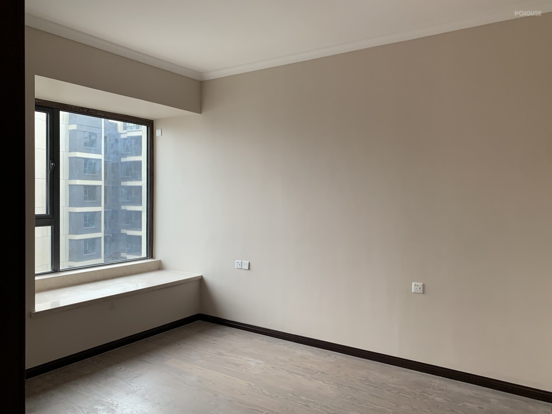
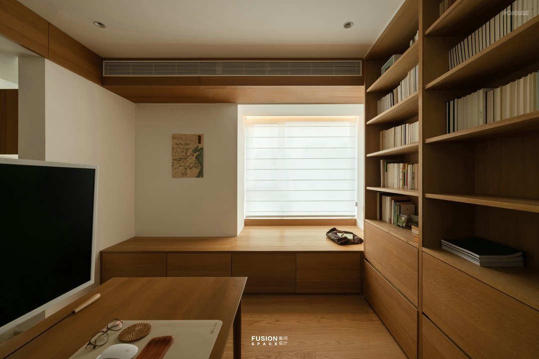
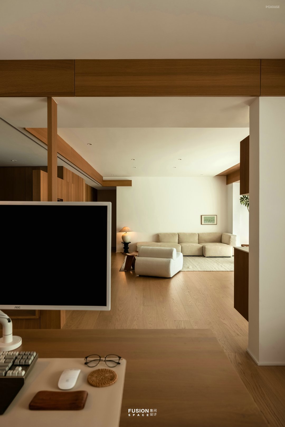

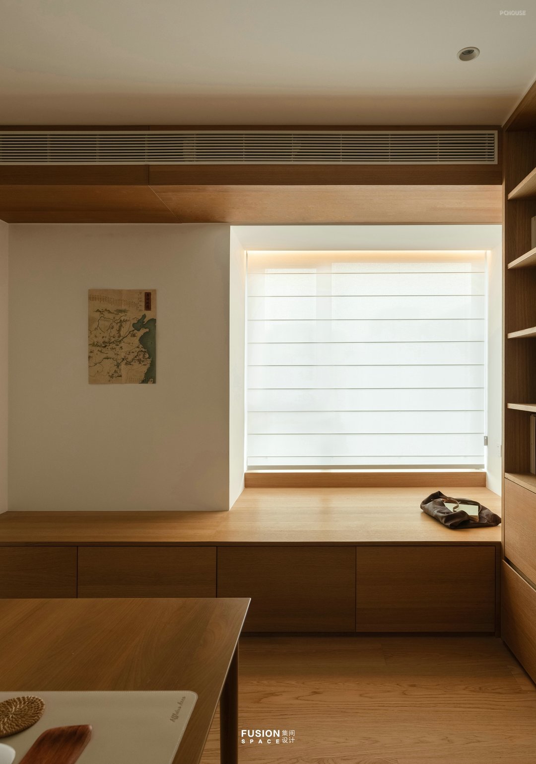
书房设置到顶书柜,柜体三分藏七分露满足收纳需求,柜体采用统一木色结合书的颜色妥妥的家庭图书馆。飘窗延伸设计地台,形成视觉拉伸满足办公、看书、撸猫、休息需要。书房与客厅之间产生互动,视觉的拉伸给工作营造轻松氛围。设计师在书桌上给男主人加了吊灯,不占用桌面空间。纱质罗马帘替代传统窗帘,柔化空间,尽显温馨。
The study is equipped with a top bookcase, with a three part storage and seven parts exposure cabinet to meet storage needs. The cabinet adopts a unified wood color combined with the appropriate color of books in a family library. The extended design platform of the bay window forms a visual stretch to meet the needs of office, reading, cat riding, and rest. The interaction between the study and living room creates a relaxed atmosphere for work through visual stretching. The designer added a chandelier to the male host's desk, which does not occupy any desktop space. Yarn Roman curtains replace traditional curtains, softening the space and showcasing warmth.
The study is equipped with a top bookcase, with a three part storage and seven parts exposure cabinet to meet storage needs. The cabinet adopts a unified wood color combined with the appropriate color of books in a family library. The extended design platform of the bay window forms a visual stretch to meet the needs of office, reading, cat riding, and rest. The interaction between the study and living room creates a relaxed atmosphere for work through visual stretching. The designer added a chandelier to the male host's desk, which does not occupy any desktop space. Yarn Roman curtains replace traditional curtains, softening the space and showcasing warmth.
· 厨房
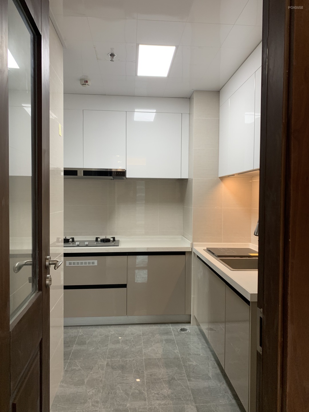

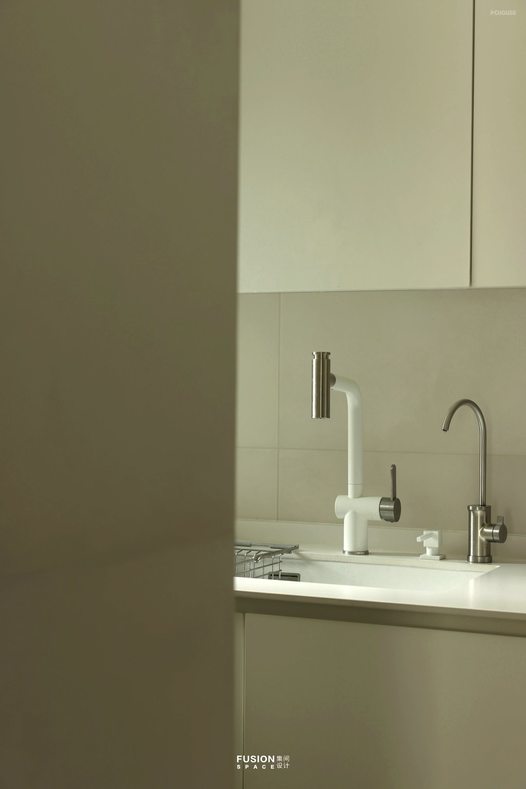
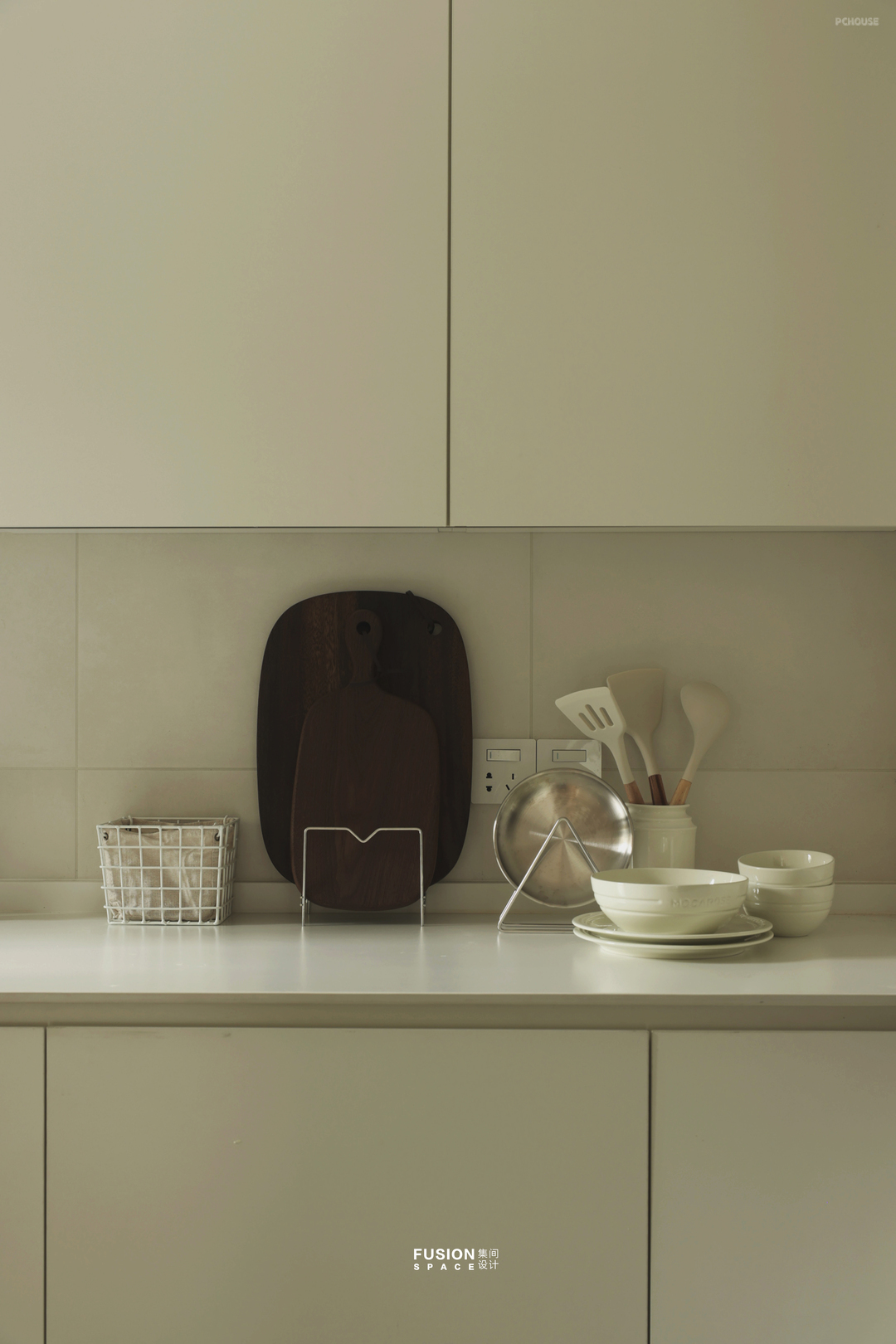
厨房女主人希望烟机吸力够大,我们选用了集成灶。橱柜和砖采用相近色,让厨房便于打理、视觉清爽。
The kitchen hostess hopes that the smoke machine has enough suction, so we have chosen an integrated stove. The cabinets and bricks are of similar colors, making the kitchen easy to manage and visually refreshing.
The kitchen hostess hopes that the smoke machine has enough suction, so we have chosen an integrated stove. The cabinets and bricks are of similar colors, making the kitchen easy to manage and visually refreshing.
· 家政间
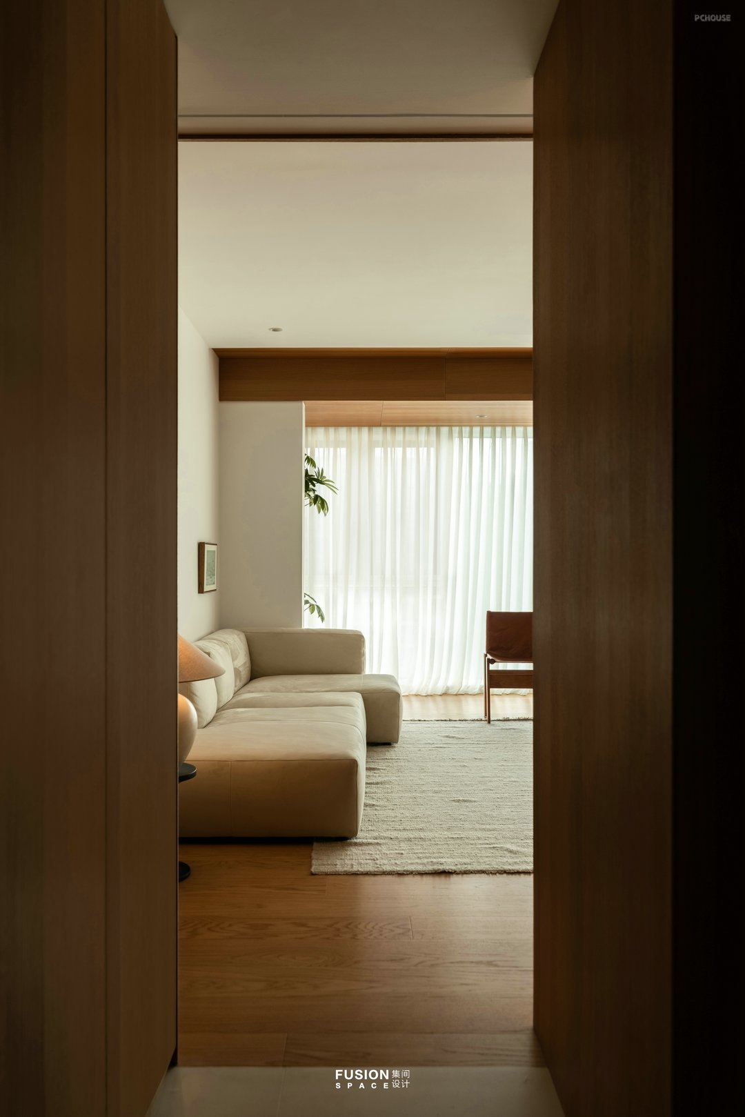
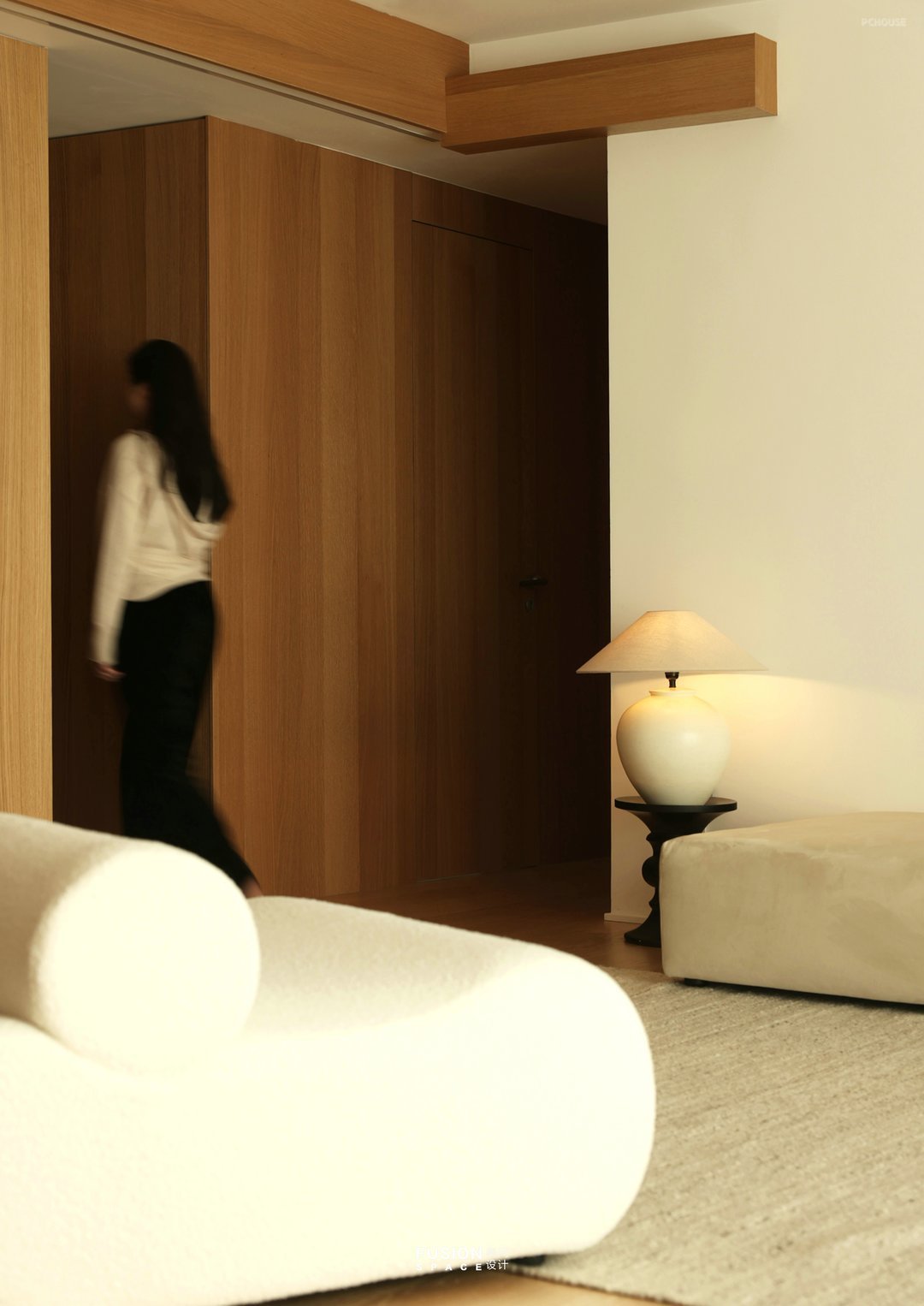
不同角度实现一步一景。
One step at a time from different angles.
One step at a time from different angles.
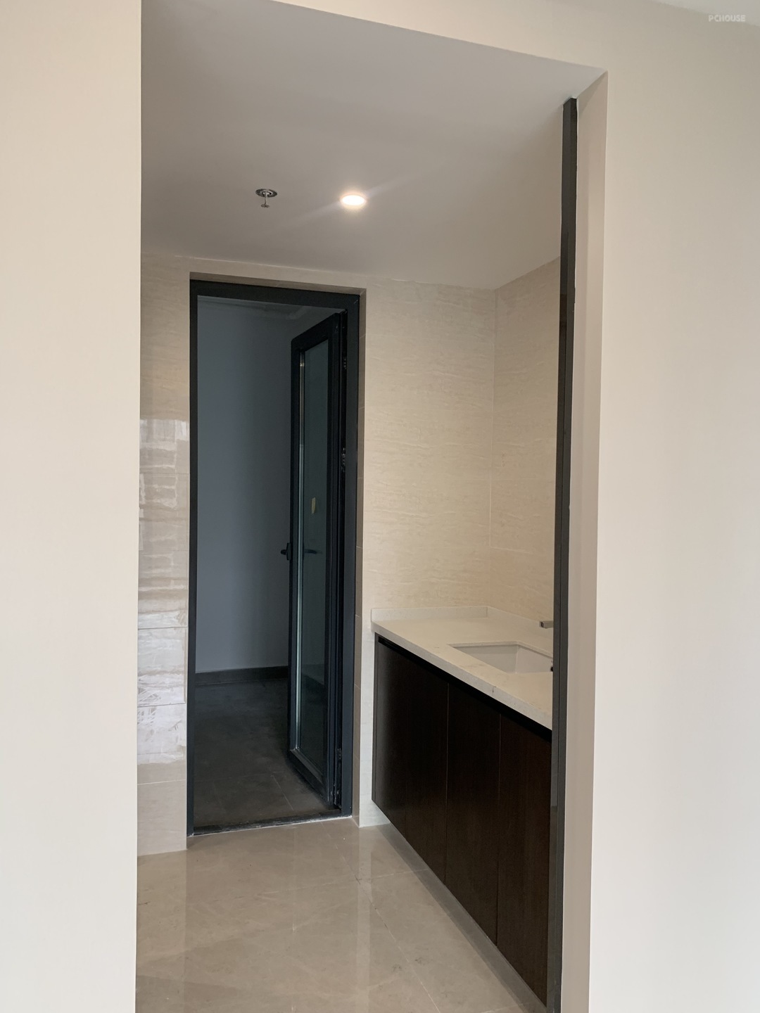
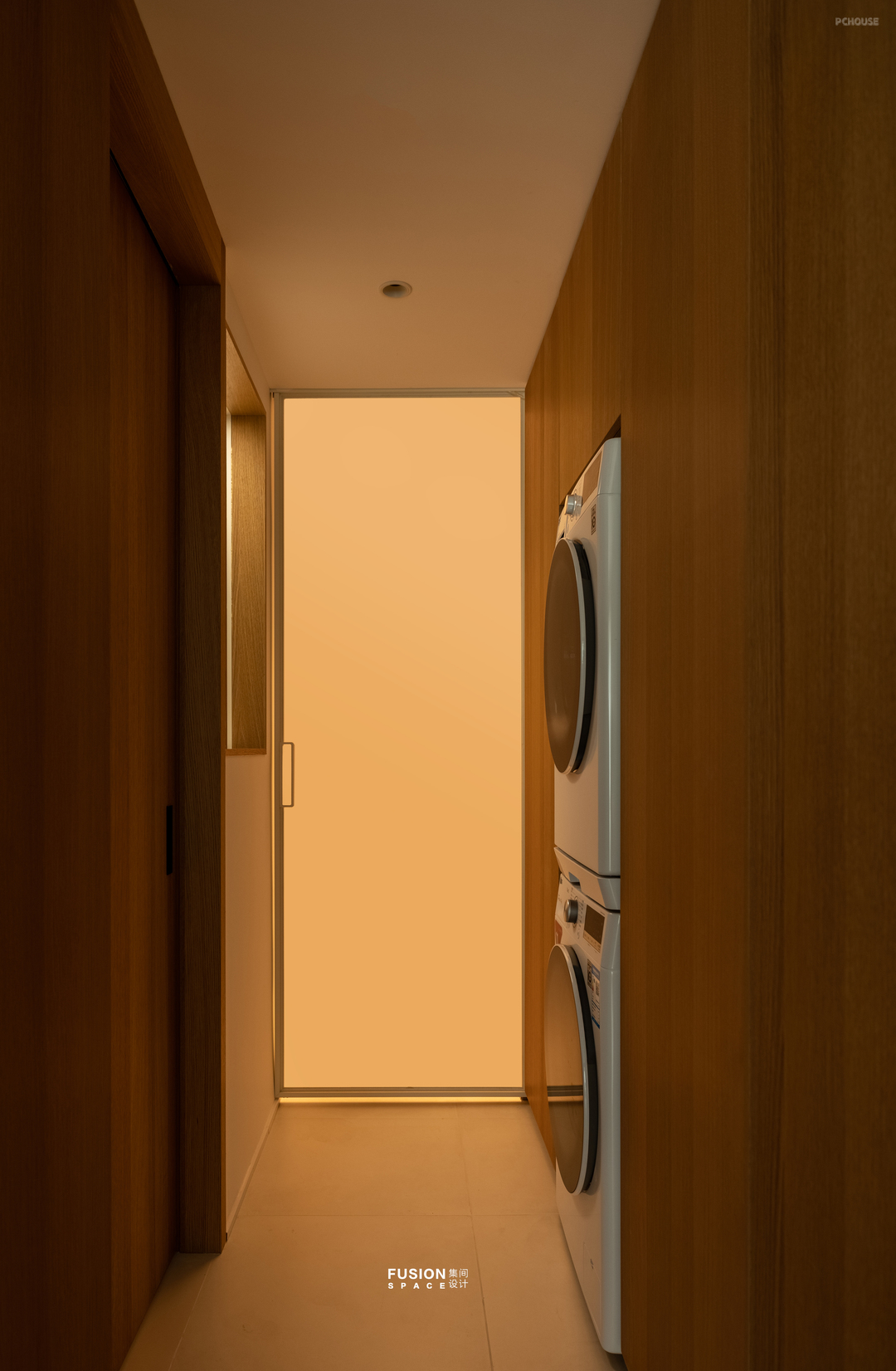
原本的盥洗间移到卫生间里面后,设计收纳柜满足家政功能,增设储物间同时也是陈颠颠的空间。
After the original bathroom was moved to the bathroom, a storage cabinet was designed to meet household functions, and a storage room was added to also serve as a space for Chen Dianding.
After the original bathroom was moved to the bathroom, a storage cabinet was designed to meet household functions, and a storage room was added to also serve as a space for Chen Dianding.
· 卫生间
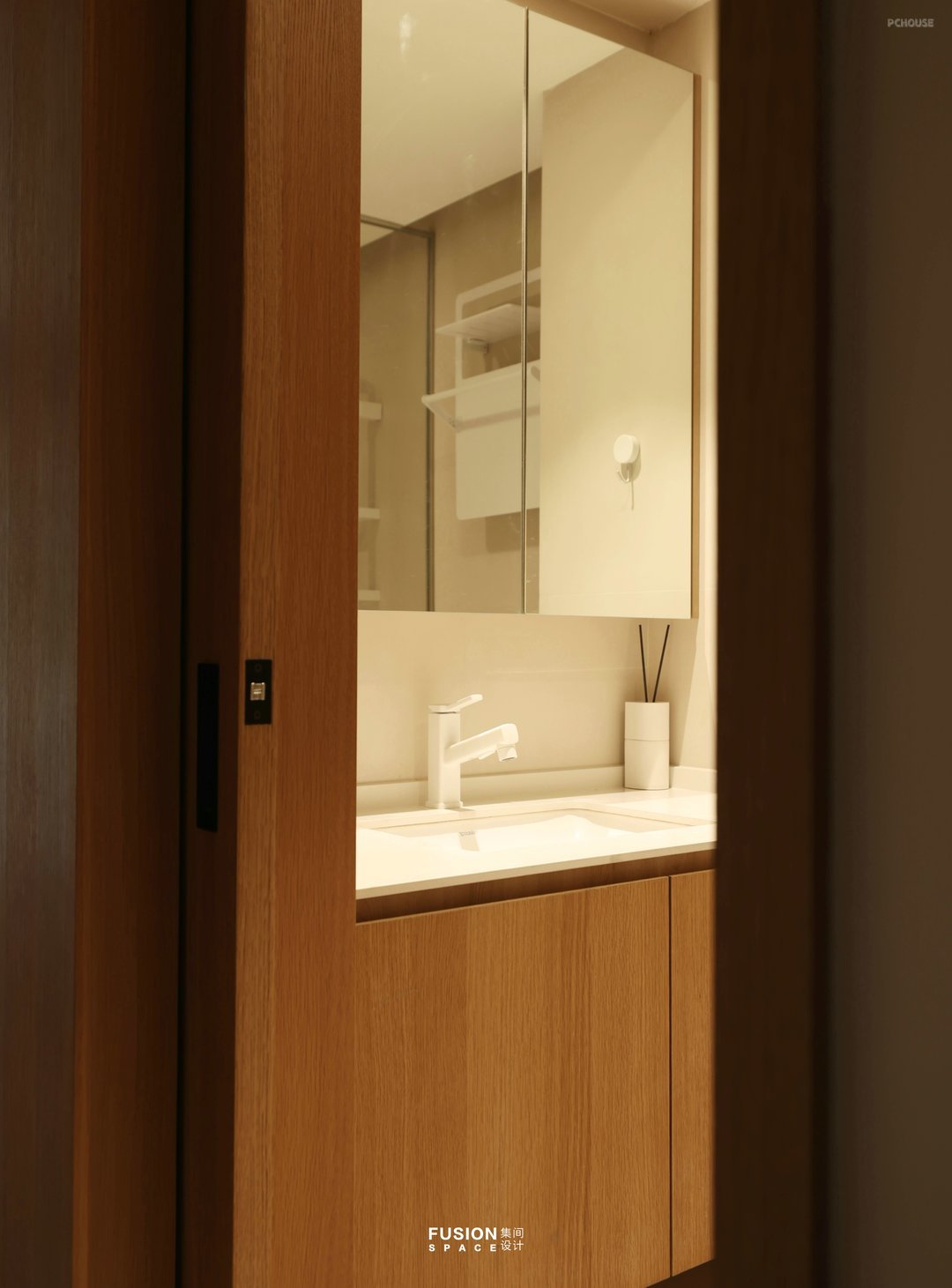
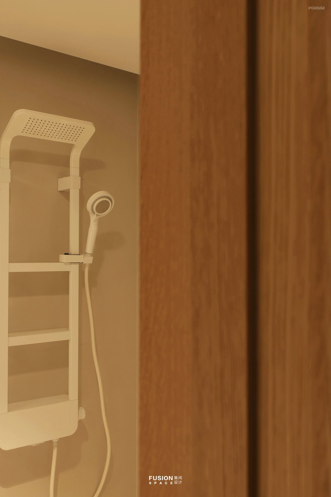
卫生间设计师把浴室柜设计在侧面增加使用台面,设计口袋门替代传统门便于打理,视觉上沿用公区配色整体统一。
The bathroom designer added a countertop to the side of the bathroom cabinet design, and designed a pocket door to replace traditional doors for easy maintenance. Visually, the overall color scheme of the public area is consistent.
The bathroom designer added a countertop to the side of the bathroom cabinet design, and designed a pocket door to replace traditional doors for easy maintenance. Visually, the overall color scheme of the public area is consistent.
· 卧室
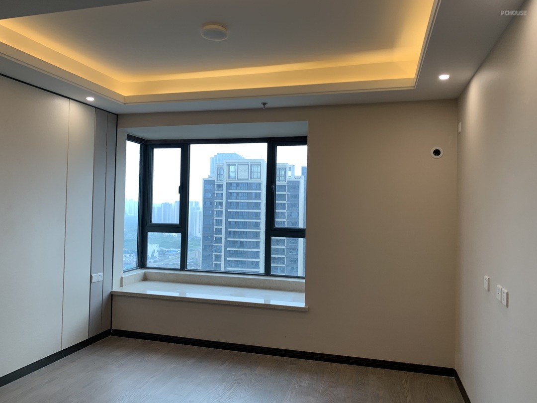
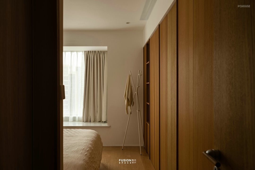
卧室沿用统一色调,衣柜设计在床对面空出两边通道让空间显得不那么局促,休憩更加放松。
The bedroom continues to use a unified color scheme, and the wardrobe design creates two channels across from the bed, making the space less cramped and relaxing for rest.
The bedroom continues to use a unified color scheme, and the wardrobe design creates two channels across from the bed, making the space less cramped and relaxing for rest.
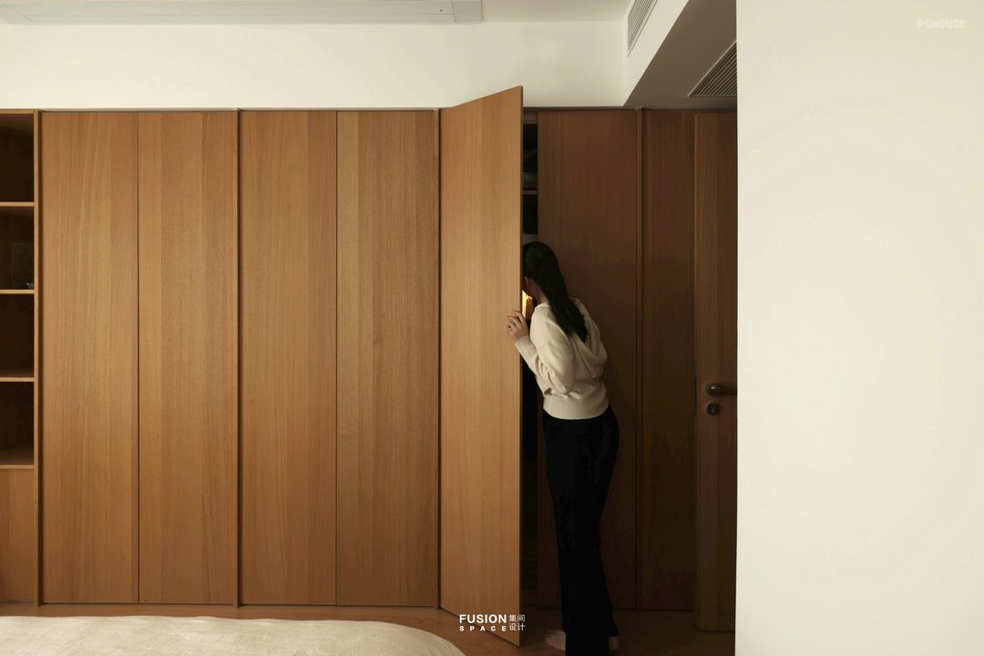
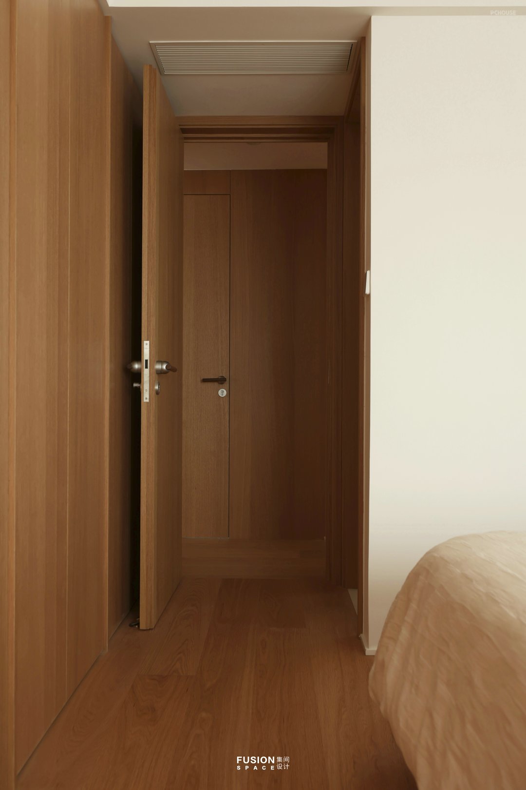
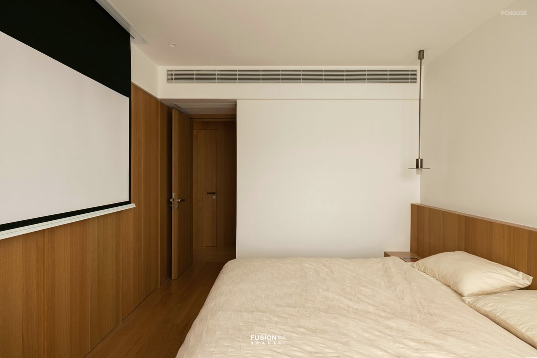
主卧的木饰面衣柜给人感受质感亲近,柜门自身设计拉手简洁实用。顶面设计幕布替代电视,保证衣柜的完整性也满足观影需求。
The wooden facing wardrobe in the master bedroom gives people a sense of closeness, and the cabinet door itself is designed with simple and practical handles. The top design of the screen replaces the TV, ensuring the integrity of the wardrobe and meeting the viewing needs.
The wooden facing wardrobe in the master bedroom gives people a sense of closeness, and the cabinet door itself is designed with simple and practical handles. The top design of the screen replaces the TV, ensuring the integrity of the wardrobe and meeting the viewing needs.
更多推荐
发表您的看法…
目录
户型图
玄关
客厅
餐厅
书房
厨房
家政间
卫生间
卧室


评论 0