锦尚木作展厅
空间类型购物
面积240m²
花费50万以上
位置温州市
风格 现代、轻奢、原木
前言
探索事物于不同角度的发散认知,以相对述平化的方式
Explore the divergent cognition of things from different angles, in a relatively flat way
来阐述其内在诸多的复杂可能性,挖掘更多不同的生活方式探讨和对人性的再思考,让空间更具可考究及情感共鸣的建立...
Explore the divergent cognition of things from different angles, in a relatively flat way
来阐述其内在诸多的复杂可能性,挖掘更多不同的生活方式探讨和对人性的再思考,让空间更具可考究及情感共鸣的建立...
· 户型图
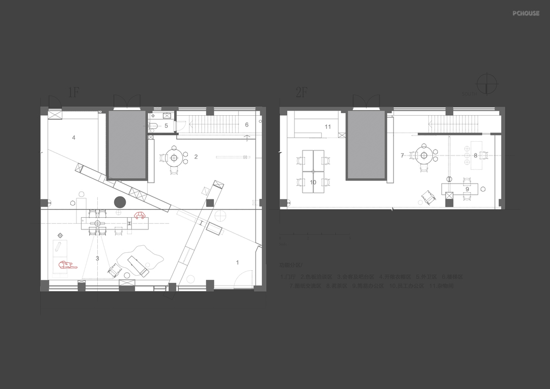
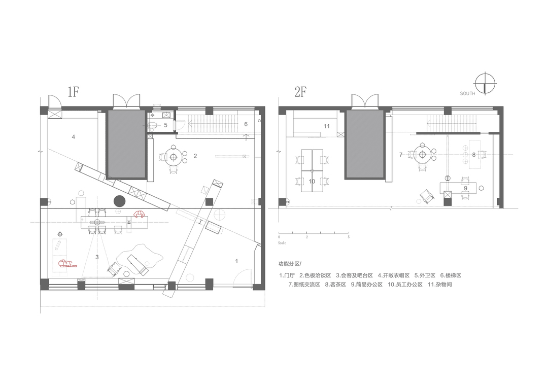
· 玄关
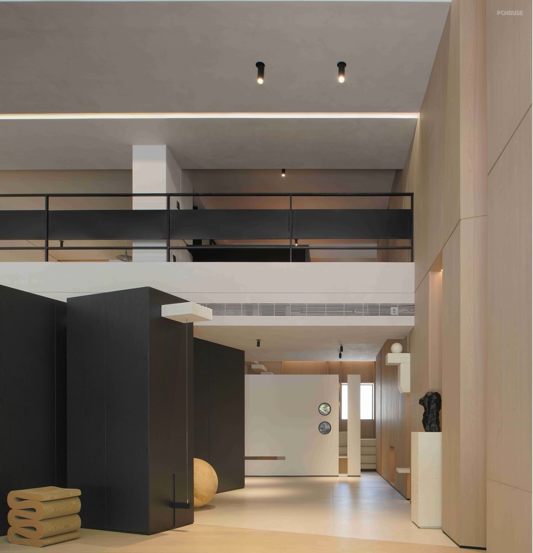

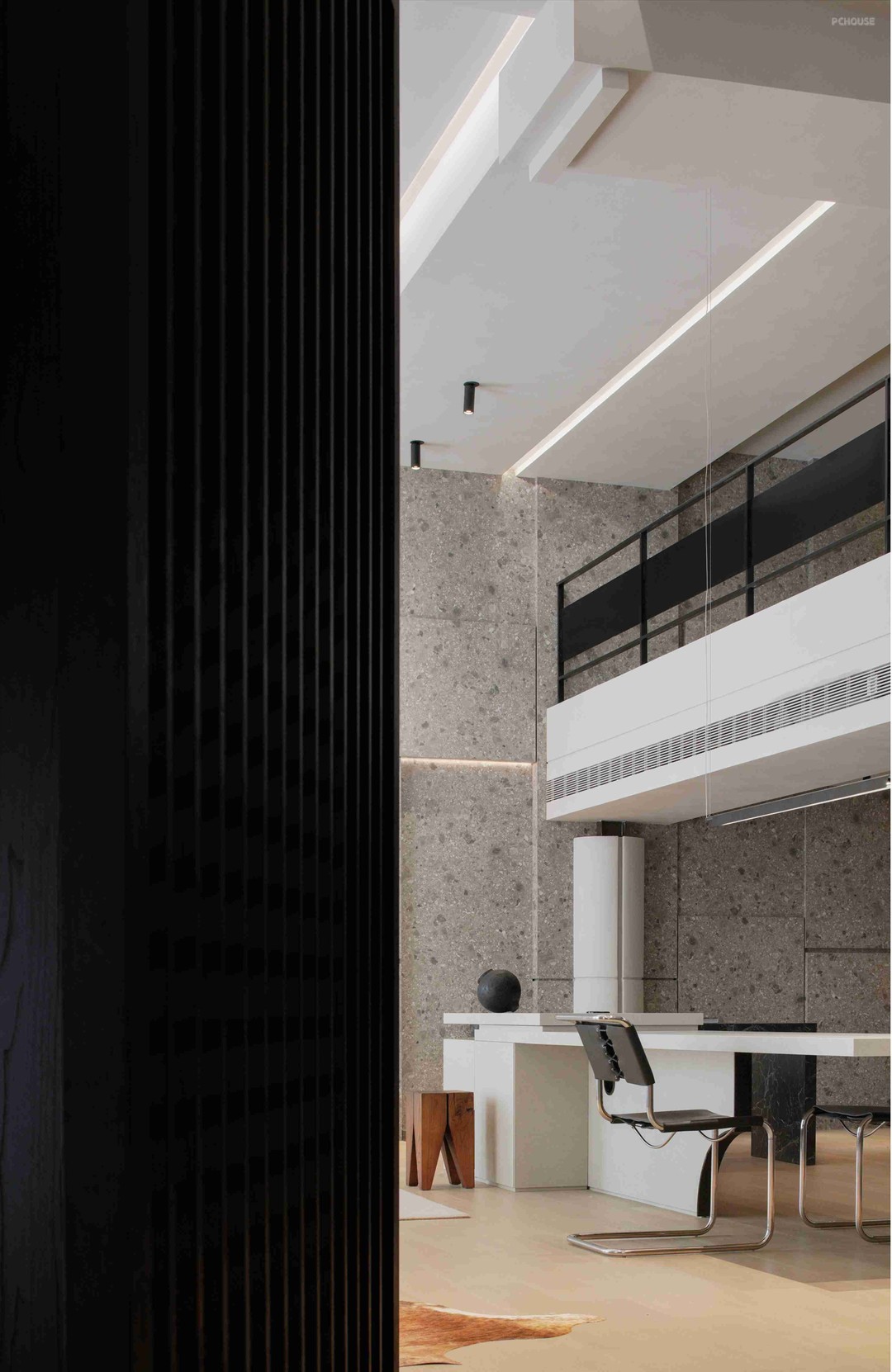
探索事物于不同角度的发散认知,以相对述平化的方式
Explore the divergent cognition of things from different angles, in a relatively flat way
来阐述其内在诸多的复杂可能性,挖掘更多不同的生活方式探讨和对人性的再思考,让空间更具可考究及情感共鸣的建立...
To elaborate its many complex possibilities, explore more different ways of life and rethink human nature, so that the space can be more tractable and the establishment of emotional resonance...
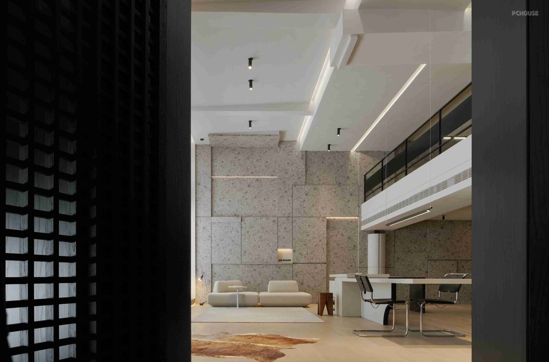
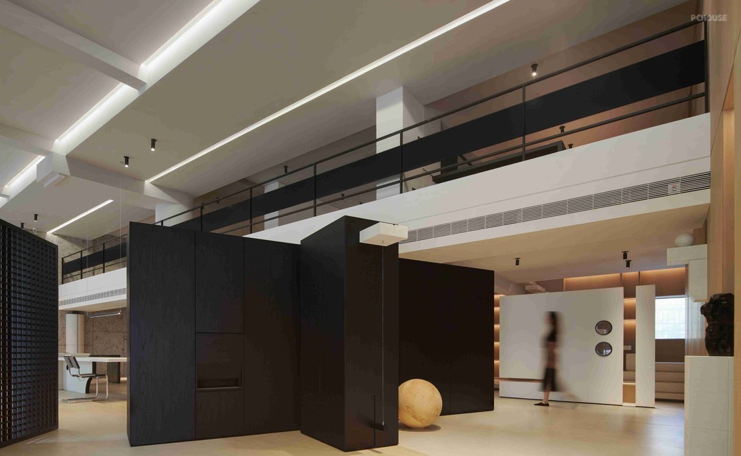
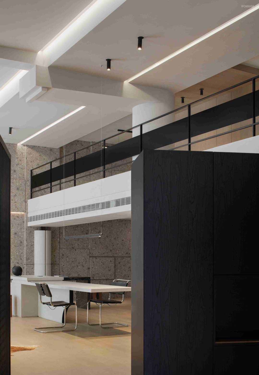
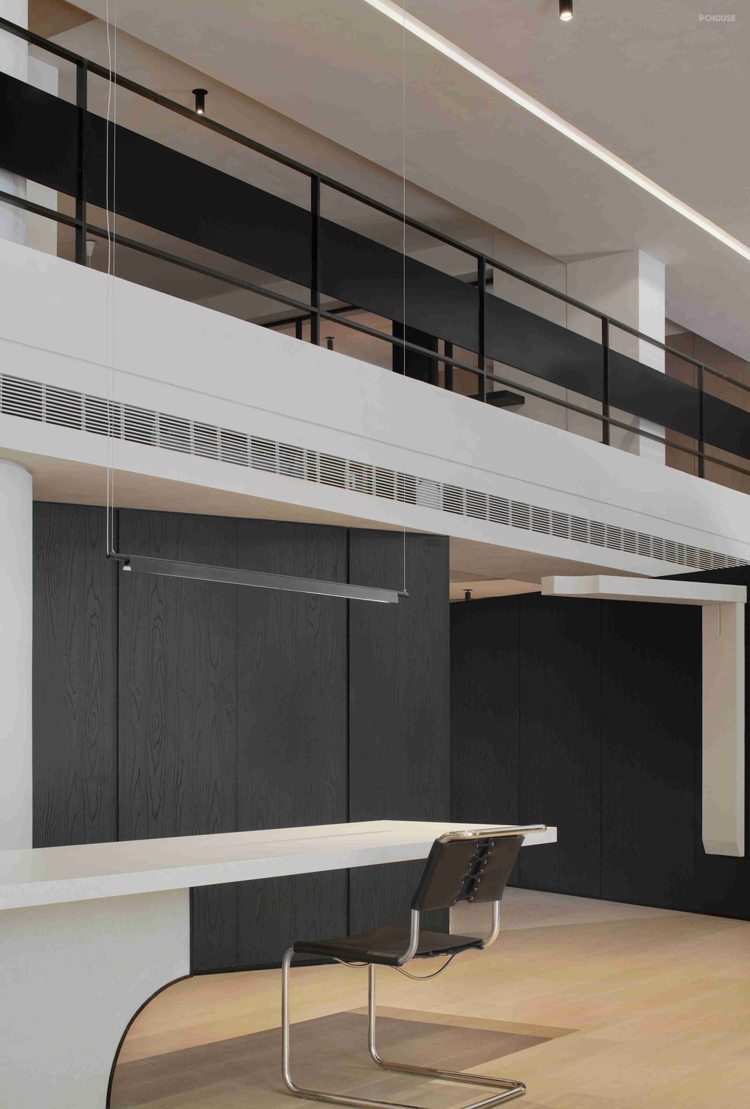
于‘秩序性’
On the order_
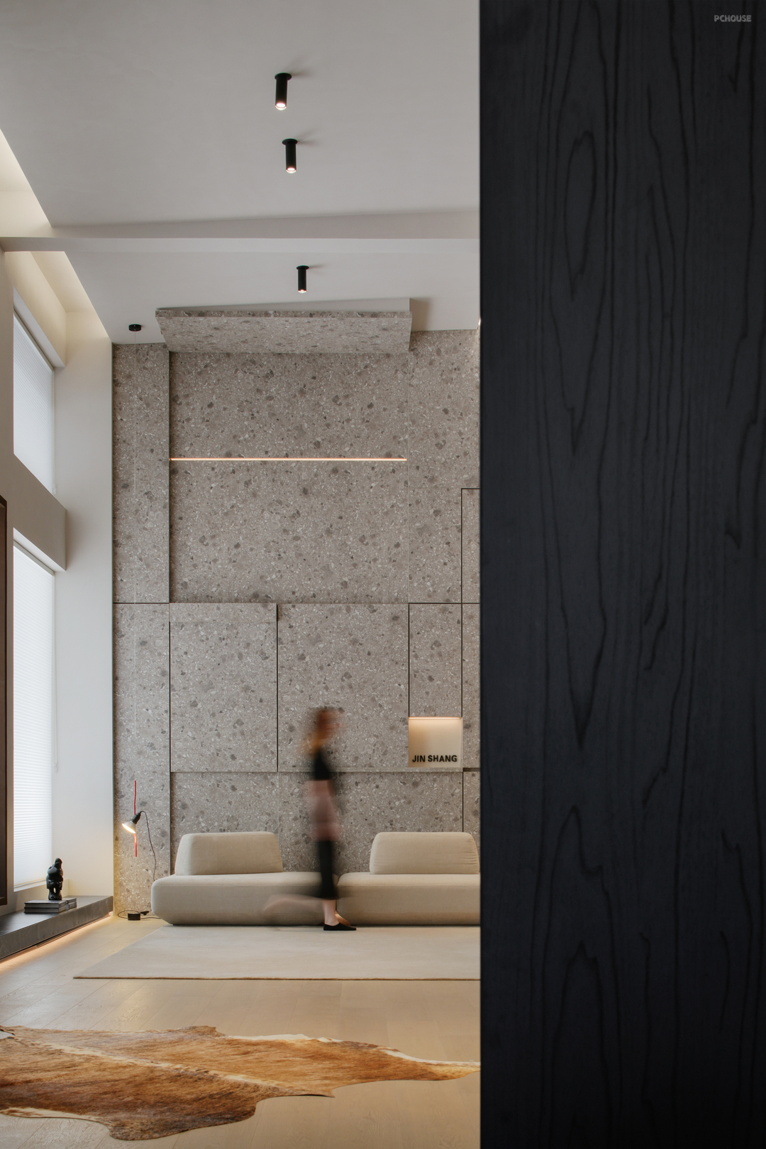
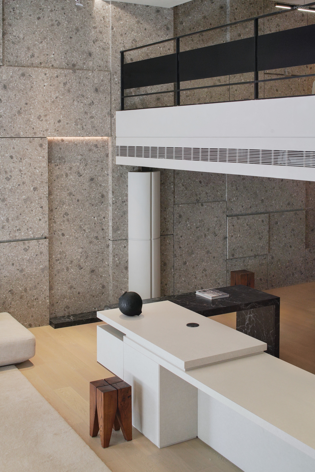
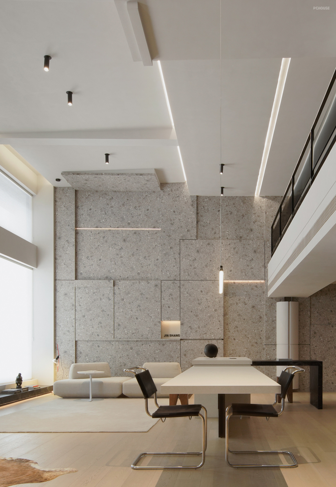
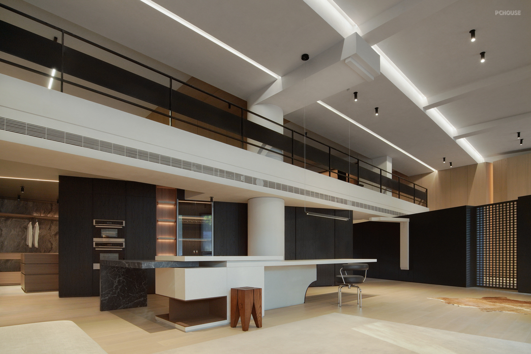
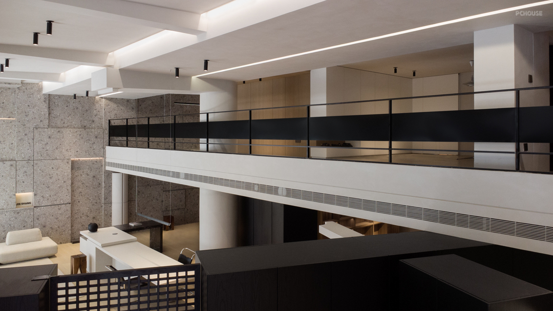
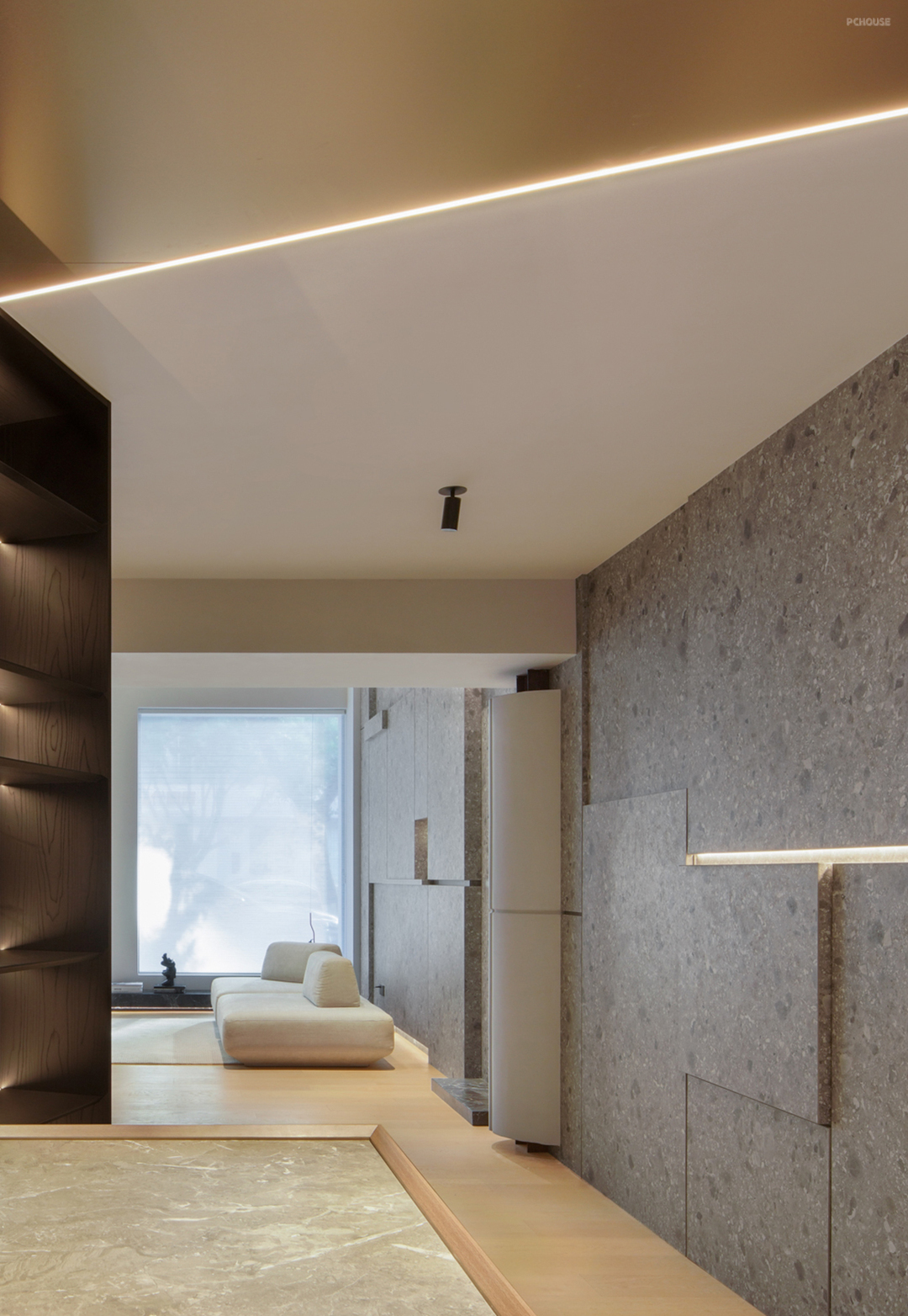
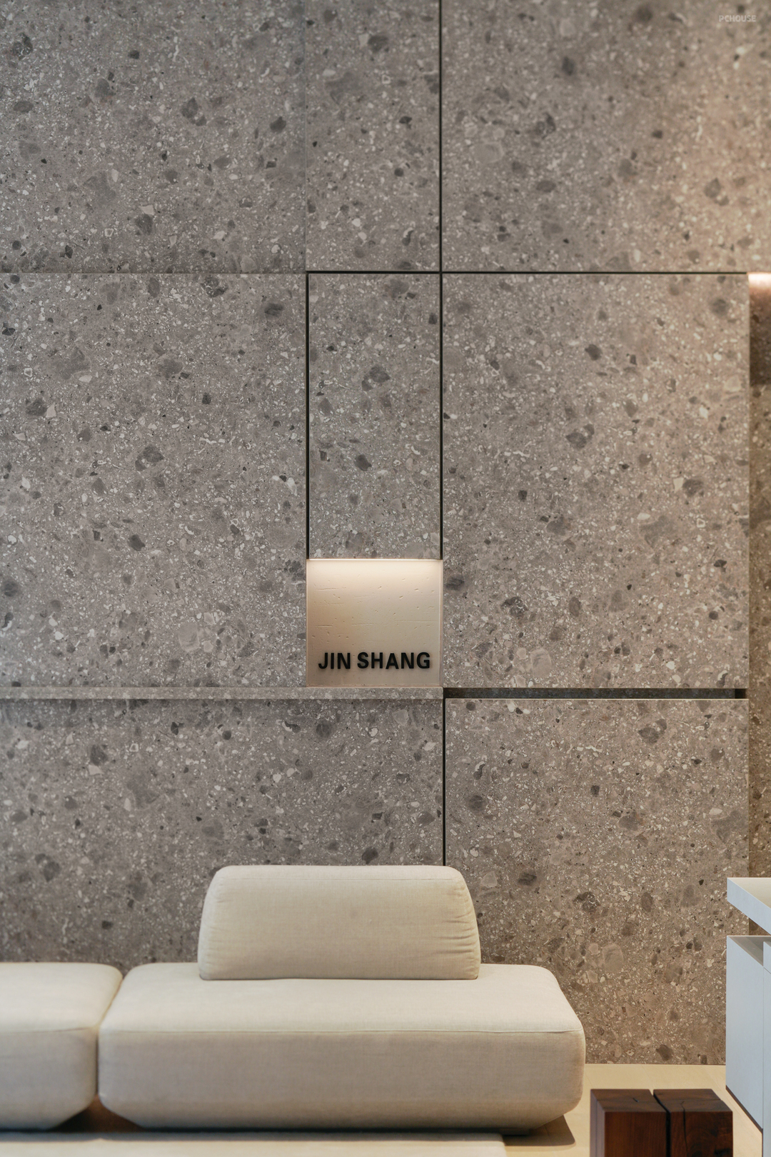
借助内结构脉络的逻辑梳理,来强化对其‘设计语言’的拆分叙述,以此来建造更多的延伸组合可能性,且反馈到‘木作’本身的体系与其相关的材质过渡及衔接,由此来解说该品牌定位的体系建立,与金属、与岩板、石材及漆面工艺...
Use comb structure within the context of the logic, to strengthen the 'design language of the resolution, in order to build more extended combination possibilities, and feedback to the' wooden 'itself system with related material transition and cohesion, which illustrate the brand positioning system, and metal, and the rock, stone material and paint process...
于‘建构性’
On 'Constructivism'_
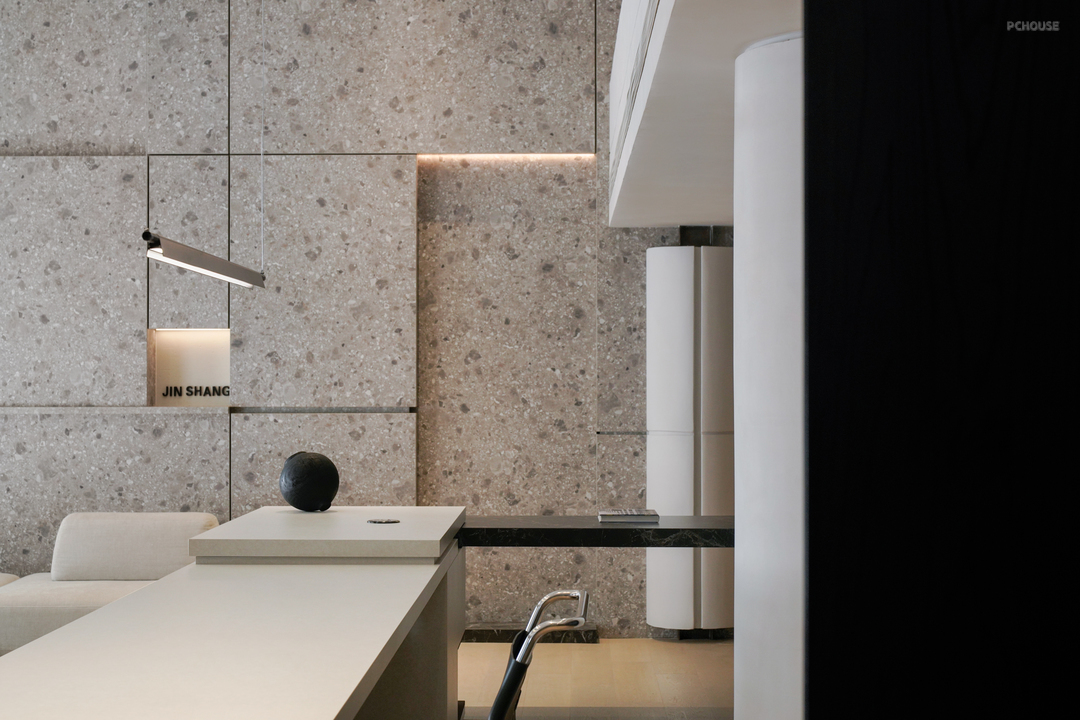
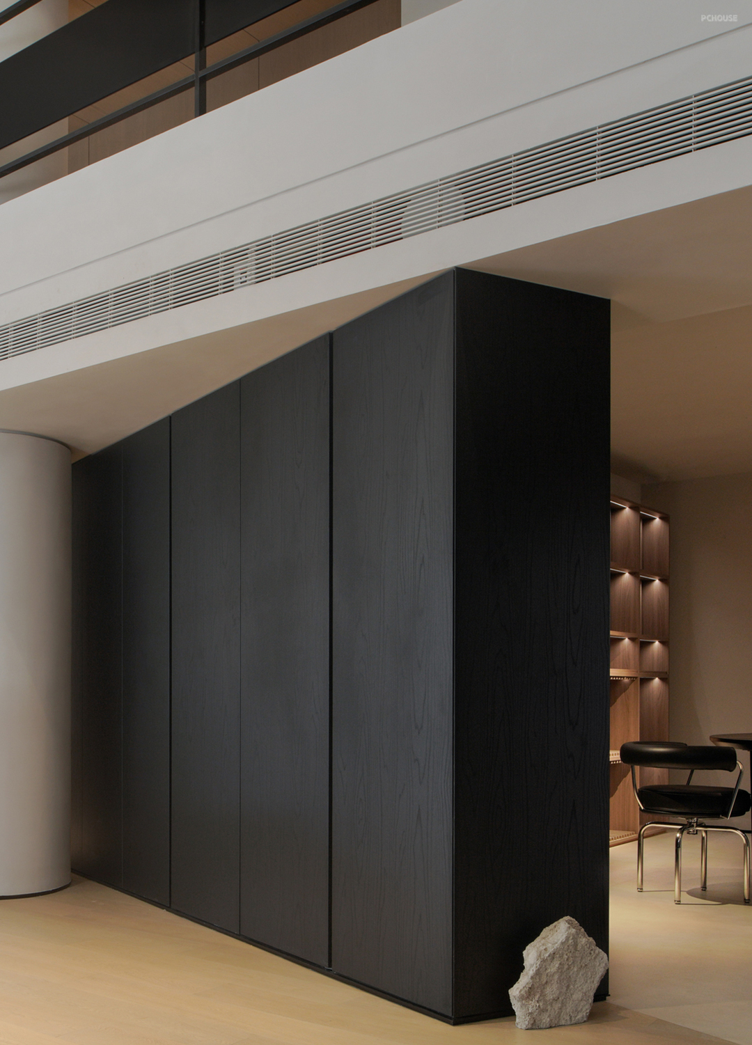
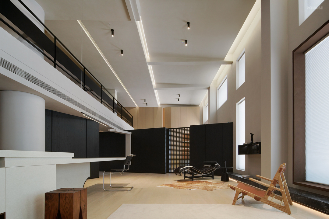
以‘再建构’的方式来作为木作品牌的切入及内部探索,组件的拆分及重组,连贯着单件的组合性,以‘分散’来对应整体的切割依据,扩展各分区的组合构件。
The way of "re-construction" is used as the entry and internal exploration of the wood brand. The split and reorganization of components are consistent with the combination of single pieces. The "dispersion" corresponds to the cutting basis of the whole, and the combined components of each partition are expanded.
· 客厅

于‘情绪空间化’
On 'Emotion spatialization'_
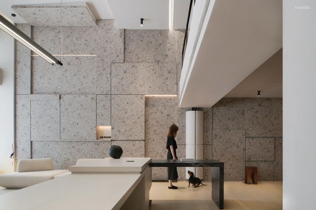
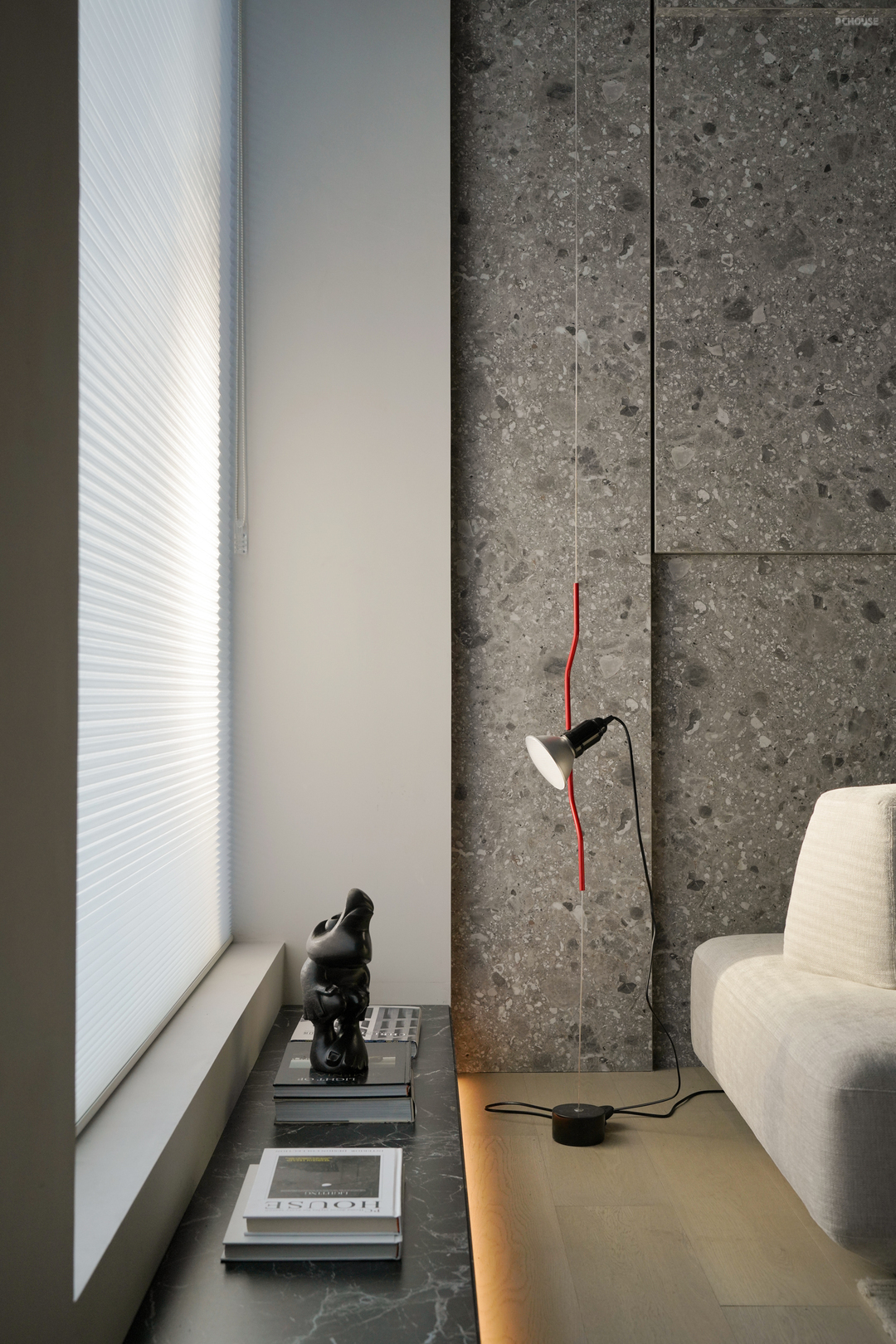
诸如体验后的感官变化,同行为于人所延伸的情绪使然,二者的矛盾及碰撞,所制造的思考过程,更贴近体态之中的自然,于空间而畅所己想。
For example, the sensory changes after the experience, and the extended emotions caused by the behavior, the contradiction and collision of the two make the thinking process closer to the nature in the body, and free one's mind in the space.
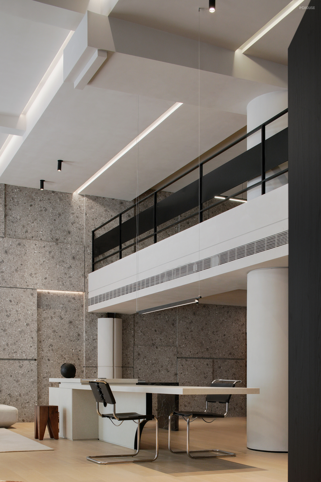
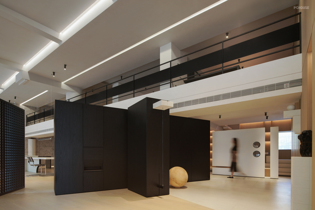
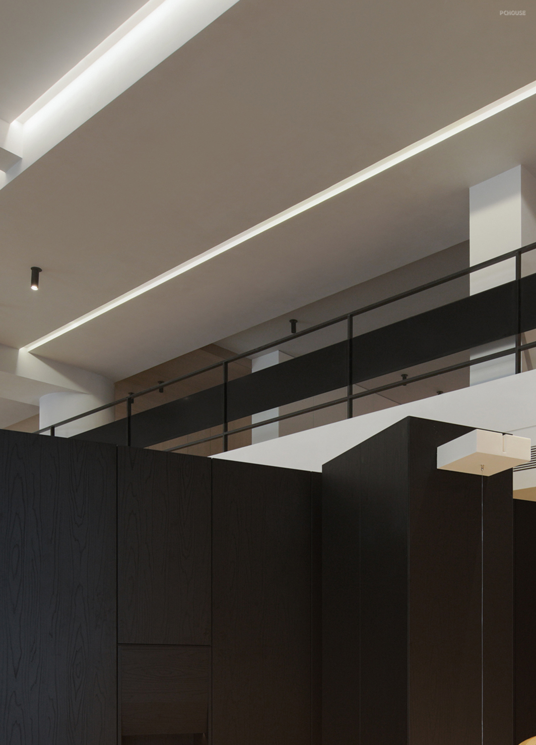
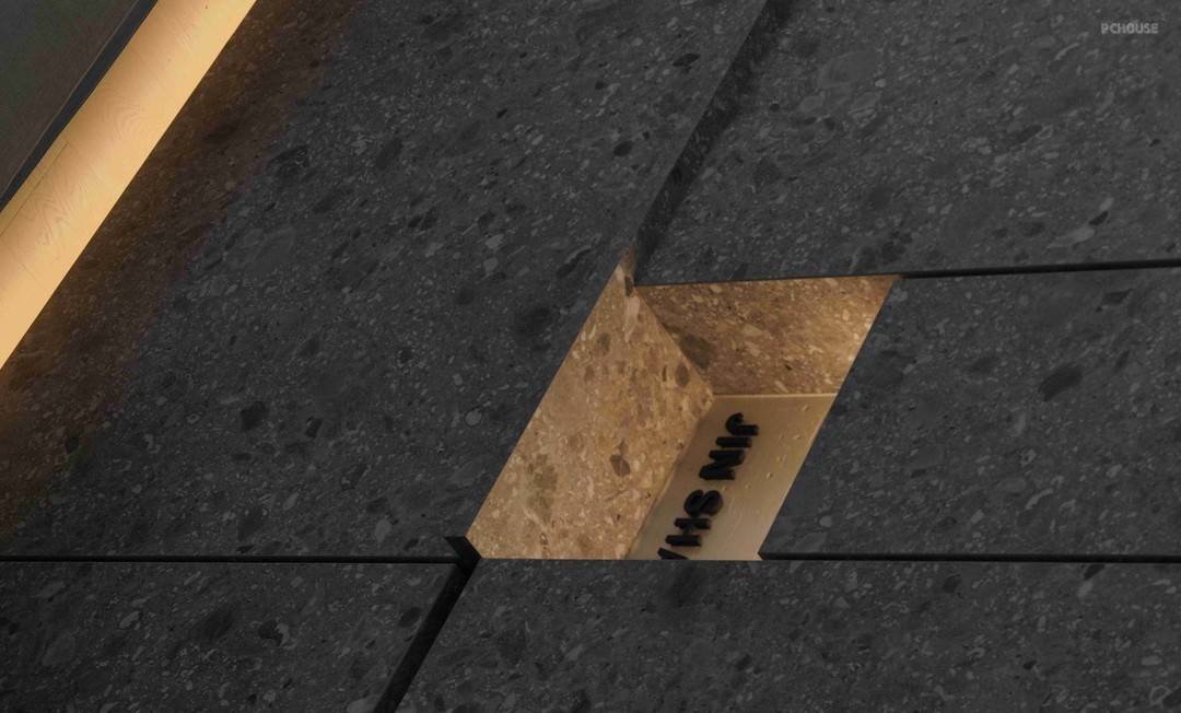
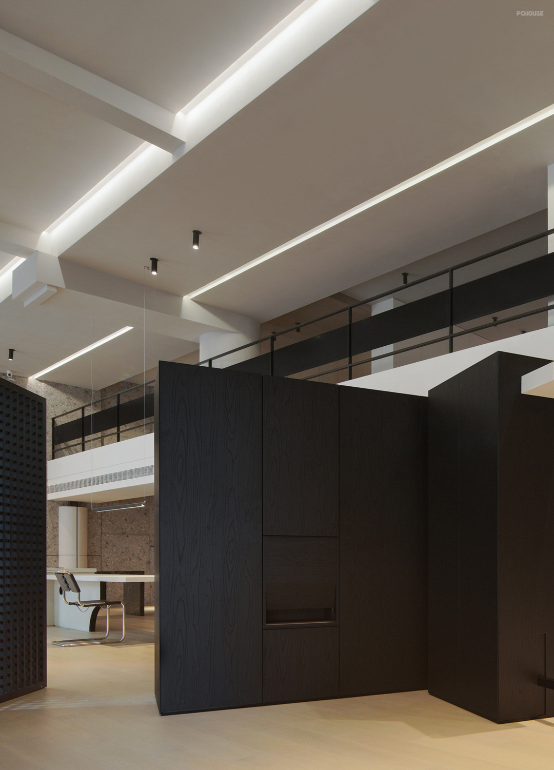
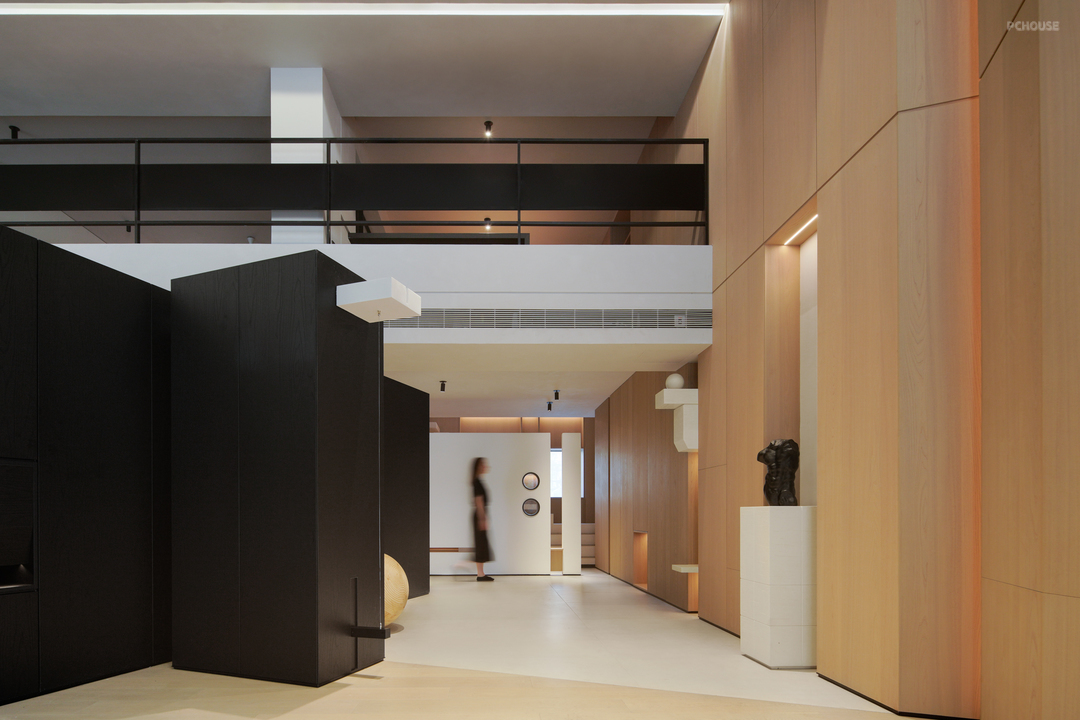
借由‘斜面’交错的阔斧切割方式,来分化行为动线的疏导,使其分区的独立性保留的同时,也可兼具对应缓冲的情绪转换,交错的边界作为动线的环绕分断。
The "inclined plane" staggered broad axe cutting method is used to divide the routing of the moving line, so that the independence of its partition is preserved, and the corresponding buffer emotional conversion can be concurrently concurrently, and the staggered boundary is used as the wrapping and breaking of the moving line.
The "inclined plane" staggered broad axe cutting method is used to divide the routing of the moving line, so that the independence of its partition is preserved, and the corresponding buffer emotional conversion can be concurrently concurrently, and the staggered boundary is used as the wrapping and breaking of the moving line.
· 其他
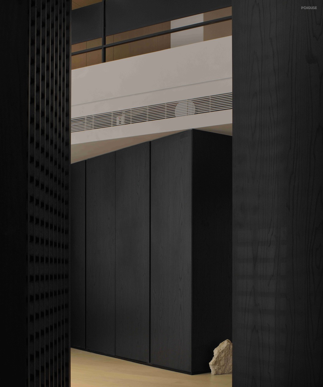
于‘结构组合’
On 'Structure Combination'_
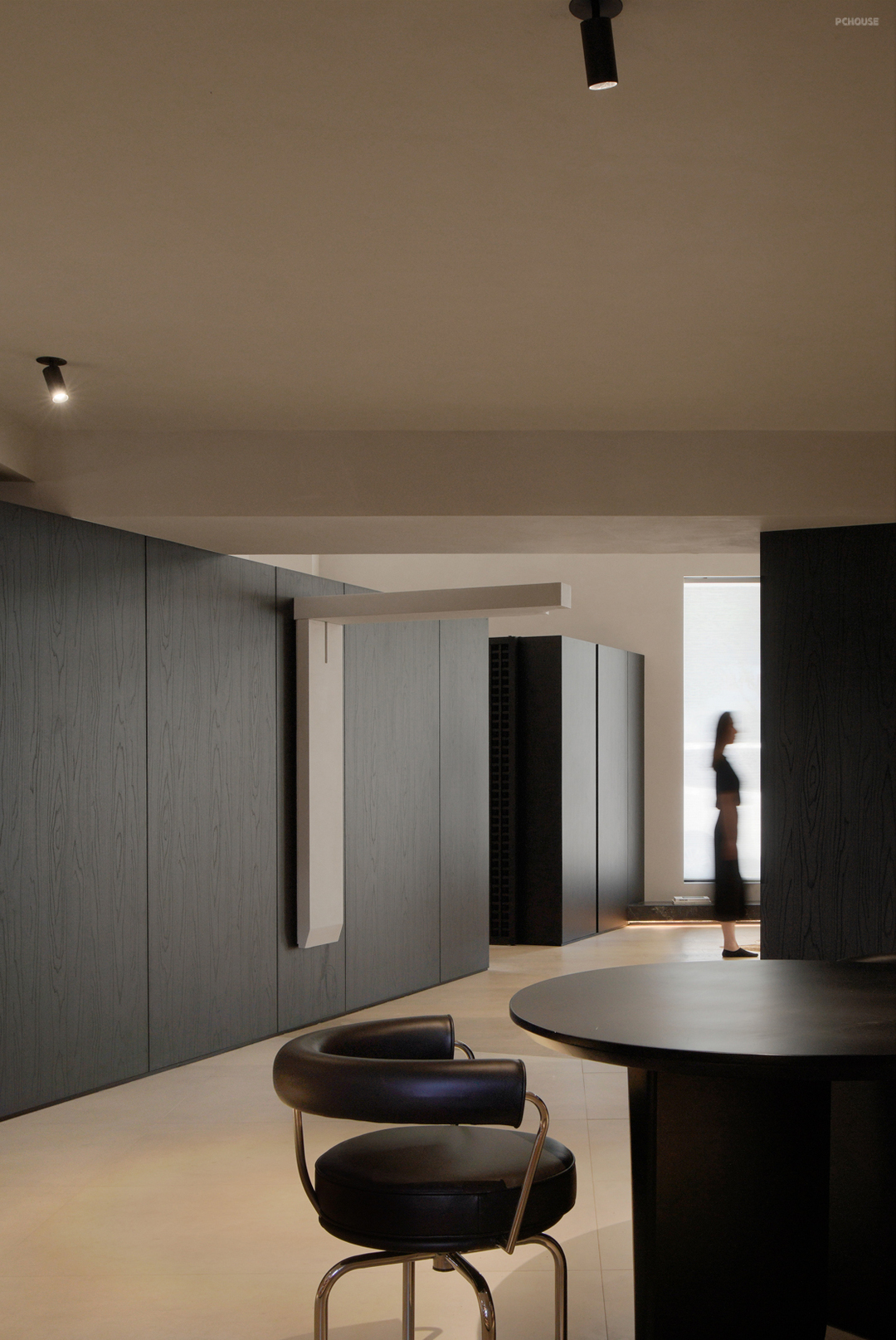
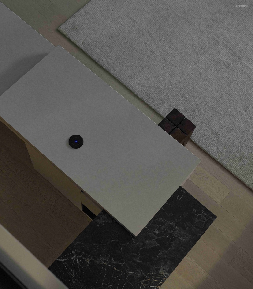
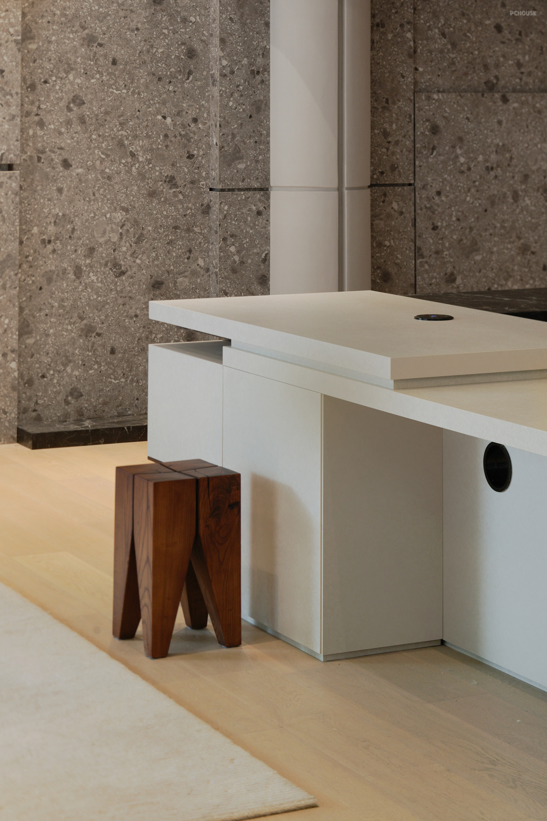
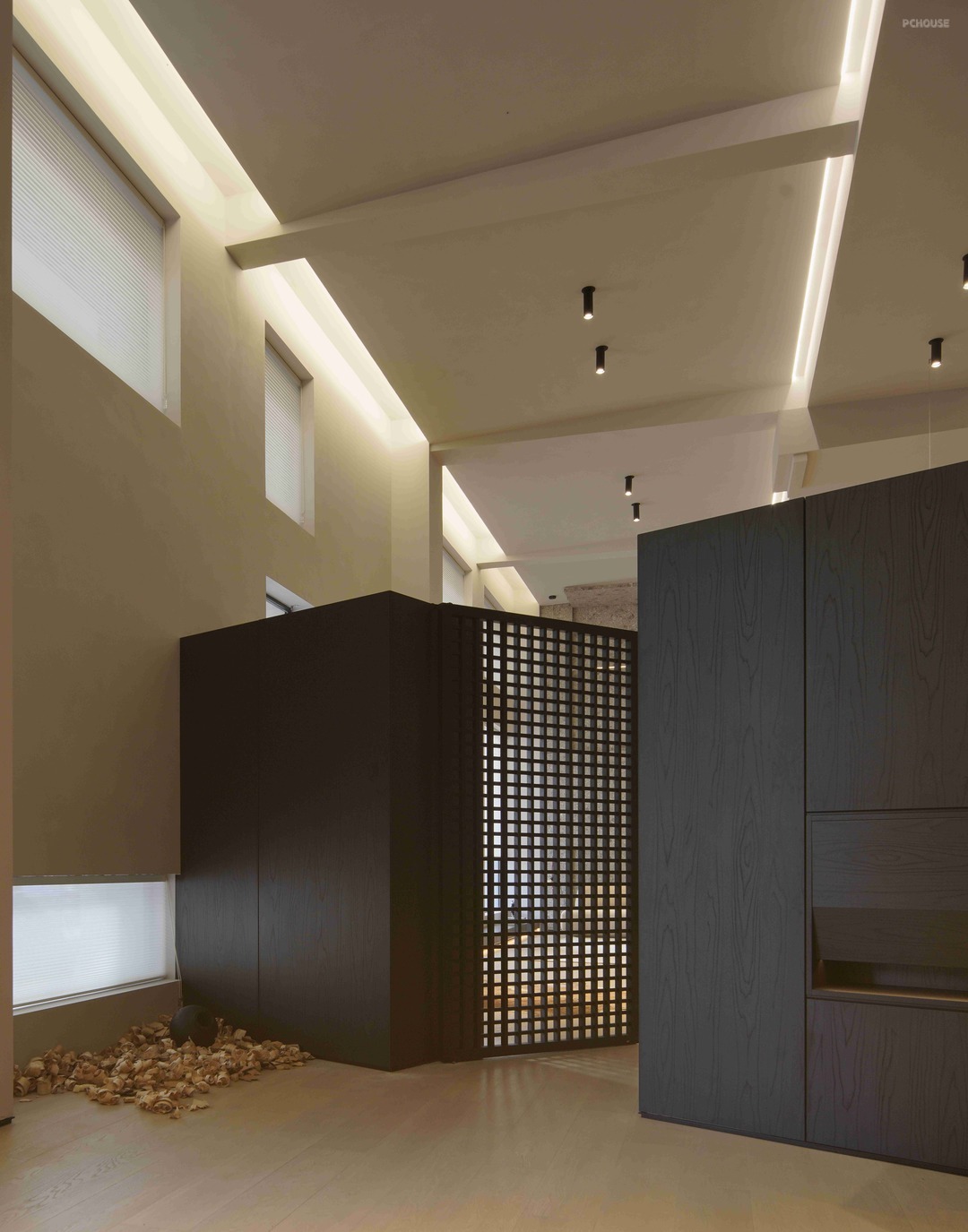
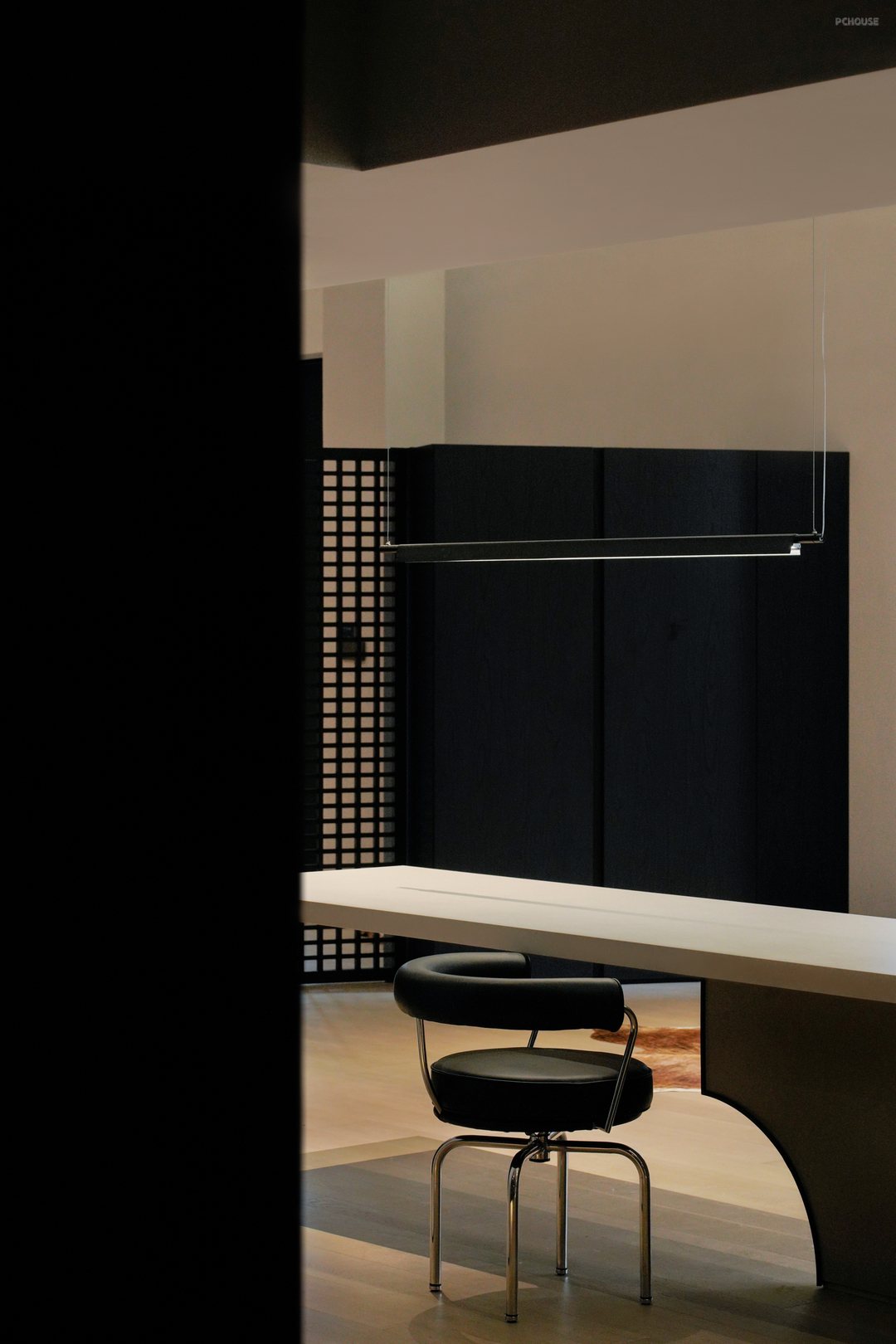
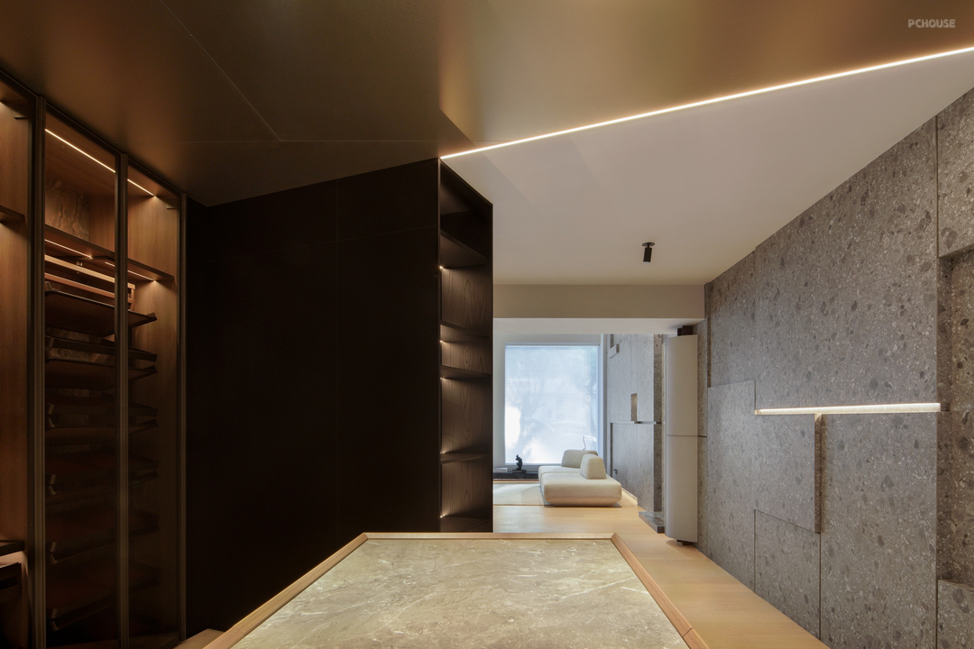
让‘中吧台’作为动线缓冲及交际互动的中心,与相邻功能分区互成交流之势,再对于其‘本身’进行拆分,借助形体的多样变换来处理体块之间的重合关系,来显现物件本身的多样化呈现。
The 'middle bar' serves as the center of moving line buffer and communication interaction, forming a potential for communication with adjacent functional zones. Then the 'itself' is split, and the overlapping relationship between the blocks is processed with the help of diverse transformation of forms, so as to show the diversified presentation of objects themselves.
‘前序’
'before the order'_
在沟通之初,在与甲方就项目的定位及立案来展开沟通时,如何让现有的产品体系更好的与空间格局融合?是甲方特别重视的点位之一,又想抛开传统定义上的分区套分区,及以背景装饰为转换面的功能产品形式,且加入更好的入店体验度及人与人之间更多的互动交流性。对此,在前端基于分区的展示形式,也罗列了很多的对应空间素材形式来沟通展开...
At the beginning of communication, when communicating with Party A about the positioning and filing of the project, how to make the existing product system better integrate with the spatial pattern? It is one of the points that Party A attaches special importance to. It also wants to put aside the traditional definition of zoning and zoning, and use background decoration as the conversion surface of functional products, and add better in-store experience and more interaction between people. In this regard, in the front based on the partition of the display form, also listed a lot of corresponding space material forms to communicate and expand...
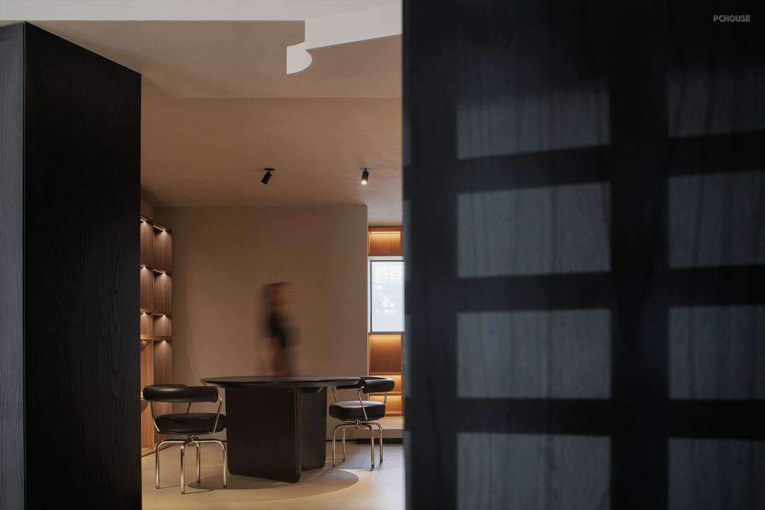
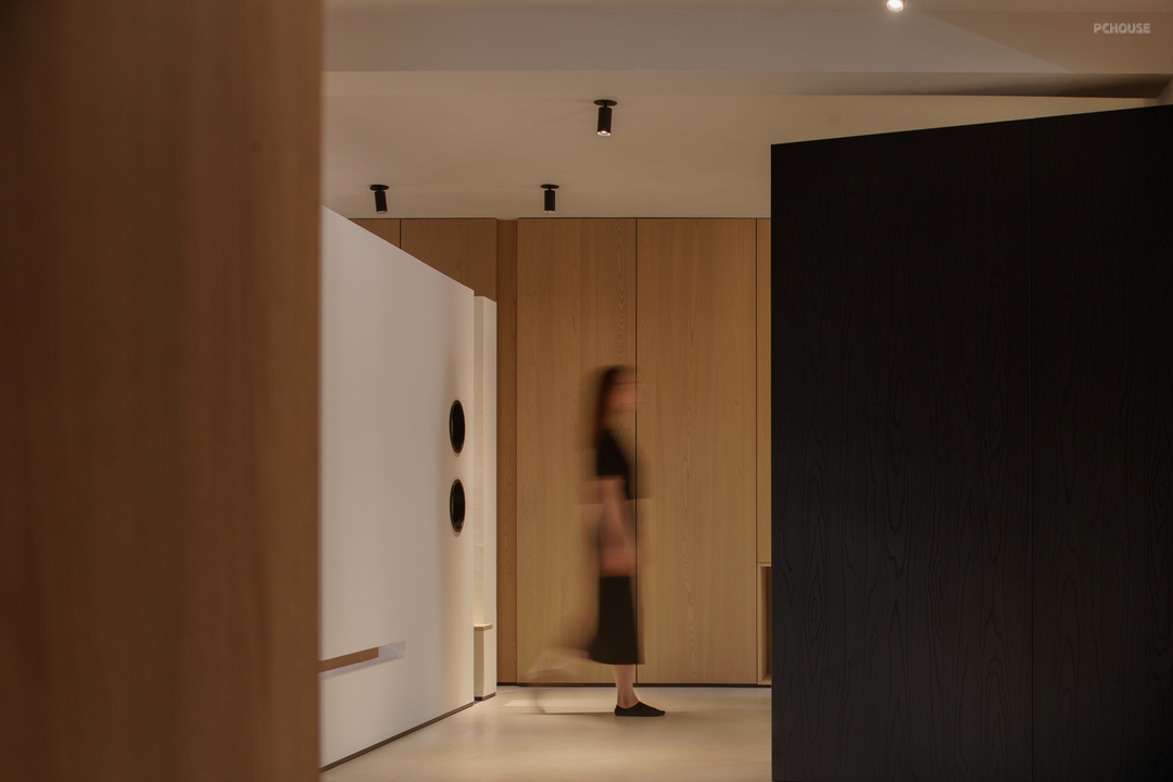
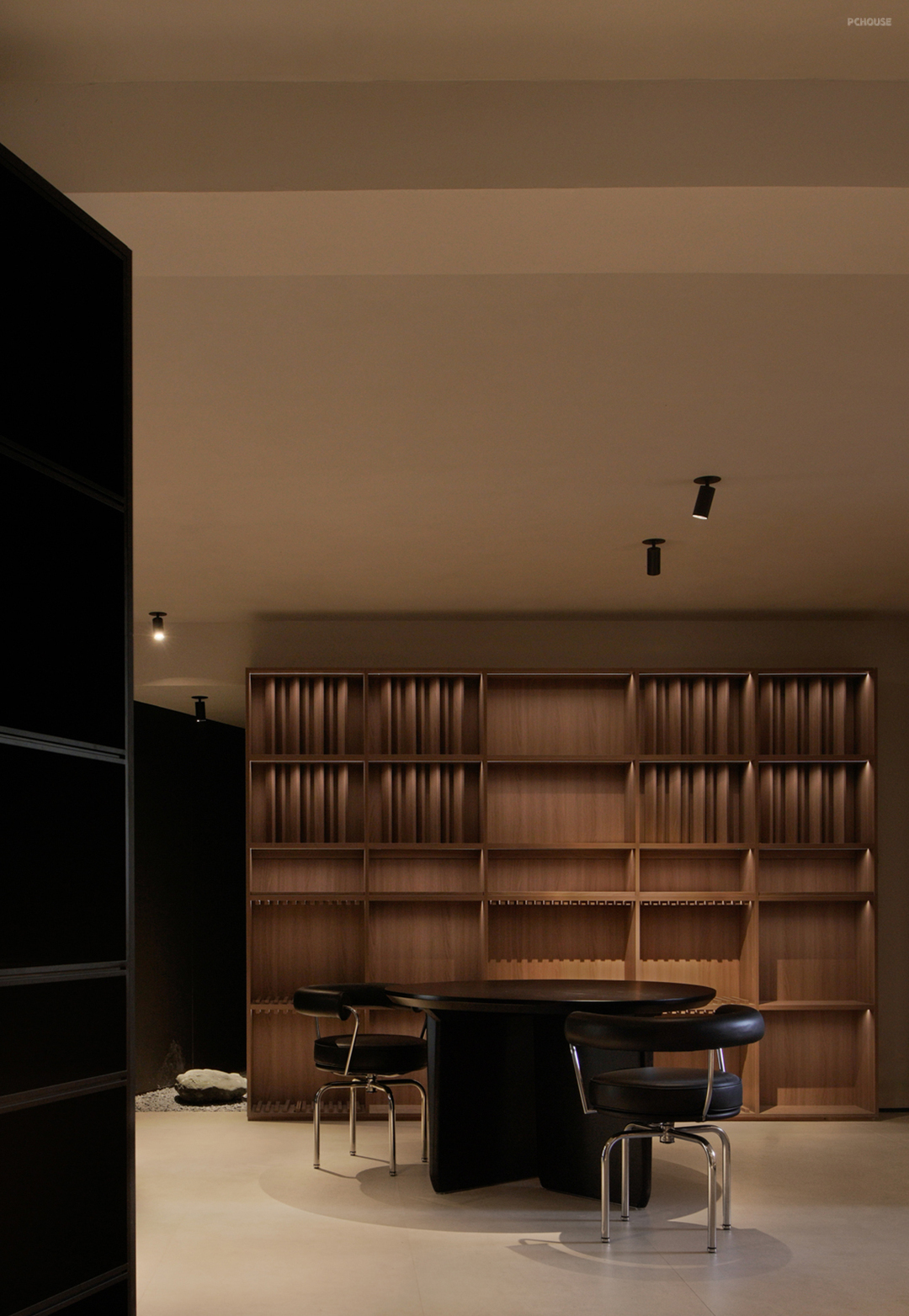
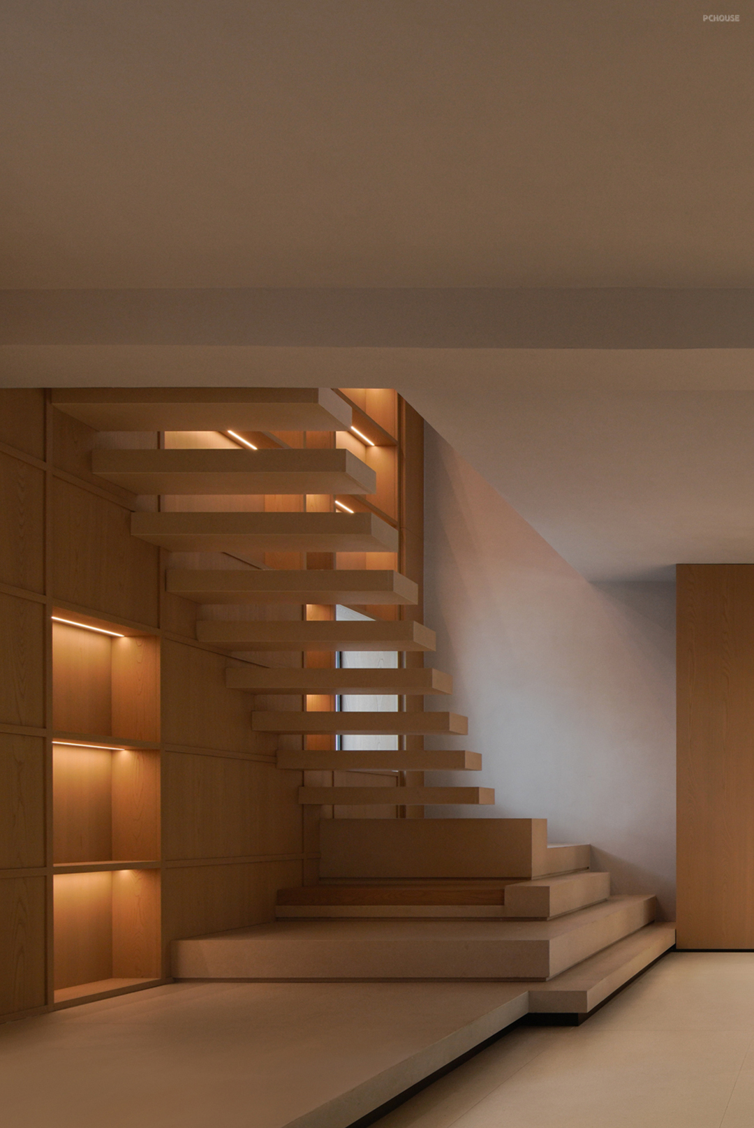
“对于该品牌来讲,他们深知客户到店之后的体验及感受是至关重要的,同样的产品置于不同的环境内,所对应的呈现和感官是完全不同的,这也是未改造之前的销售痛点。包括市场于不同时间段下的风格倾向趋势,原本最初的产品出样体系已不能满足客户到店之后的产品体验及对于诸多点位的认同,再者结合当下年轻客群的年龄层转换,对于产品的考究也更为全面。”
"For this brand, they know that the experience and feeling of customers after coming to the store is very important. The same product in different environments will have completely different presentation and senses, which is also the sales pain point before the transformation. Including the style trend of the market in different periods of time, the original product sampling system can no longer meet the customer's product experience and recognition of many points after coming to the store. Moreover, combined with the age change of the current young customers, the product research is more comprehensive."
"For this brand, they know that the experience and feeling of customers after coming to the store is very important. The same product in different environments will have completely different presentation and senses, which is also the sales pain point before the transformation. Including the style trend of the market in different periods of time, the original product sampling system can no longer meet the customer's product experience and recognition of many points after coming to the store. Moreover, combined with the age change of the current young customers, the product research is more comprehensive."
于‘轴称式’
On 'axis scale'_
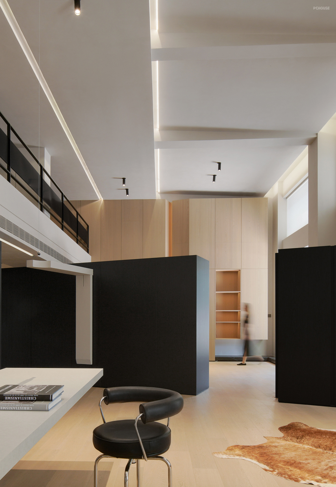
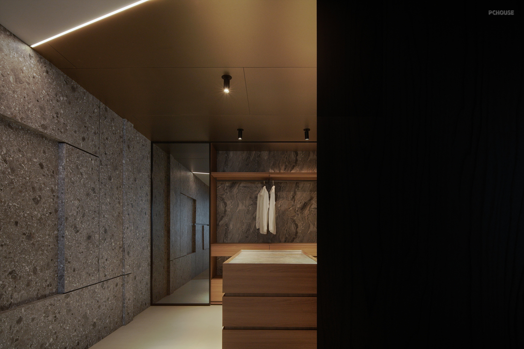
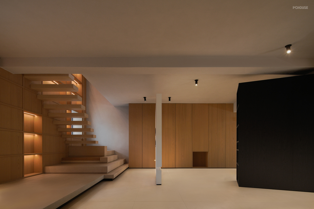
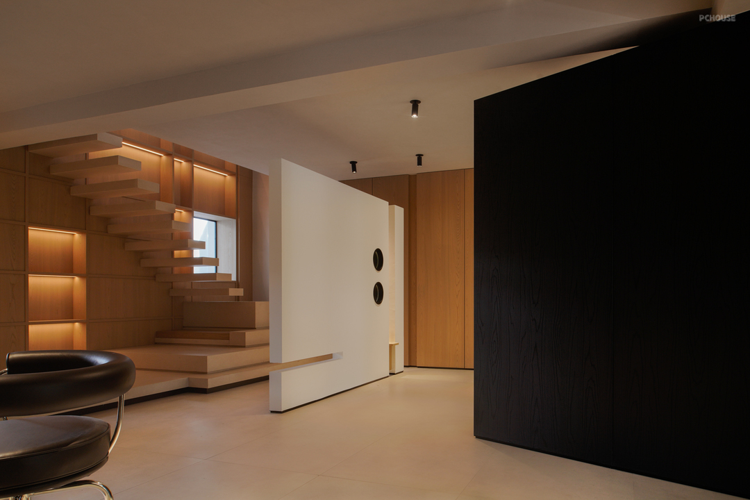
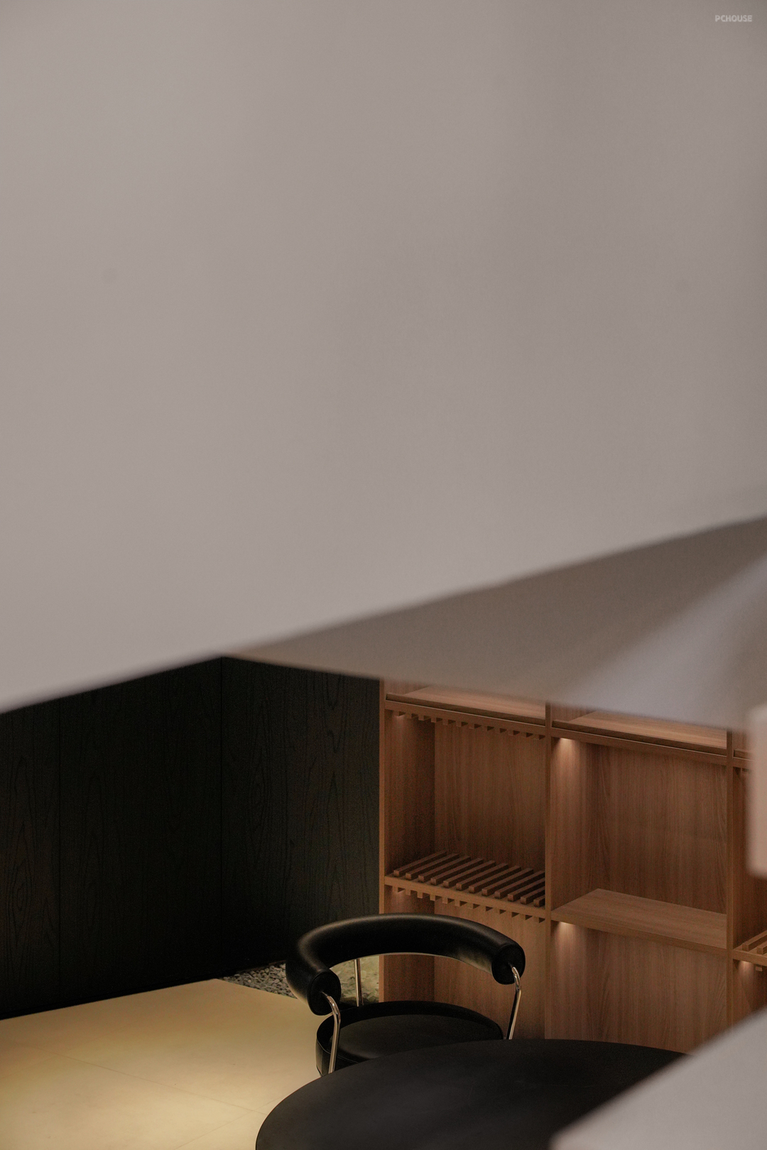
以‘轴向’来作为定义空间分区的切分枢纽,结合轴端的两向延伸点来界定功能区面的划分,再通过独立的位面形式来区隔视线的交错,引导其行为的自然发生状态...
"Axial direction" is used as the dividing hub to define the spatial partition, and the functional plane is divided by combining the two extension points of the axial end. Then the staggered line of sight is separated by the independent plane form, and the natural occurrence state of its behavior is guided.
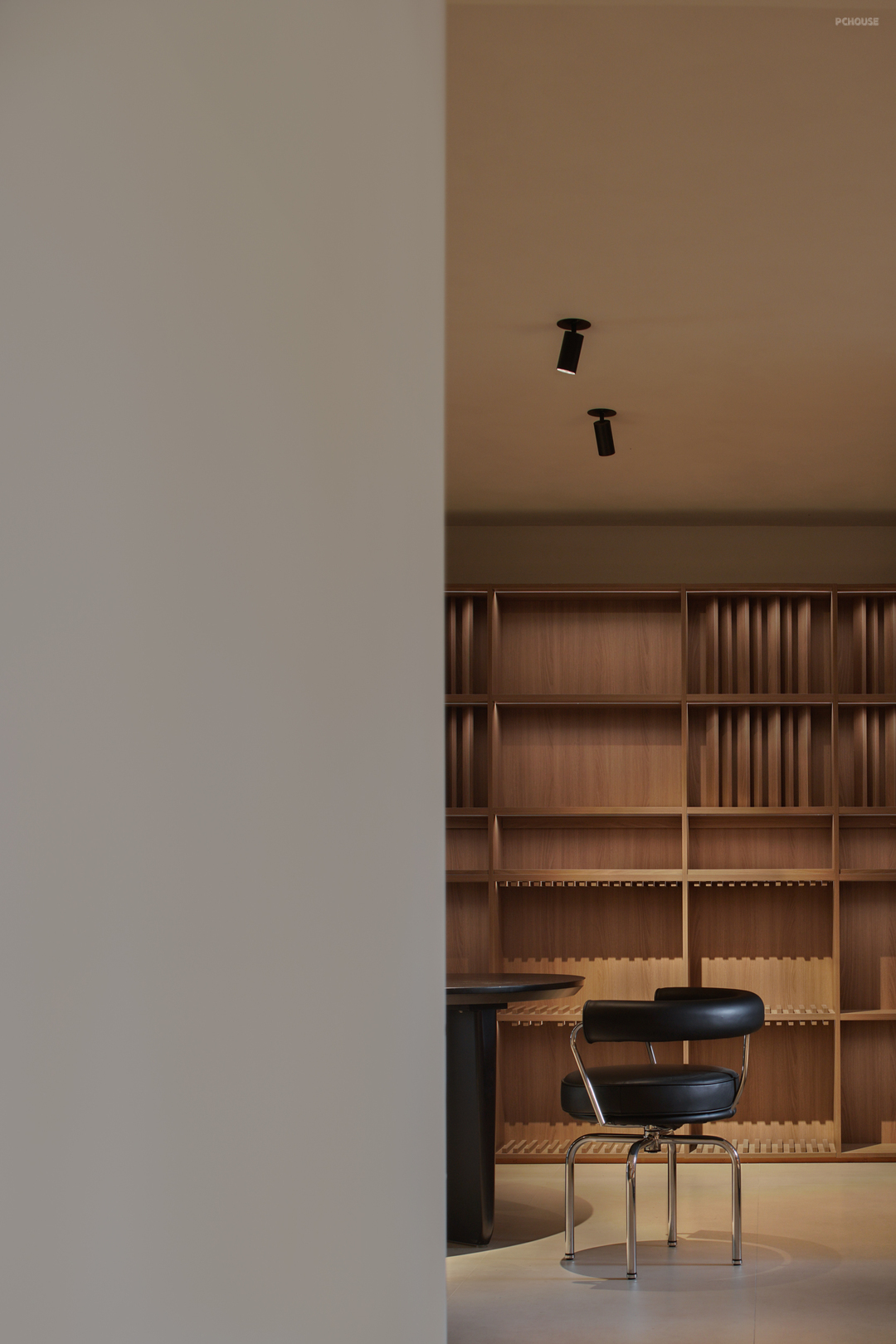

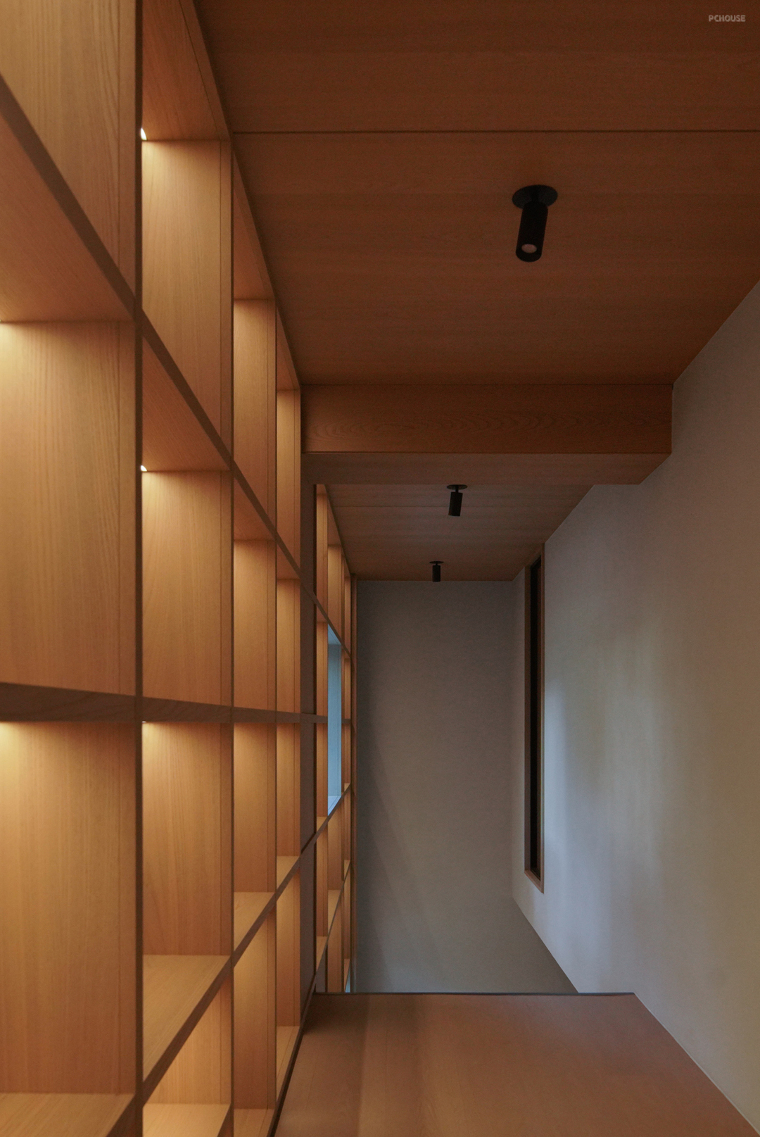
出于以上的种种的综合考量,该品牌决定在原有的基础上,扩展自己更多的优势(理念、美学观感及工艺的多样化体现),包括对于‘COLORNMENT’品牌的双向优势叠加,以此来扩展自身更多的对内探索,基于对工艺及多样化的设计要求,来配合到项目空间的精准落实。
Due to the above comprehensive considerations, the brand has decided to expand more of its own strengths (diversified reflection of ideas, aesthetics and techniques) on the original basis, including in relation to the bidirectional advantages of the brand 'colorin relation', in order to expand its own internal exploration, based on the requirements for techniques and diversified design. To cooperate with the precise implementation of the project space.
Due to the above comprehensive considerations, the brand has decided to expand more of its own strengths (diversified reflection of ideas, aesthetics and techniques) on the original basis, including in relation to the bidirectional advantages of the brand 'colorin relation', in order to expand its own internal exploration, based on the requirements for techniques and diversified design. To cooperate with the precise implementation of the project space.

于‘插序’
In 'insertion order'_
其更强调直觉的重要性,最初的构思往往源自于现场
的特质所激发的直觉,而构思的主件明晰、发展、成熟则需要时间。对于自己而言,并不存在通向成功的创作捷径,而是在形象、空间秩序的直觉和结构、功能及环境等更为具体的因素之间,存在着一个来回往复运动的过程。在这一过程中,人的思维方式并不是线性的,而以曲线或‘之’字形迂回的方式,这是一种更为综合的方式。这种非线性的思维对任何可能的情况都是开放的。
--阿尔瓦罗.西扎
In 'insertion order'_
其更强调直觉的重要性,最初的构思往往源自于现场
的特质所激发的直觉,而构思的主件明晰、发展、成熟则需要时间。对于自己而言,并不存在通向成功的创作捷径,而是在形象、空间秩序的直觉和结构、功能及环境等更为具体的因素之间,存在着一个来回往复运动的过程。在这一过程中,人的思维方式并不是线性的,而以曲线或‘之’字形迂回的方式,这是一种更为综合的方式。这种非线性的思维对任何可能的情况都是开放的。
--阿尔瓦罗.西扎
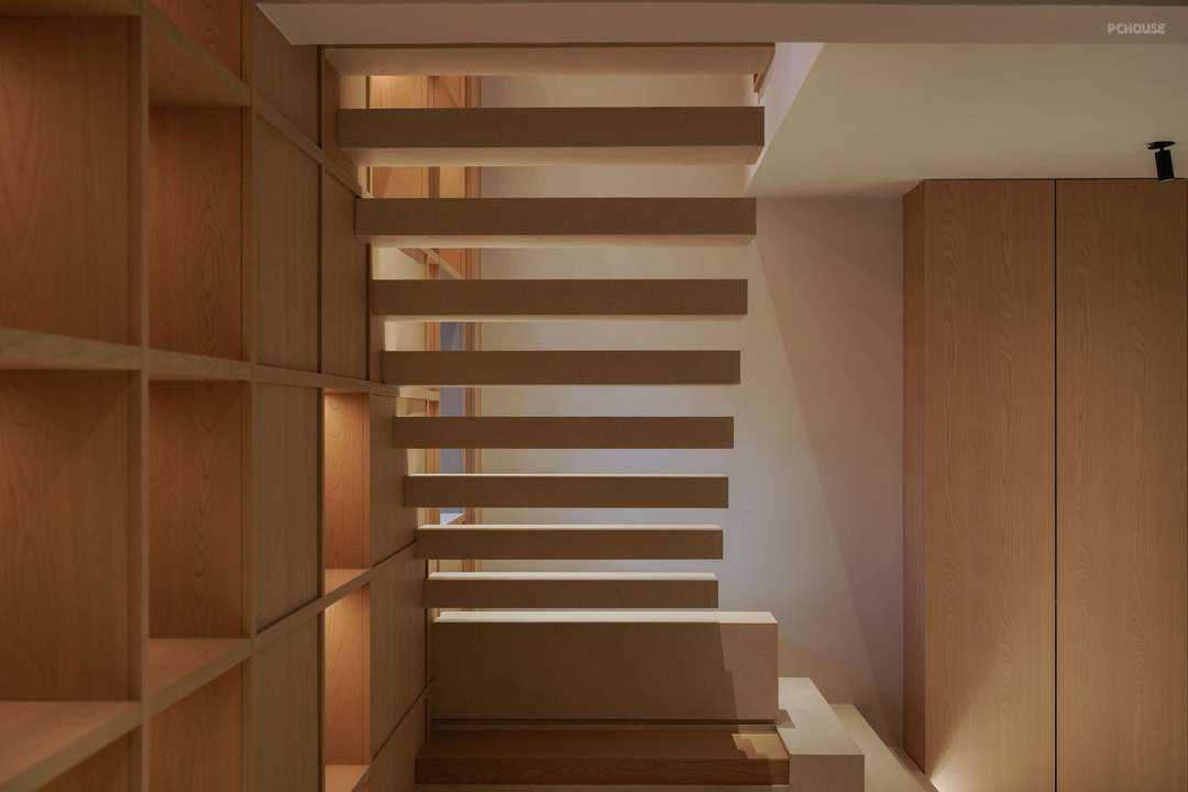
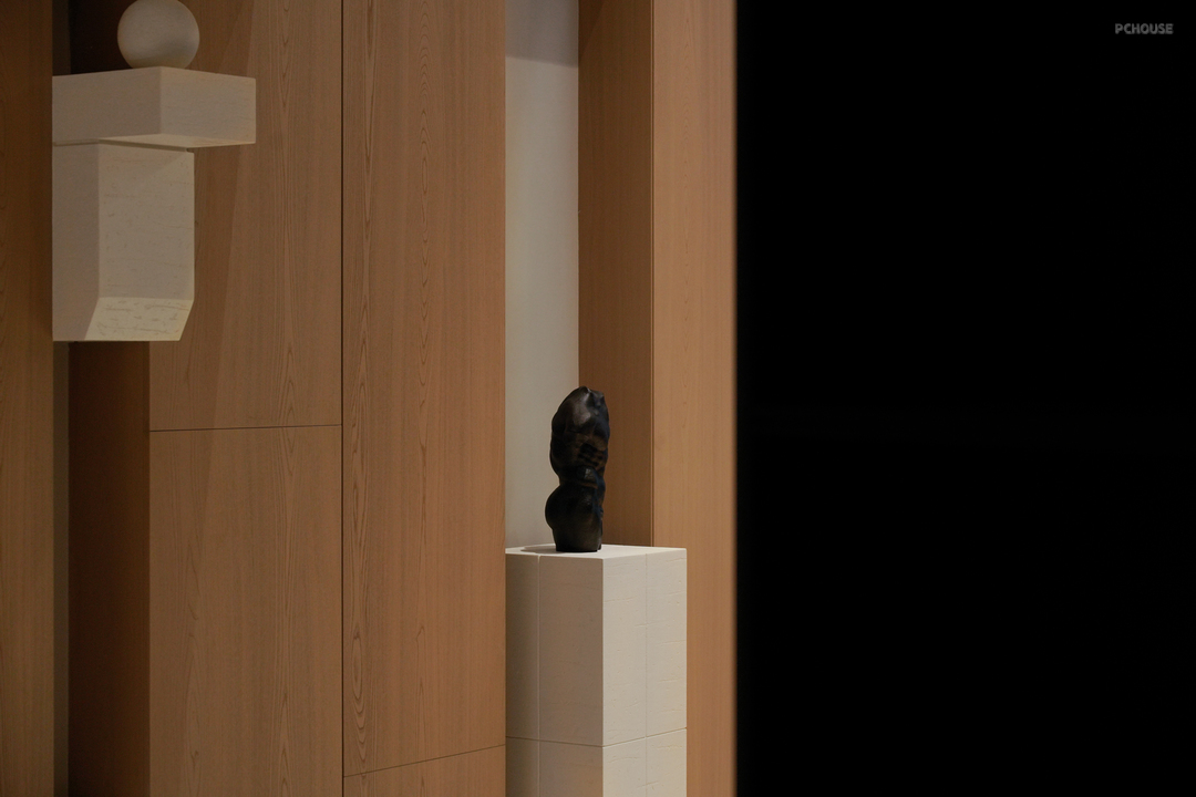
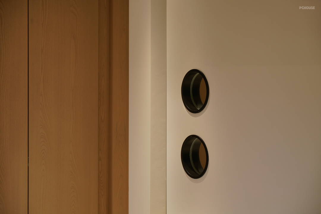
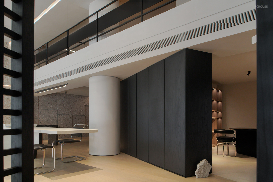
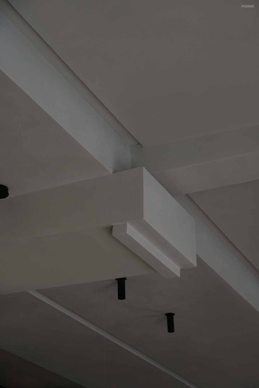
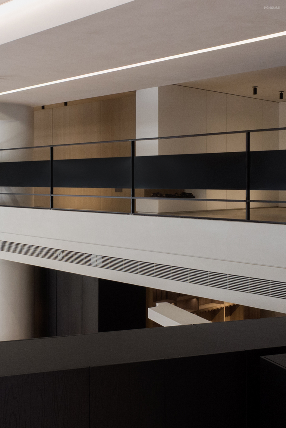
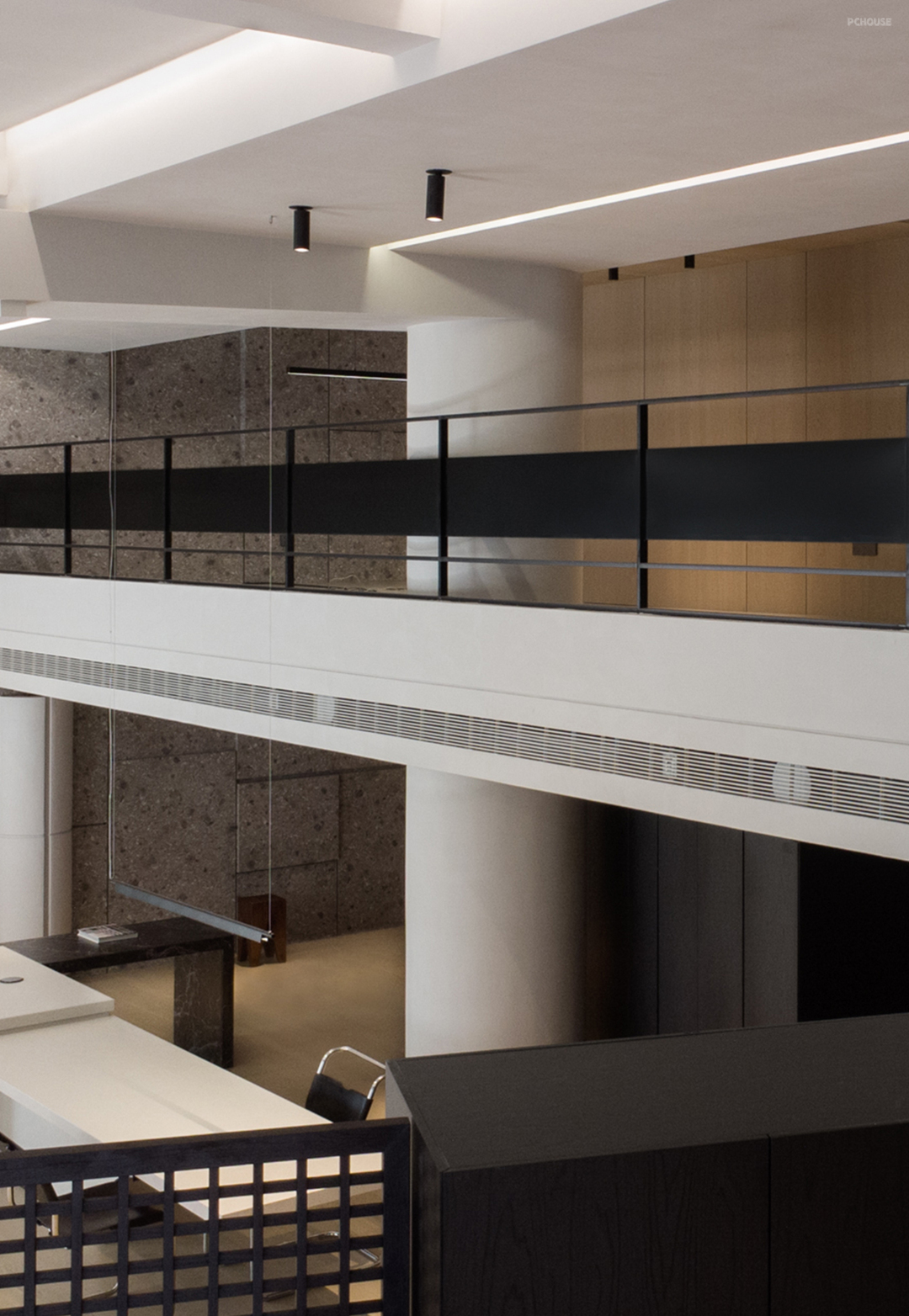
考虑1F为主要展示分区,楼上均作为内部团队使用,故在分段楼层高度的阶段,把更舒适的视觉感受给到了底层,2F以满足极限高度为准,确保正常的动线分隔及使用感受。
Considering 1F as the main display area, the upstairs is used by the internal team, so in the stage of dividing the floor height, more comfortable visual feeling is given to the ground floor, 2F is subject to the limit height, to ensure normal moving line separation and use feeling.
Considering 1F as the main display area, the upstairs is used by the internal team, so in the stage of dividing the floor height, more comfortable visual feeling is given to the ground floor, 2F is subject to the limit height, to ensure normal moving line separation and use feeling.
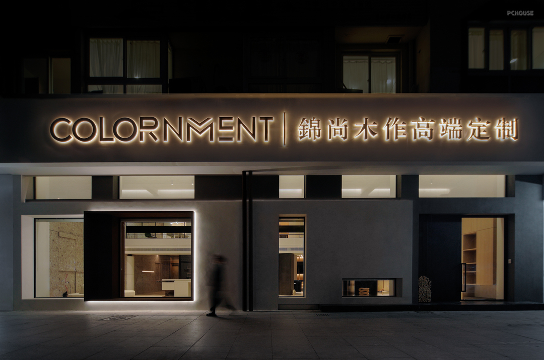
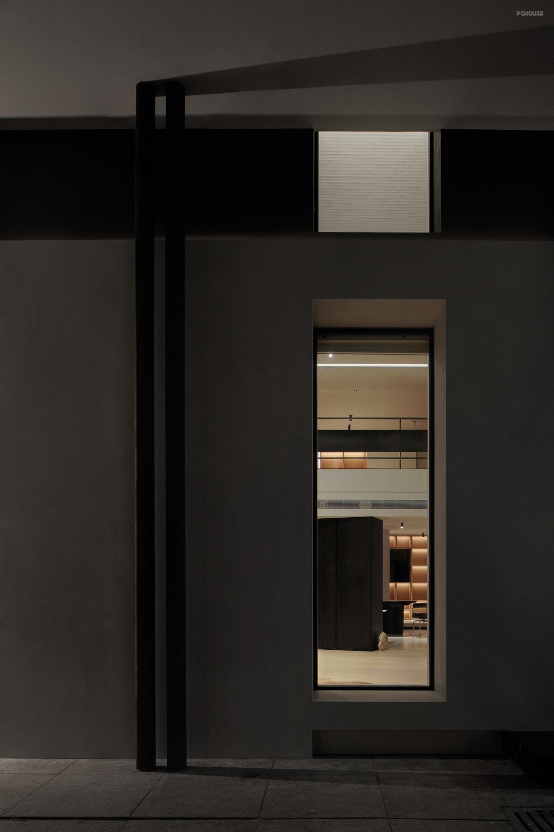
以‘产品模块化’的形式来组合变换可能性的呈现,再通过设计语言的引导至分断区域的过渡,以此来作为连接相邻分断区位面的整体统一性。
The presentation of transformation possibility is combined in the form of "product modularity", and then the transition to the breaking area is guided by the design language, so as to connect the whole unity of adjacent breaking area.
The presentation of transformation possibility is combined in the form of "product modularity", and then the transition to the breaking area is guided by the design language, so as to connect the whole unity of adjacent breaking area.
更多推荐
发表您的看法…
目录
户型图
玄关
客厅
其他


评论 0